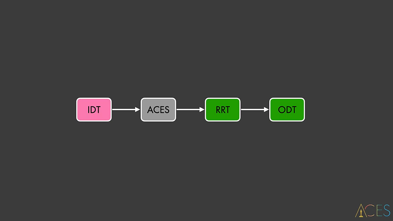
OCIO, Display Transforms and Misconceptions
Source
Author: Christophe Brejone
Introduction
I often think about this great question asked by Doug Walker at one of our OpenColorIO OCIO meetings: what are you trying to solve? So in our case, what is this post about?
In the past year (2021), I have given several talks online about OCIO and the Academy Color Encoding System (ACES). I thought it would be useful to put those slides online for two reasons:
- If there is any inaccuracy, anyone can correct me and I’ll be more than happy to update this page.
- With these slides online, I hope I can reach more people and raise awareness about certain topics.
I do not consider myself an expert. I do not believe in this word anymore. We are only human beings, doing our best to understand things. We make mistakes, hopefully learn from them and keep going. So no, I’m not an expert on anything!
The only thing I can offer is an artist’s point of view on Color Management. Quite often, I have been lost on where to begin when it comes to OCIO and ACES. So by writing this post, I hope I can share with you some useful information.
There is a reason my book starts with two chapters about Color Management. It will give you the foundation to create beautiful images. So I thought it would be interesting to compare various OCIO configs, with a series of visual examples in order to study their strength and flaws.
Really the idea is to look back but NOT judge these historical OCIO configs. Not at all! Huge respect to all the persons who more than ten years ago developed and shared these configs with the community.
The importance of terminology
I’m writing these lines with great humility because I have been dead wrong in the past and I’m probably still inaccurate about many things… But I’m learning and I think my only vantage is to explain things simply enough so hopefully fellow CG artists can understand me.
I’ll start here with a bit of OCIO vocabulary, so we’re all on the same page:
- Display: monitor with its characteristics (primaries, White point, EOTF, nits…).
- View: the way we see the images (ACES, Raw, Log, Un-tone-mapped…).
- Look: creative preference or grading (LMT in the ACES terminology).
These three terms may sound really basic but they are out of the utmost importance for what comes next. As you probably know, I’m quite a practical person. I like to have visual and concrete examples to support my explanations. So we’ll start by having a look at these two OCIO Config repositories and study our different options:
- nuke-default
- spi-anim / spi-vfx
- Filmic Blender
- ACES
OCIO Configs examples
nuke-default
nuke-default description
Why should we start with an OCIO config that was shipped with Nuke 6.3 in 2011? First of all, because I believe it is still used in some schools and small shops. Second of all, because it contains an option that has misled me for ages.
displays:
  default:
    -!<View> {name: None, colorspace: raw}
    -!<View> {name: sRGB, colorspace: sRGB}
    -!<View> {name: rec709, colorspace: rec709}
    -!<View> {name: rec1886, colorspace: Gamma2.4}

active_displays: [default]
active_views: [sRGB, rec709, rec1886, None]
Let’s focus on something else instead!
Revelation #1: In this config it is important to notice that the Rec.709 Transfer Function is a camera encoding OETF! It is NOT a display standard! It took me a while to figure that one out! So what everybody calls a “Rec.709 display” is actually a “BT.1886 EOTF with BT.709 primaries” display.
From a fellow color nerd.
BT.709 and BT.1886
This was one of my first interrogations when I discovered ACES. Because the Rec.709 (ACES) Output Transform is “less contrasted” (for lack of a better words) than the sRGB (ACES) one, contrary to the nuke-default. Here are the approximative Gamma values:
- BT.709 is a camera encoding OETF (~Gamma 1.95).
- BT.1886 is an EOTF output display (~Gamma 2.4) and is used in the Rec.709 (ACES) Output Transform.
Thanks Zach Lewis for the precision.
Old-school VS new-school
There is a couple of things to know about this:
- Using “rec709” in your viewer (“old school” intention), you’ll never get 1:1 for all the values. Because the general power function difference is loosely a “surround/flare compensation”!
- If you use “rec1886” on a pure BT.1886 display (“new school” intention), it is an idealized inverse for the EOTF. What we call a no-operation.
And it is the exact same issue with BT.709/sRGB piecewise encoding dumped through the proper 2.2 power function. There is a very interesting talk about this precise issue by Daniele Siragusano. It is a bit technical but definitely worth watching!
Daniele Siragusano.
We may add a couple of things: we should never ever use “Rec.709” nor “BT.709” without a further qualifier. Because “Rec.709” can either mean a transfer function or a set of primaries. For clarity, we need to separate the transfer function from the primaries.
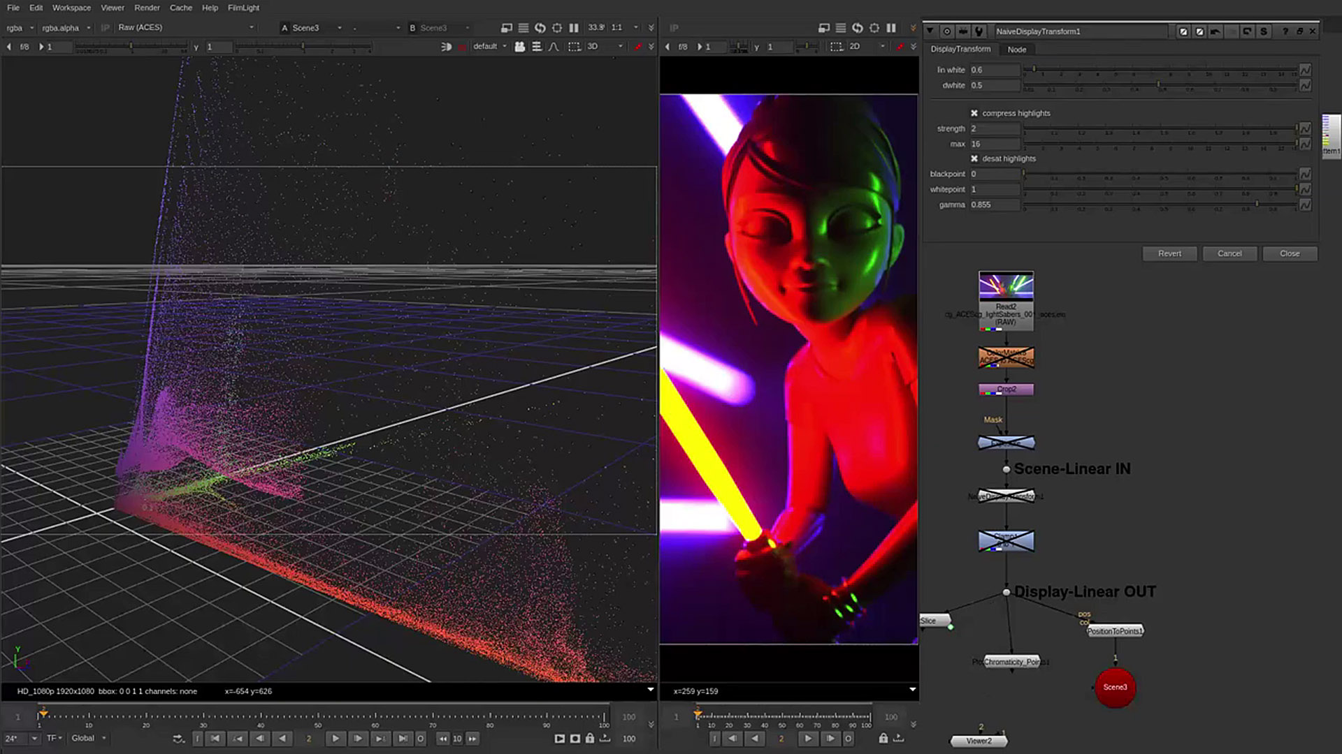
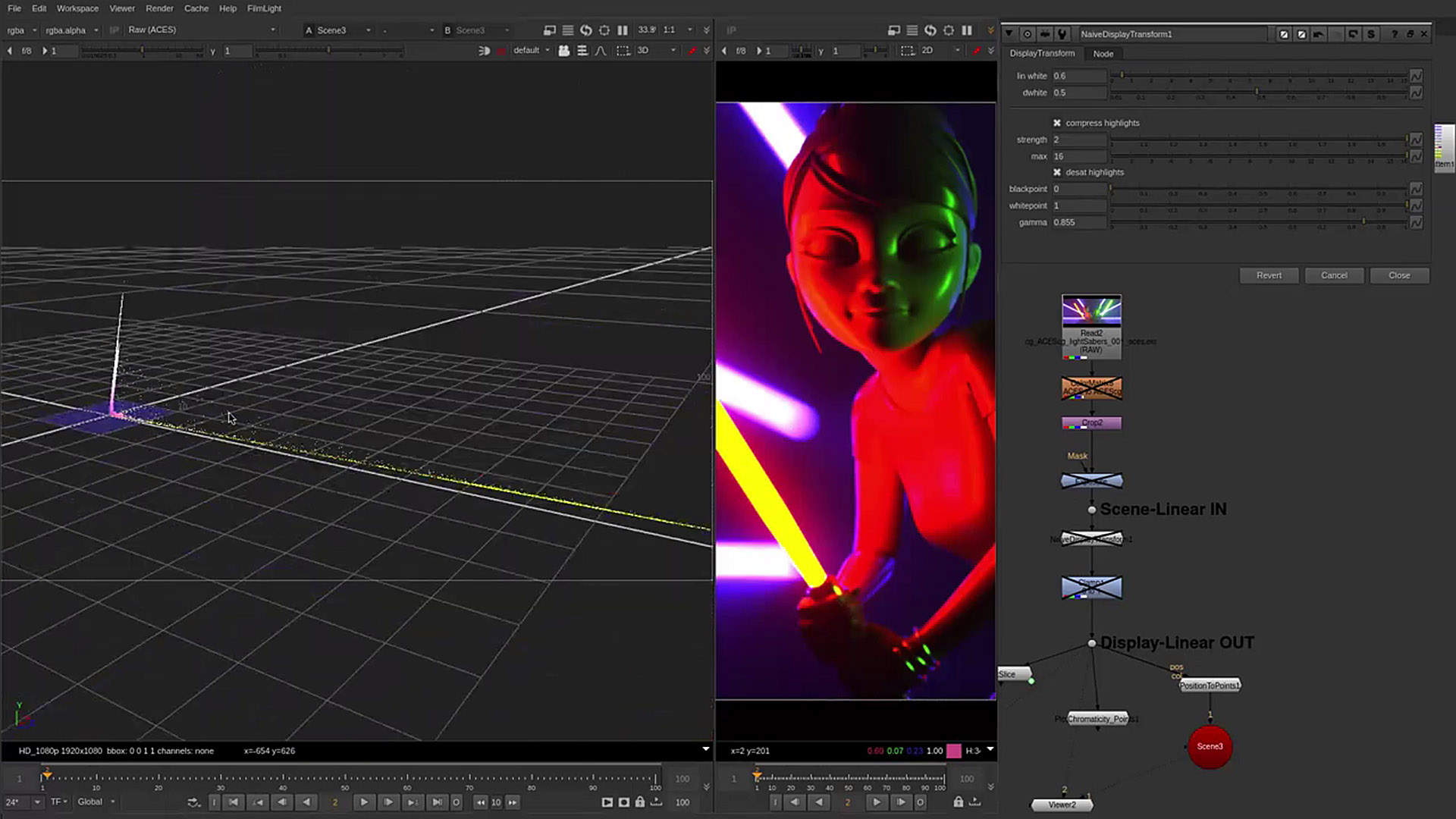
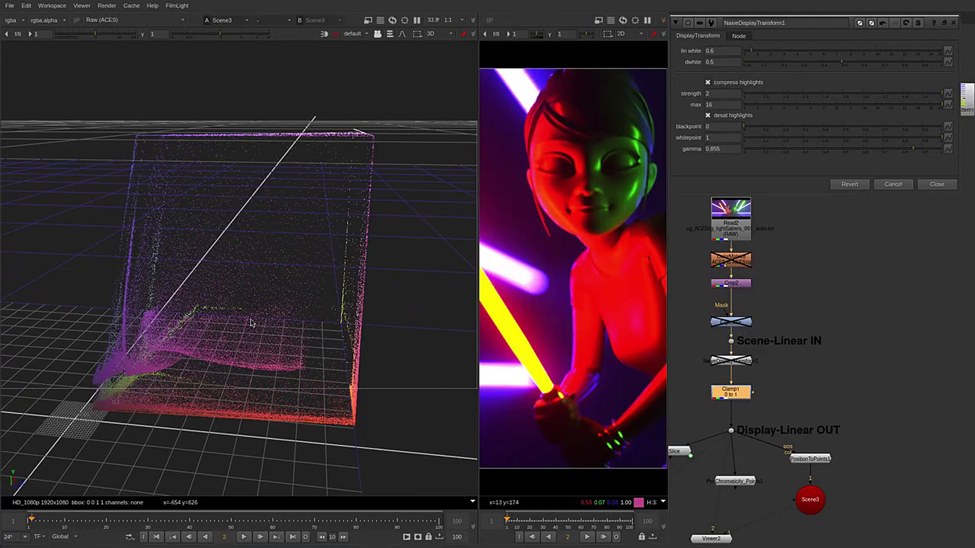
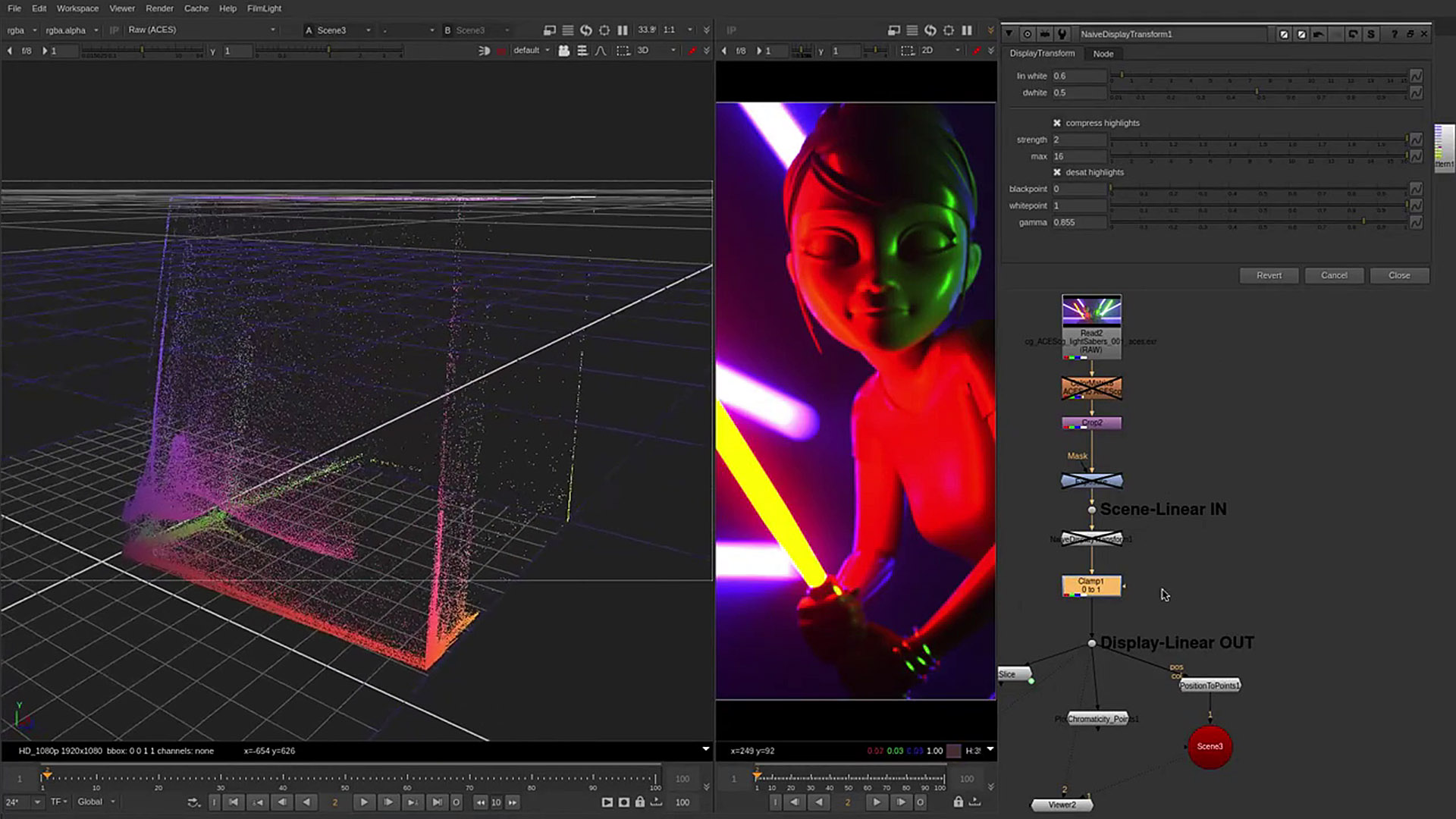
nuke-default visual examples
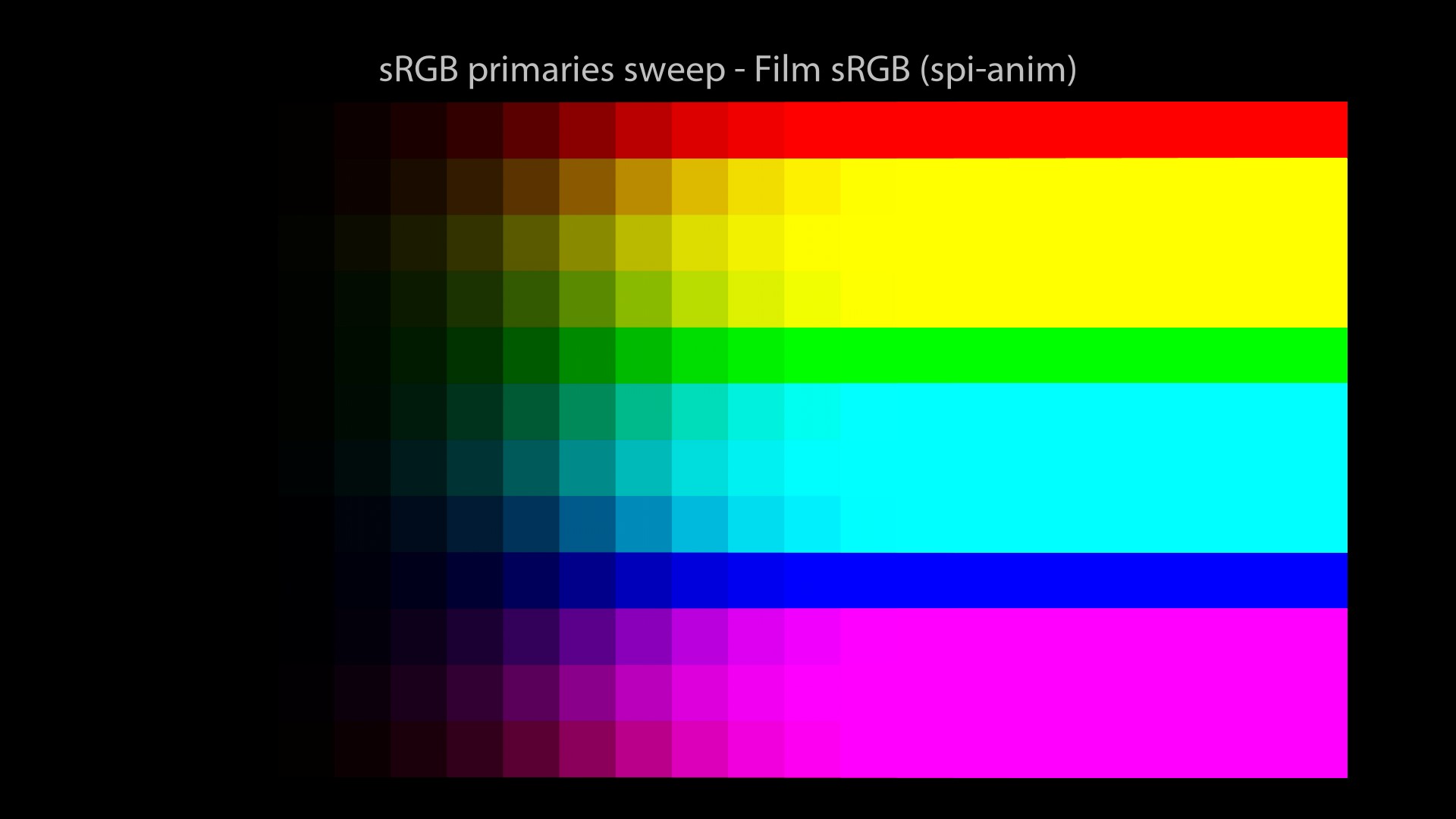
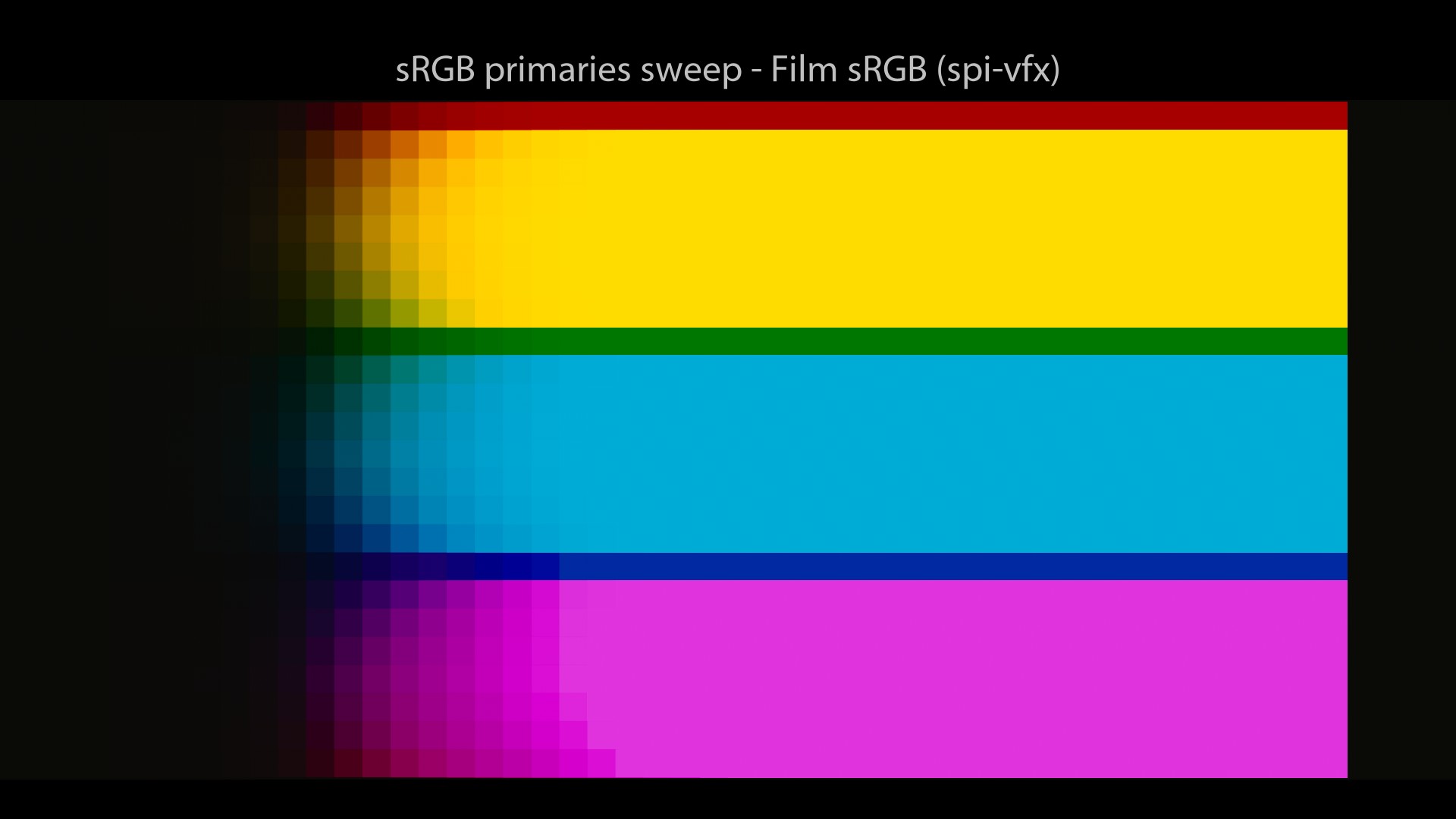
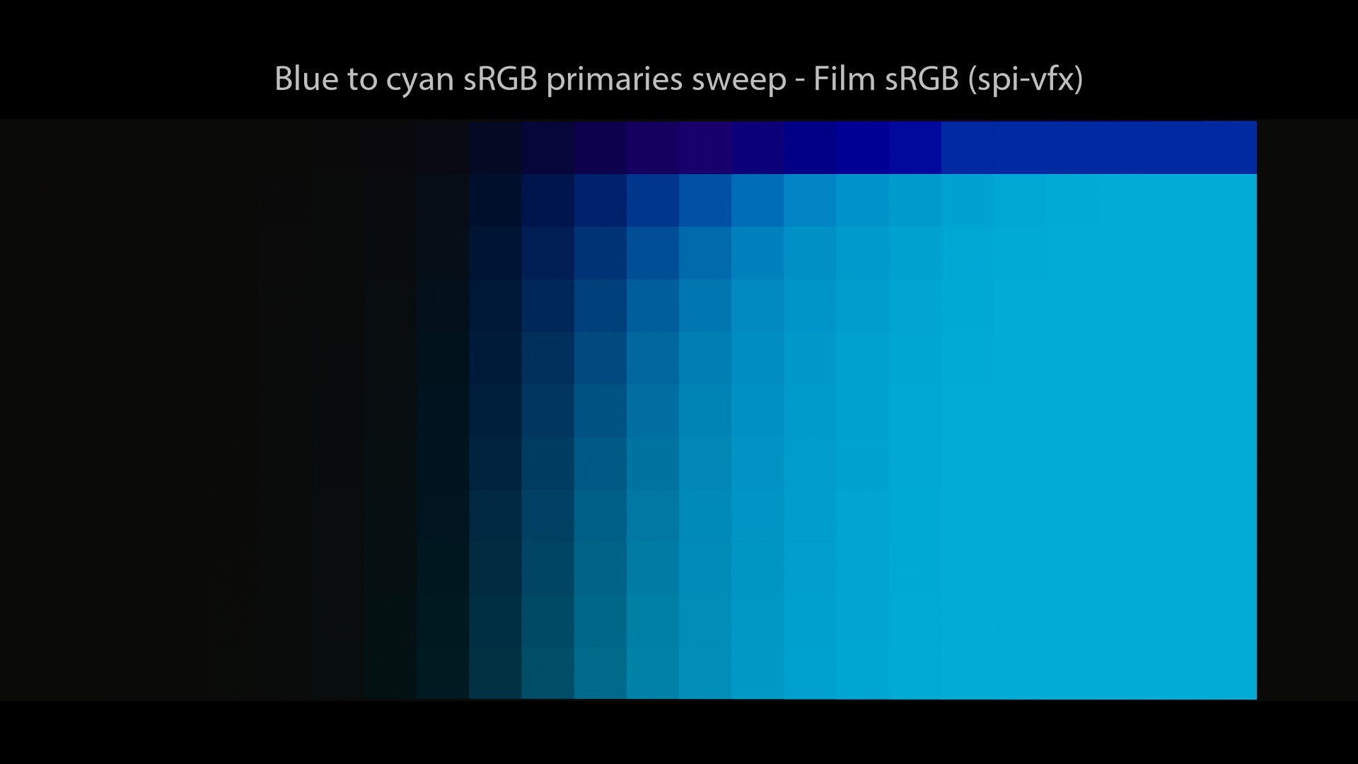
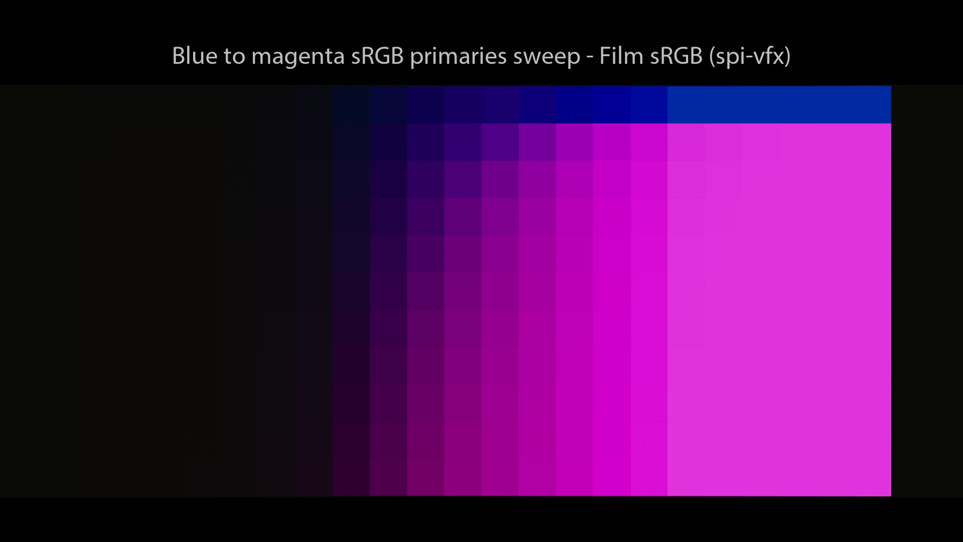
We are now going to look at a sweep of sRGB/BT.709 primaries with this config. It will show an interesting phenomenon known as the “Notorious 6“. The setup is super simple: in Nuke, I have set a range of sRGB/BT.709 primaries vertically and I increase by 1 stop for each column (horizontally). Let’s have a look!
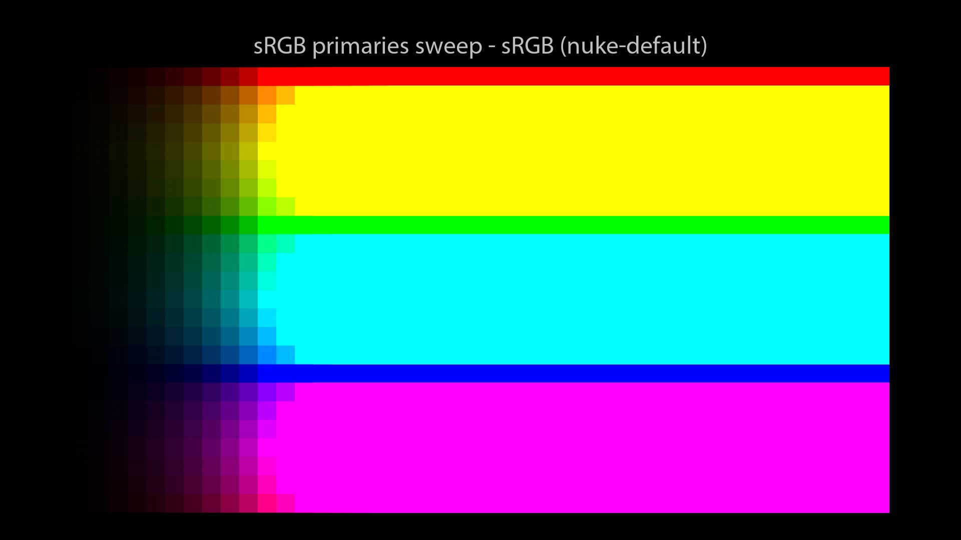

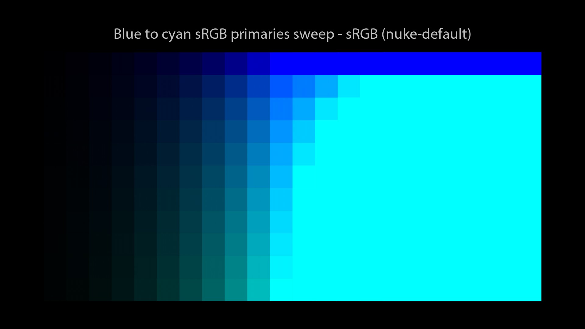
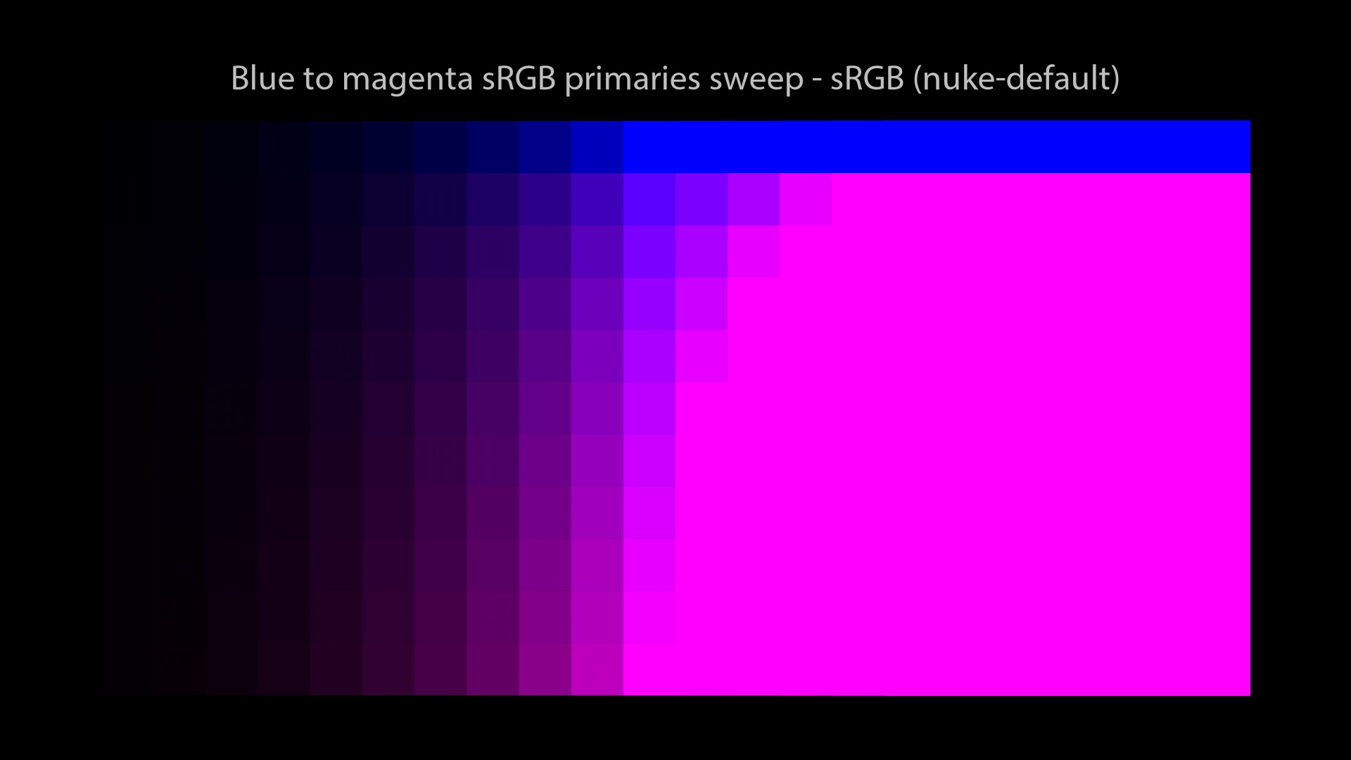
Revelation #2: With this config, no matter how many values you use, you will ALWAYS end up on these six values at display: Red, Green, Blue, Cyan, Magenta and Yellow. Pay attention to this behaviour since we will observe it with several Color Management Workflows.
A friendly reminder…
spi-anim / spi-vfx
spi-anim description
There is a very complete description of the spi-vfx config in the OCIO docs (which is like a “sister” config of spi-anim). For the record, both configs are from Sony Picture Imageworks (spi).
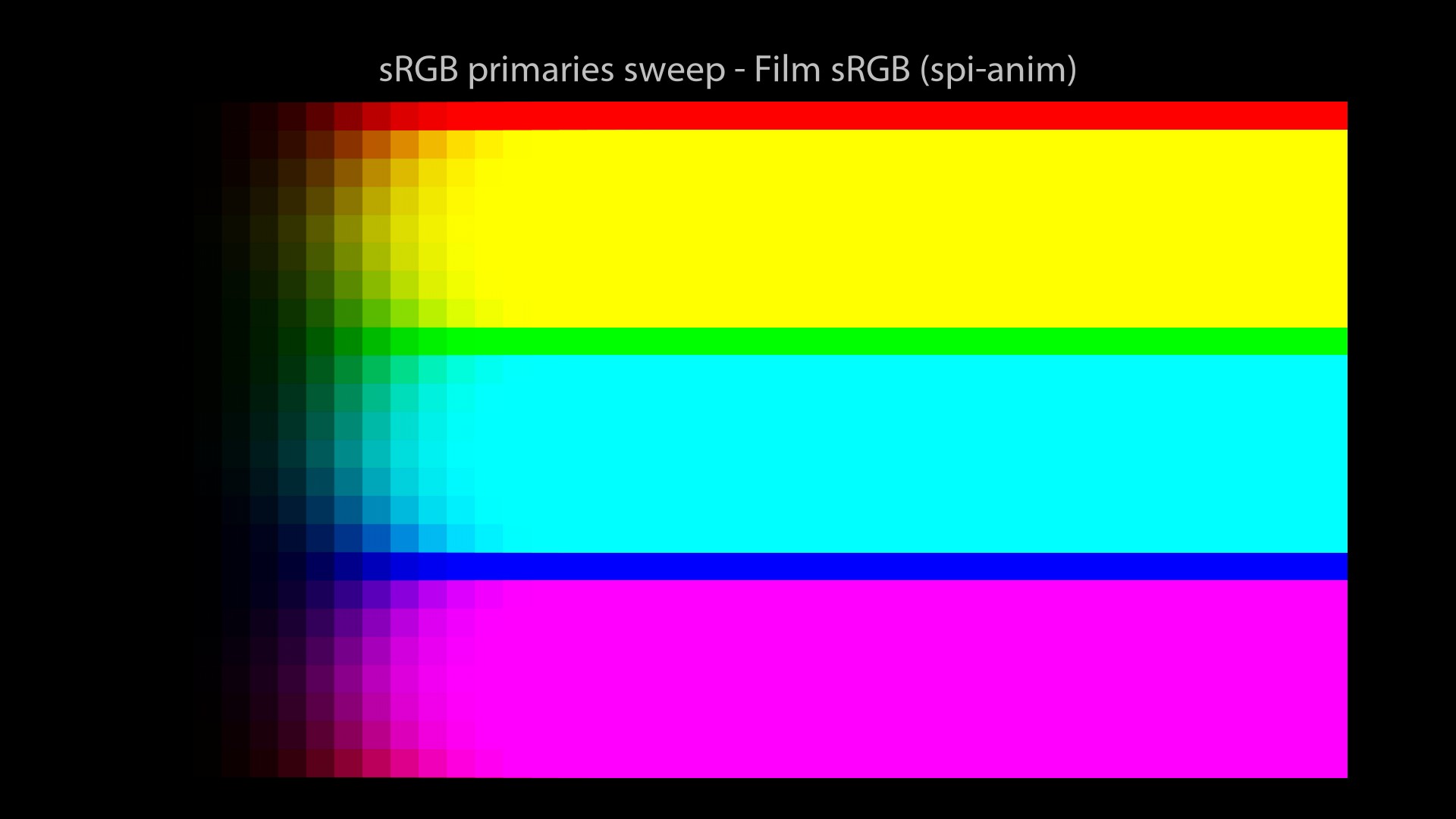
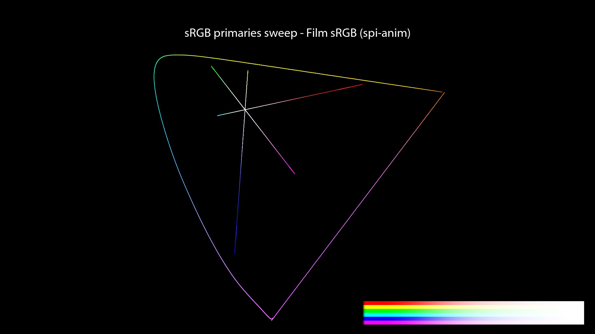
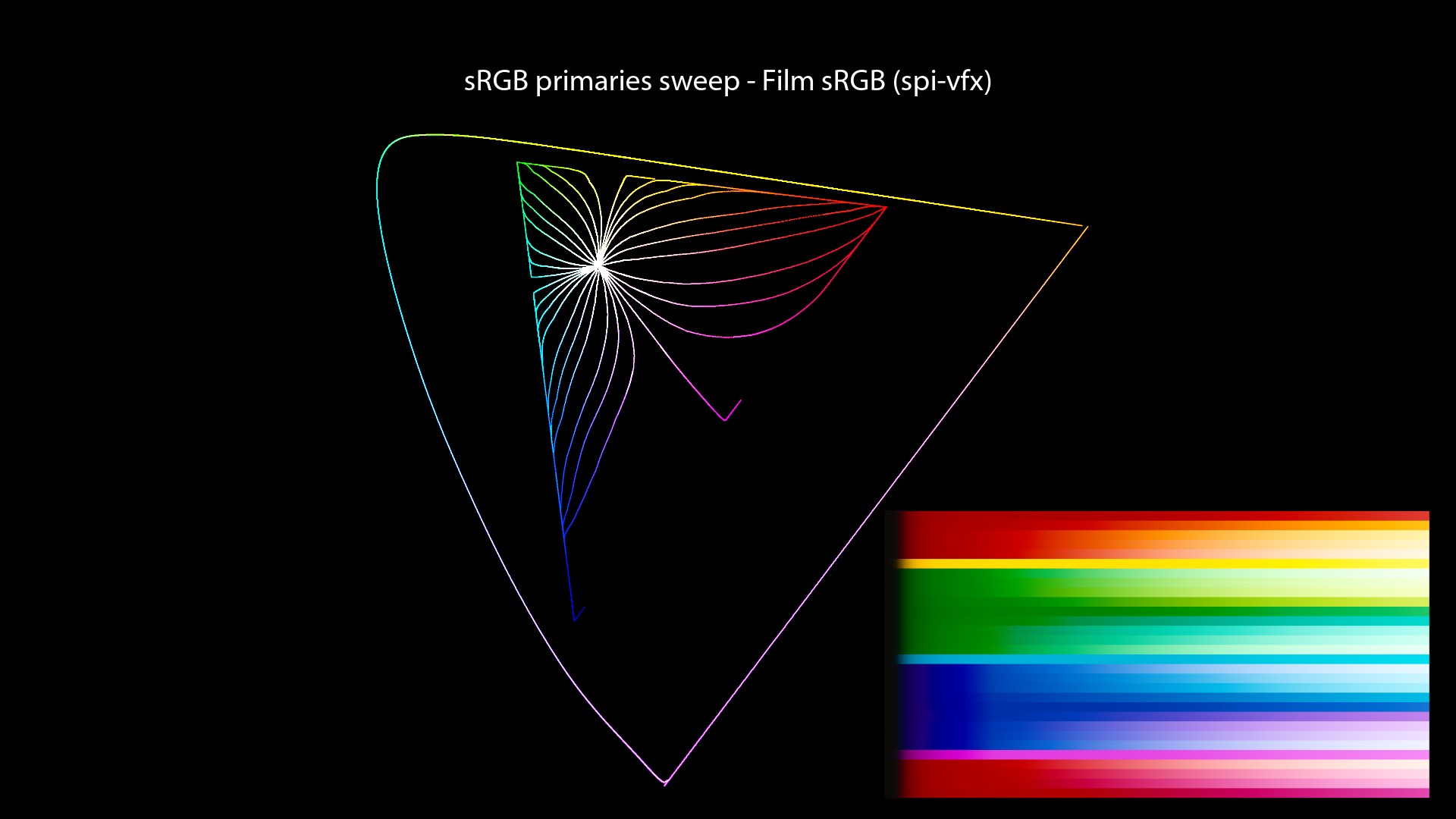
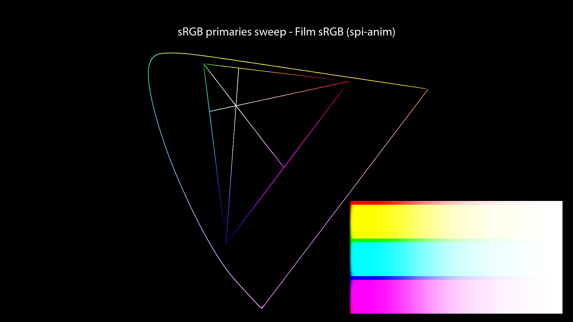
Since we focus on Display Transforms in this post, we will have a look at the “Film (sRGB)” View from the spi-anim OCIO Config. Here is a quick quote:
The spi-anim OCIO config uses a 1D LUT for its “Film” View. For sRGB Displays, the LUT file used is called “vd16.spi1d“. Here is an example from the config which I believe uses the correct OCIO terminology:
displays:
  DCIP3:
    -!<View> {name: Film, colorspace: p3dci8}
    -!<View> {name: Log, colorspace: lm10}
    -!<View> {name: Raw, colorspace: nc10}
  sRGB:
    -!<View> {name: Film, colorspace: vd16}
    -!<View> {name: Log, colorspace: lm10}
    -!<View> {name: Raw, colorspace: nc10}
We do have access to two displays: “sRGB” and “DCIP3“. And three different ways of “viewing” our renders: “Film“, “Log” and “Raw“. This is a simple and correct OCIO setup, very clear and easy to understand.
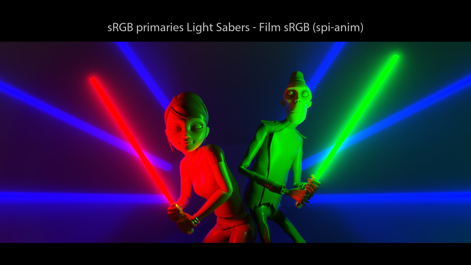
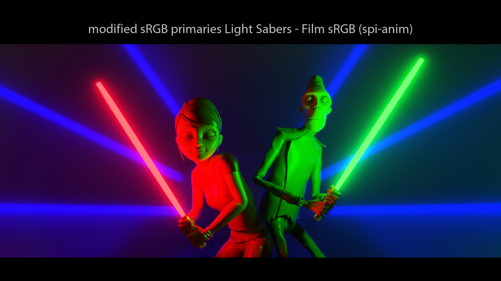
spi-anim visual examples
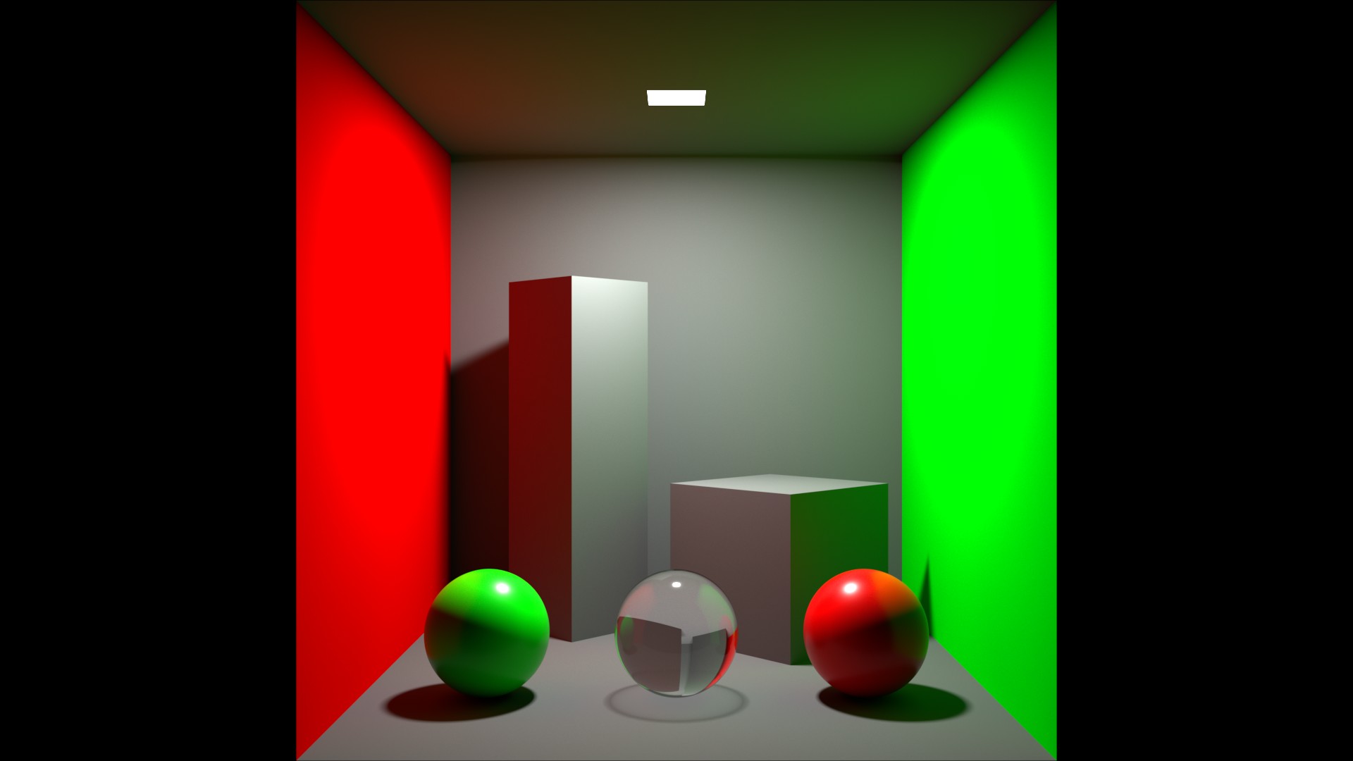
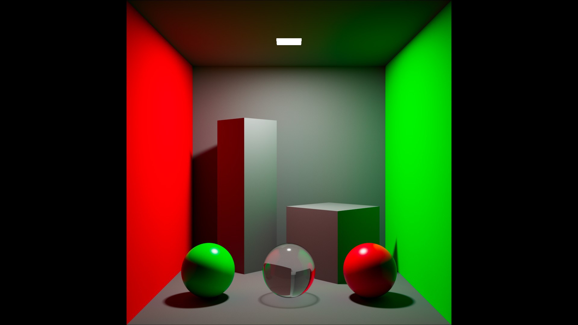
Let’s now have a look at some renders!
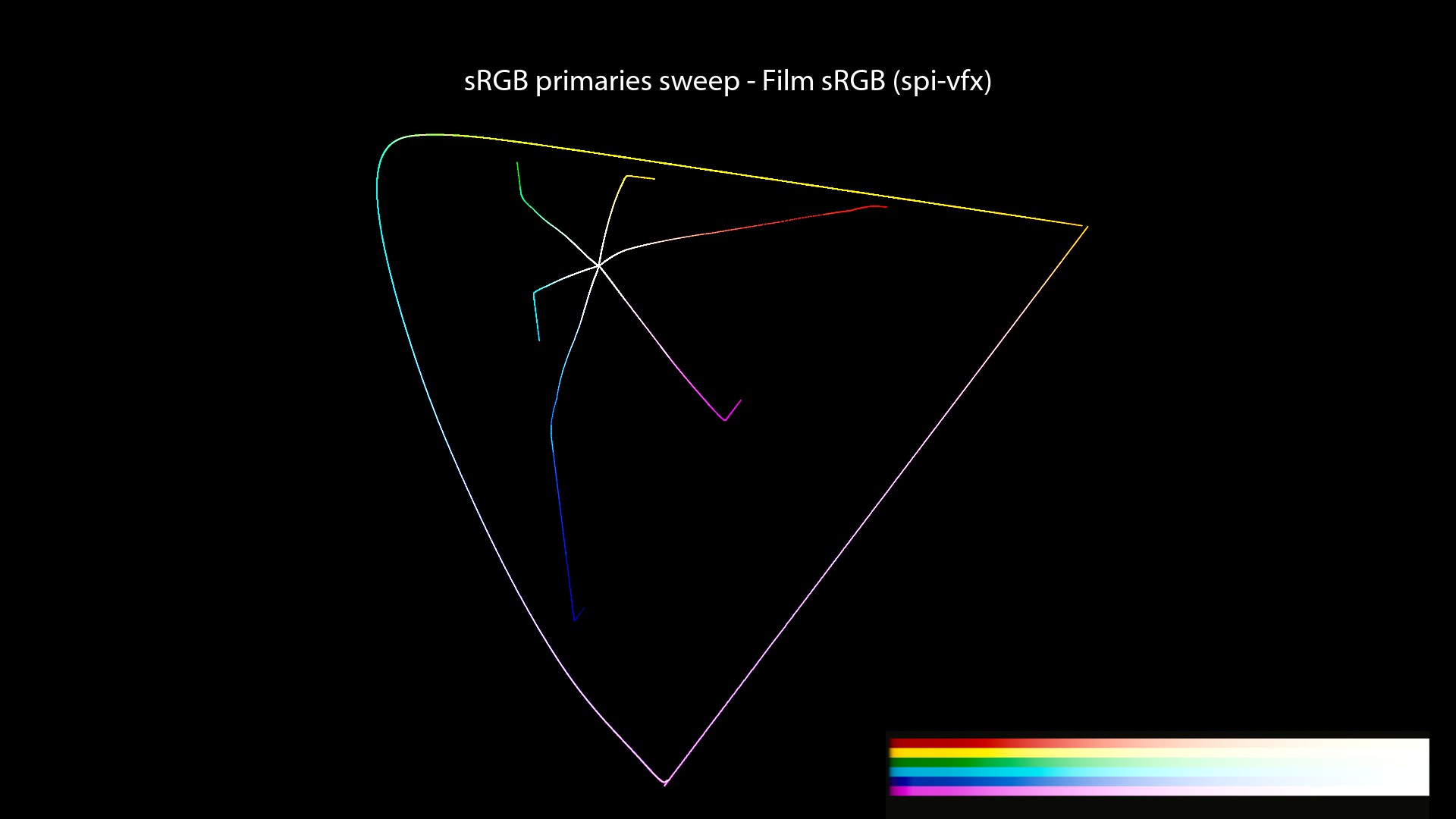
spi-vfx description
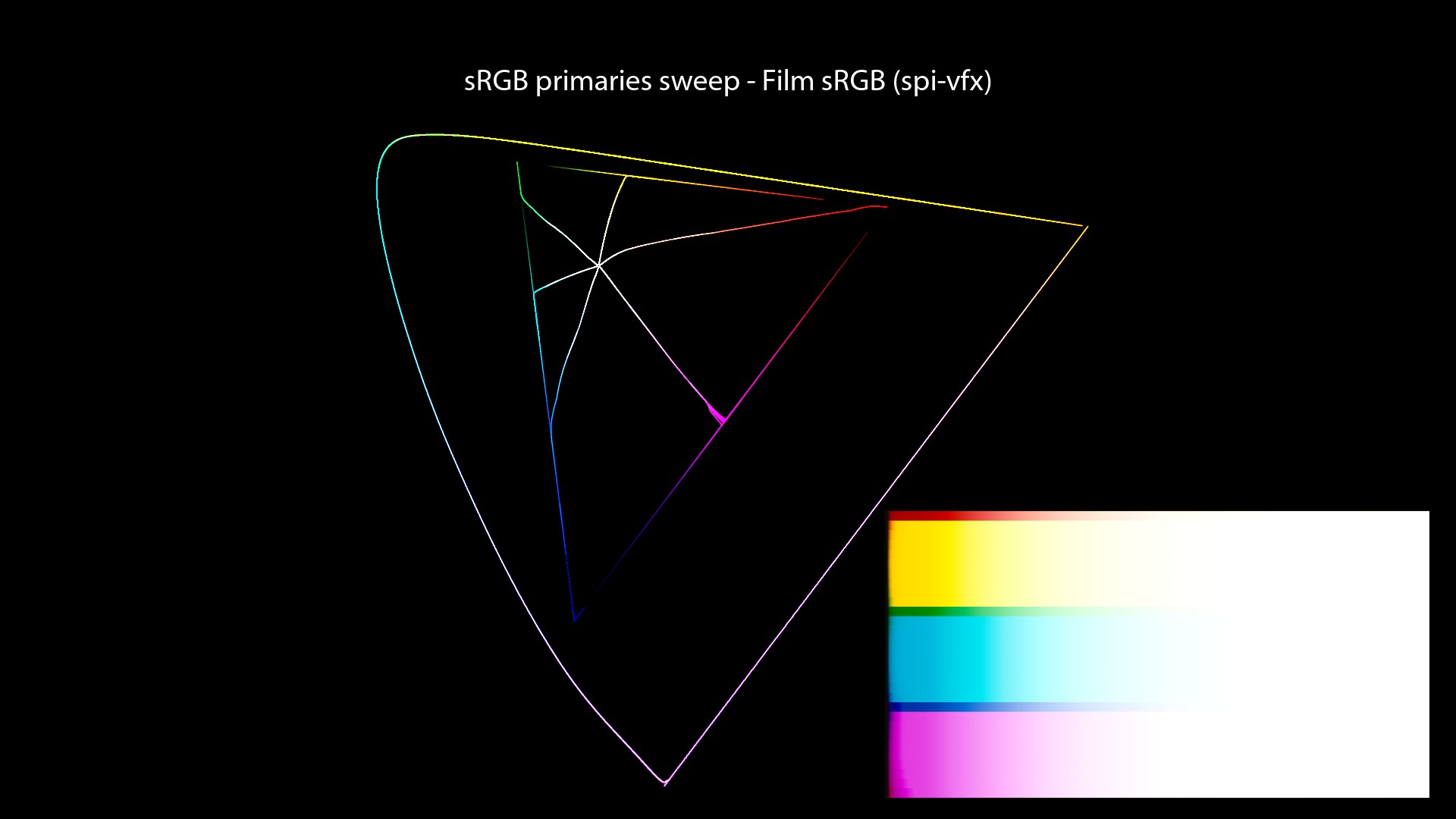
For completeness, I have also used the same renders through the “srgb8” View from the spi-vfx OCIO config. Here its description from the OCIO docs:
spi-vfx visual examples
And here are our usual renders for comparison:
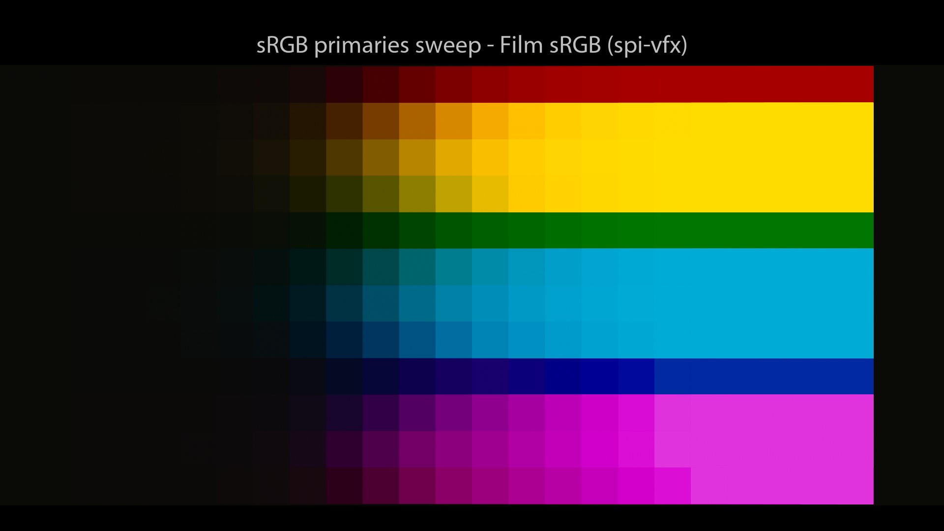
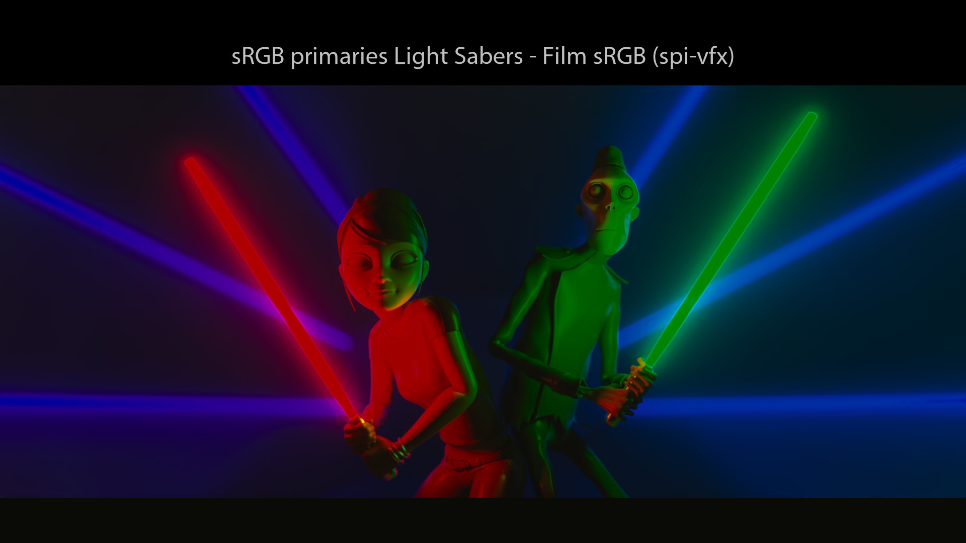
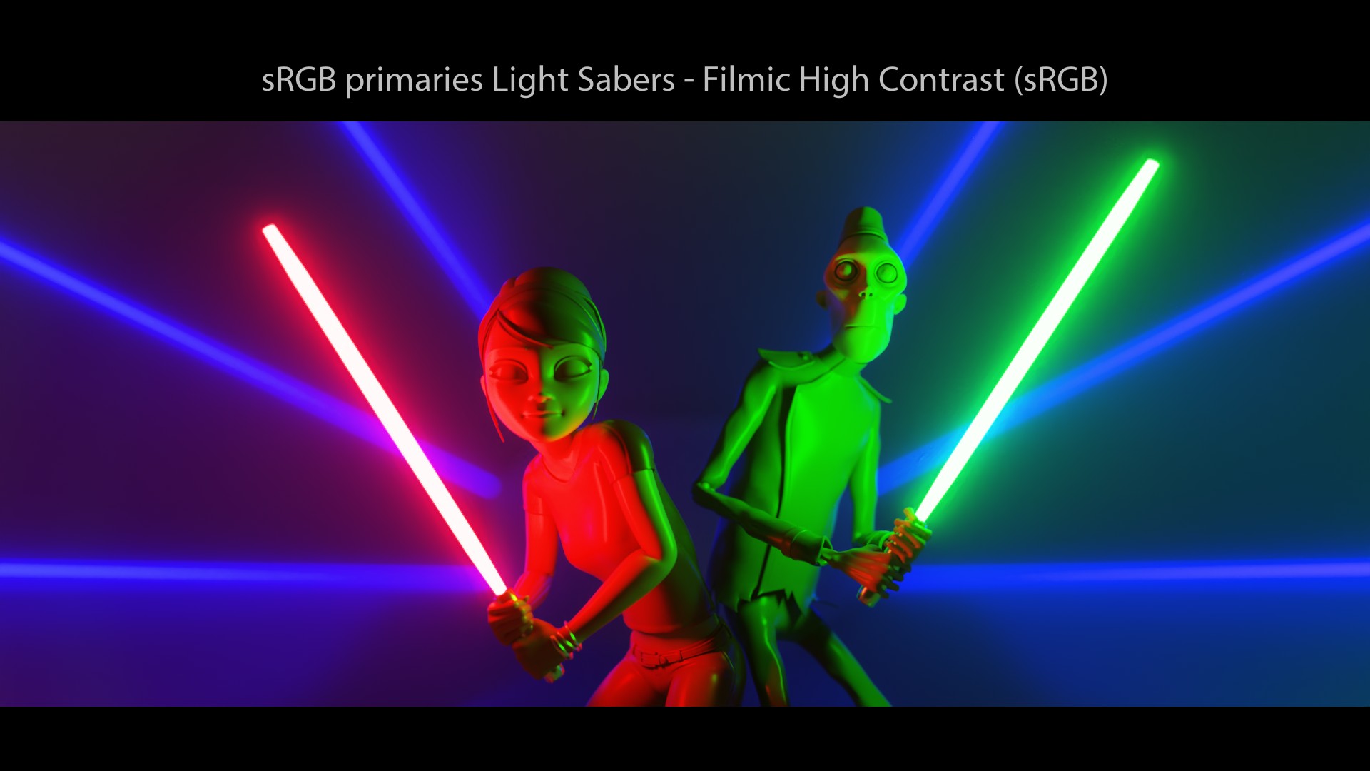
I got really really really surprised when I looked at these images… I did not expect a Display Transform called “Film” to behave like that! My two main surprises were:
- sRGB/BT.709 primaries do not go to white!
- We end up on the “Notorious 6” values, just like a simple sRGB EOTF!
Which made me arrive at this earth-shaking conclusion… Revelation #3: an s-curve has nothing to do with the “Filmic” behaviour. Certainly, it will add a nice “contrast” to the image and perform some kind of luminance lookup. But does this really qualify as “Filmic”? I’m not sure…
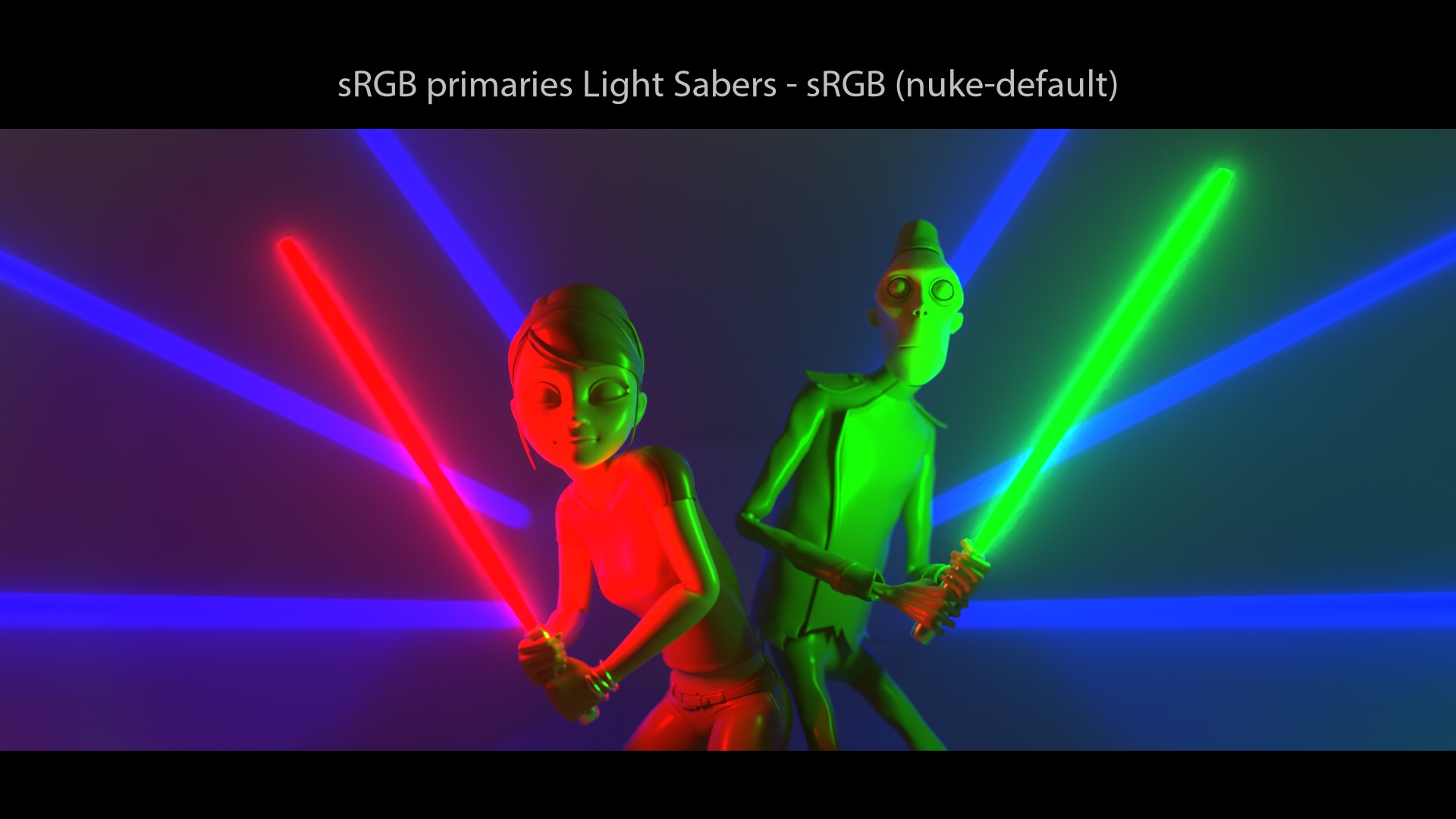
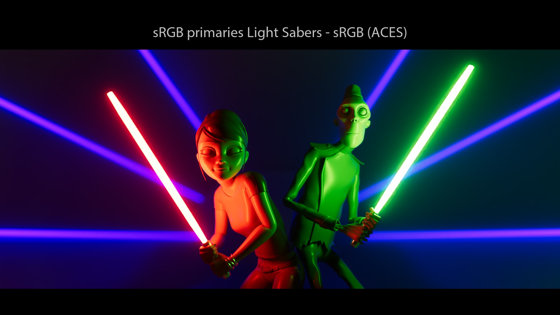
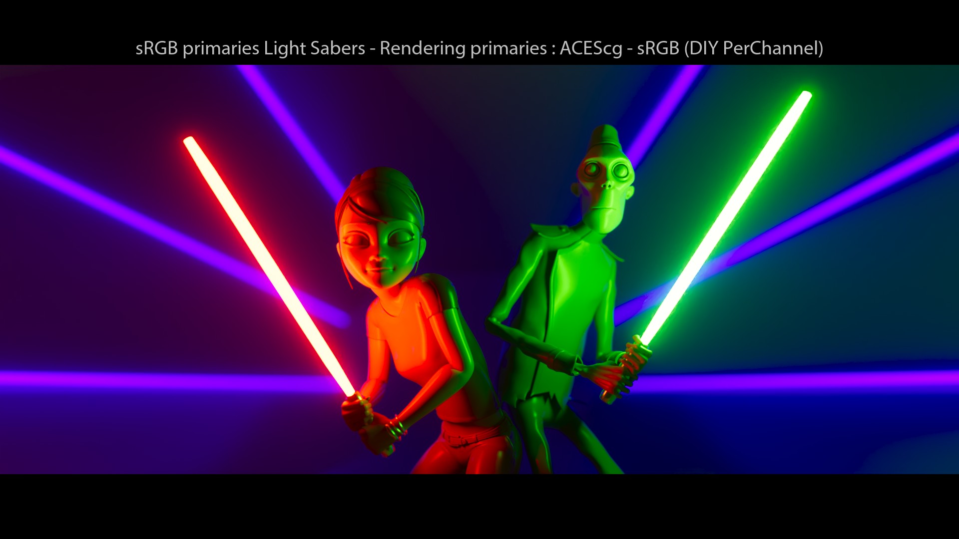
To me, “filmic tone-mapping” means that there is a visual “path-to-white” (some people calls it “desaturated highlights“). The fact that sRGB/BT.709 primaries light sabers do not go to white with a “film3d emulation LUT” looks wrong to me. It tells me that maybe something else is at play here! So, yeah, s-curves have nothing to do with the “path-to-white“.
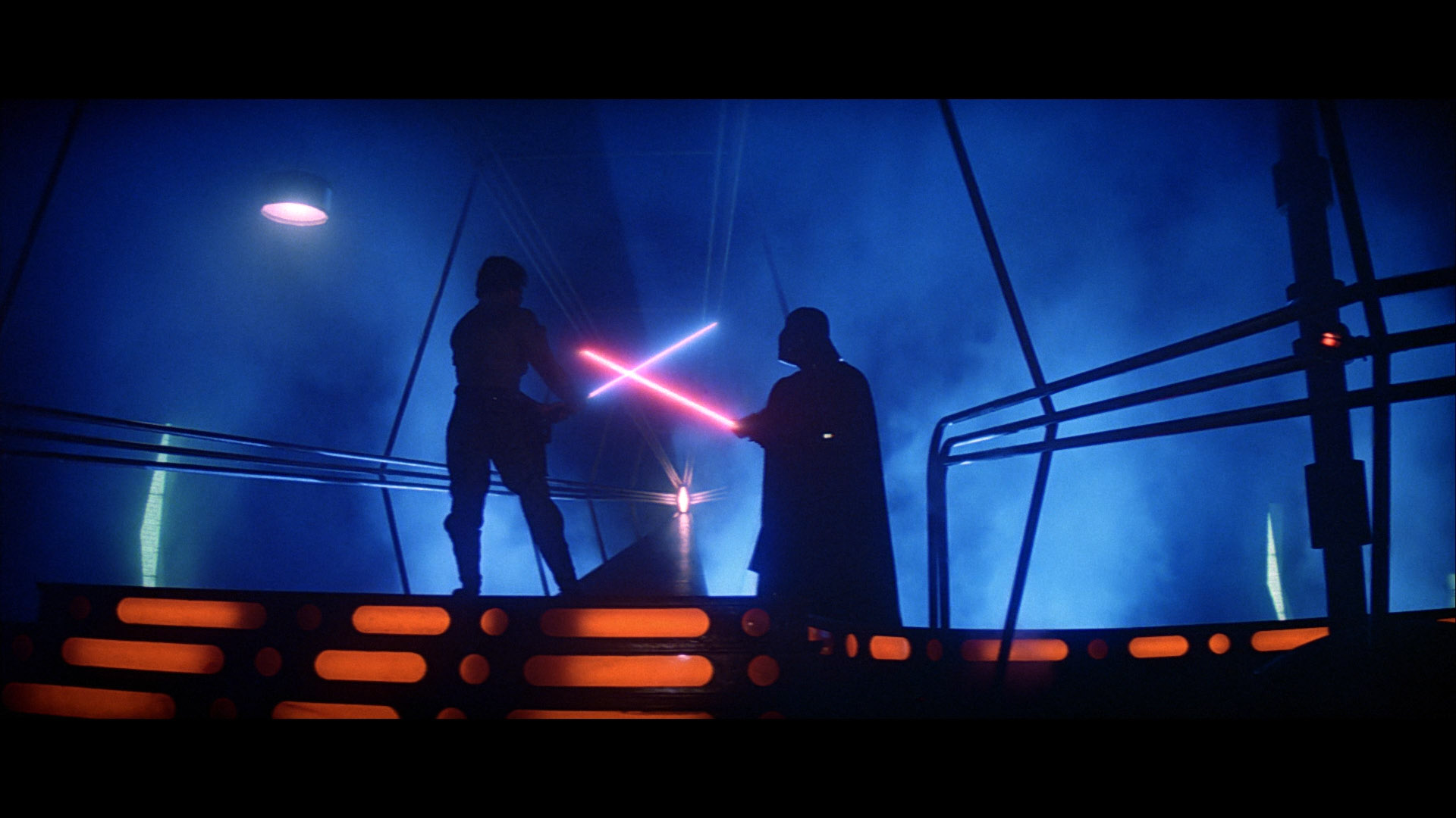
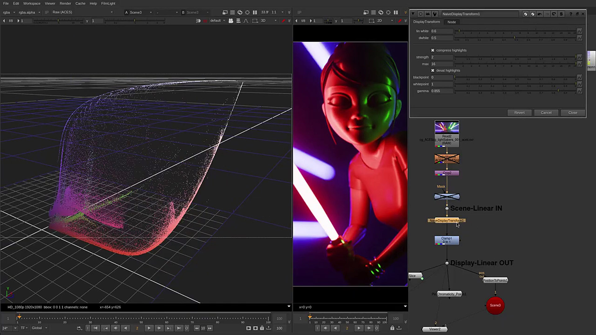
I did look for a “filmic” reference to illustrate my thoughts. And “Star Wars” was the best example I could come with. This is the “Look” I would expect for my light sabers: a white “core” with a colored glow.
Edge cases?
One may argue that my examples are edge cases: “hey Chris, stupid you, just use 0.001 instead of 0 and you’re good to go!” And this is true. It is a common and known practice to limit the range of input colors to get some kind of “path-to-white“. But doesn’t it reveal something?


To be clear, I am not even using any wide gamut rendering in these examples. But rather the lowest common denominator: sRGB/BT.709 primaries through several Display Transforms. Since lasers are BT.2020 primaries, I believe that using sRGB/BT.709 primaries is not an edge case. Not at all!
A fellow color nerd.
But, of course, we need to put things back in their context here. These two configs from Sony did a great job back in 2011, color managing amazing movies such as “Cloudy with a chance of meatballs“. Again, I’m trying to dig a bit in History to understand where my own misconceptions come from. Nothing more.
Great summary by Sean Cooper.
Filmic Blender
Filmic Blender description
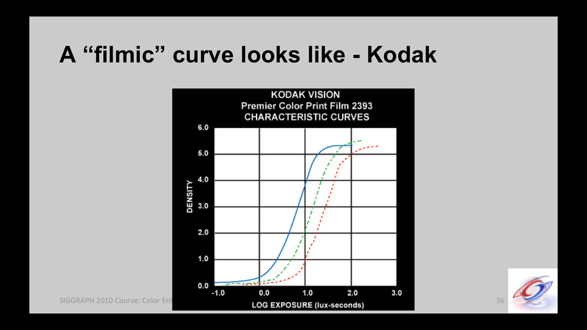
Not the easiest OCIO config to start with, but it is actually super simple. And a pretty damn good option! I highly recommend to read the README from GitHub as it describes exactly what “Filmic” does.
Great description by Troy Sobotka.
Filmic Blender Displays and Views
It should be needless to say that the “Filmic” OCIO Config will work in any DCC software that supports OCIO. Let’s have a quick look at the Displays and Views available in the config:
displays:
  sRGB:
    -!<View> {name: sRGB OETF, colorspace: sRGB OETF}
    -!<View> {name: Non-Colour Data, colorspace: Non-Colour Data}
    -!<View> {name: Linear Raw, colorspace: Linear}
    -!<View> {name: Filmic Log Encoding Base, colorspace: Filmic Log Encoding}
  BT.1886:
    -!<View> {name: BT.1886 EOTF, colorspace: BT.1886 EOTF}
    -!<View> {name: Non-Colour Data, colorspace: Non-Colour Data}
    -!<View> {name: Linear Raw, colorspace: Linear}
    -!<View> {name: Filmic Log Encoding Base, colorspace: BT.1886 Filmic Log Encoding}
  Apple Display P3:
    -!<View> {name: sRGB OETF, colorspace: AppleP3 sRGB OETF}
    -!<View> {name: Non-Colour Data, colorspace: Non-Colour Data}
    -!<View> {name: Linear Raw, colorspace: Linear}
    -!<View> {name: Filmic Log Encoding Base, colorspace: AppleP3 Filmic Log Encoding}
# VRay users should uncomment the Filmic views below as VRay doesn't permit Looks
#    -!<View> {name: Filmic Very High Contrast, colorspace: Filmic Log Encoding, look: +Very High Contrast}
#    -!<View> {name: Filmic High Contrast, colorspace: Filmic Log Encoding, look: +High Contrast}
#    -!<View> {name: Filmic Medium High Contrast, colorspace: Filmic Log Encoding, look: +Medium High Contrast}
#    -!<View> {name: Filmic Very Low Contrast, colorspace: Filmic Log Encoding, look: +Very Low Contrast}
#    -!<View> {name: Filmic Medium Low Contrast, colorspace: Filmic Log Encoding, look: +Medium Low Contrast}
#    -!<View> {name: Filmic Low Contrast, colorspace: Filmic Log Encoding, look: +Low Contrast}
#    -!<View> {name: Filmic Base Contrast, colorspace: Filmic Log Encoding, look: +Base Contrast}
#    -!<View> {name: Filmic False Colour, colorspace: Filmic Log Encoding, look: +False Colour}
#    -!<View> {name: Debug, colorspace: Debug}
Just like the spi-anim/vfx OCIO configs, the Displays and Views are setup correctly, according to the OCIO terminology. But there is one more element available: Looks. And it can be unsettling if you’re not used to them. Let’s check the documentation again:
But there is a tiny issue here. Only a couple of DCC softwares permit interactive “Look Overrides”: Blender and Renderman 24. So most users modify the OCIO config to combine the “Look” with the “View” as a workaround.
OCIO Viewing experience and Roles
When this article was published, the following revelation has caused a bit of waves. So I have updated it to be as accurate as I could.
Proper explanation by Zach Lewis.
Revelation #4: OCIO is NOT implemented the exact same way in all softwares. And yes, that’s a big one! With OCIOv2, there is an effort trying to normalize it though. But if you look at the “color_picking” role for instance, it does not have the same behaviour between Maya and any other DCC softwares!
OCIO implementation and UX
I will repeat for clarity: yes, OCIO provides a consistent viewing experience accross DCCs. But it is also worth noting that:
Rv is a clear example of this behaviour. Thanks Zach!
So, I reckon I entangled a couple of things in the term “implementation”:
- Most DCC softwares do not permit interactive “Look Overrides“, like a dropdown menu that would let you easily choose them from a list. This more an UX thing.
- DCCs may use different OCIO roles, or the same roles for different purposes (“reference” and “color_picking” are ambiguous). I’d personnally say that this is an implementation thing.
- With OCIOv1, there are some visual differences between the CPU and the GPU processor that may cause you a little bit of headache. This is now fixed with OCIOv2.
Editing an OCIO Config
So if you want to use “Looks” in your OCIO Config, there is an easy way to do that. Most users have this workaround, which looks like this:
displays:
  sRGB:
    -!<View> {name: sRGB OETF, colorspace: sRGB OETF}
    -!<View> {name: Non-Colour Data, colorspace: Non-Colour Data}
    -!<View> {name: Linear Raw, colorspace: Linear}
    -!<View> {name: Filmic High Contrast, colorspace: Filmic Log Encoding, look: High Contrast}

active_displays: [sRGB]
active_views: [Filmic High Contrast, Non-Colour Data]
As you can see, it is pretty simple to modify an OCIO config based on your needs. Just open it in notepad and you can directly edit it! And that’s our Revelation #5: it is recommended to edit the standard OCIO configs. So don’t be afraid to dive in!
This is very well explained in this thread:
Nick Shaw and Thomas Mansencal for the win!
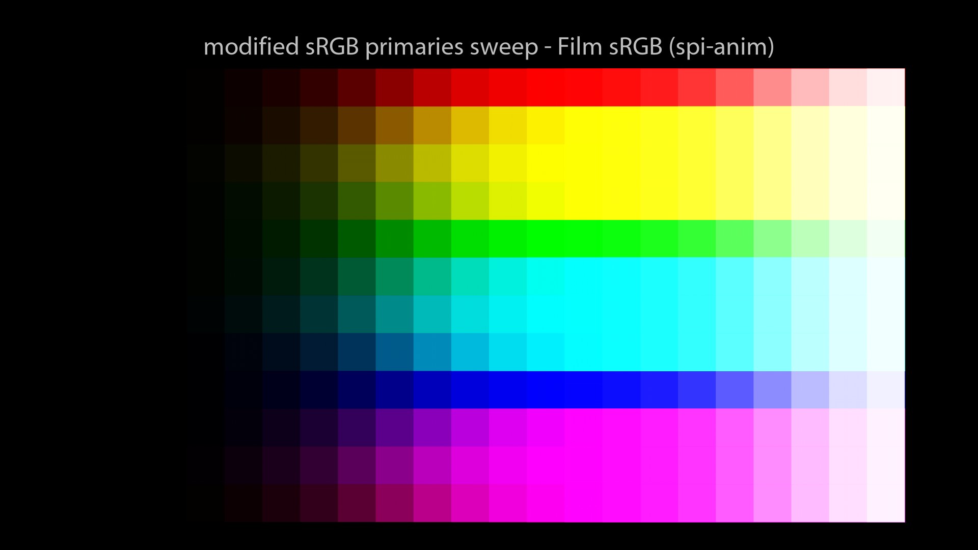
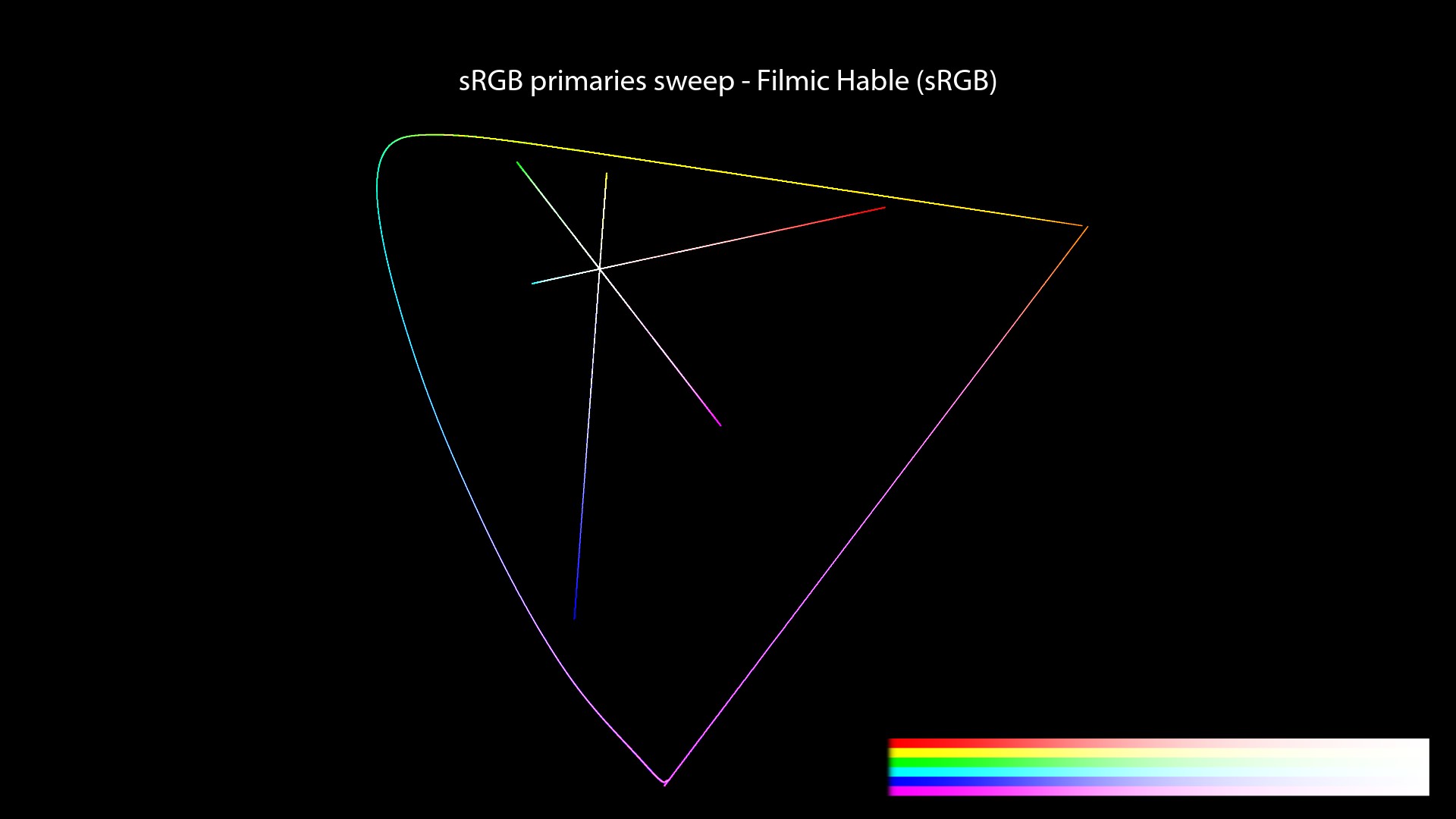
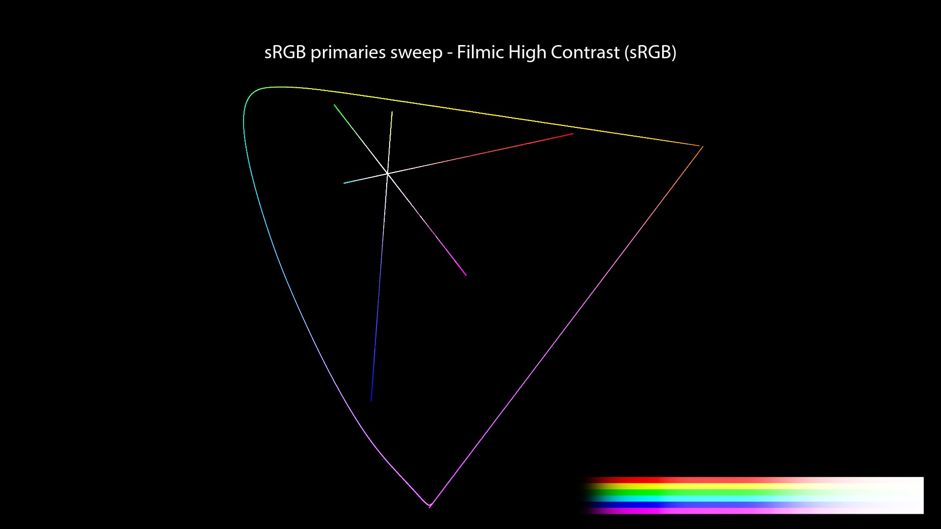
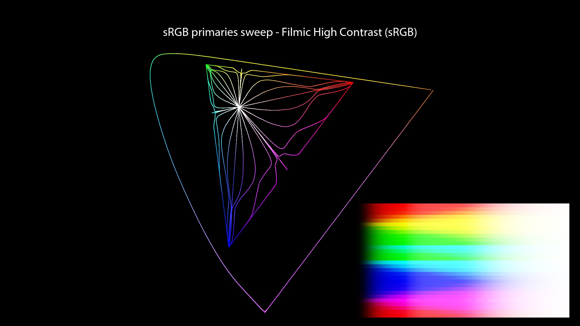
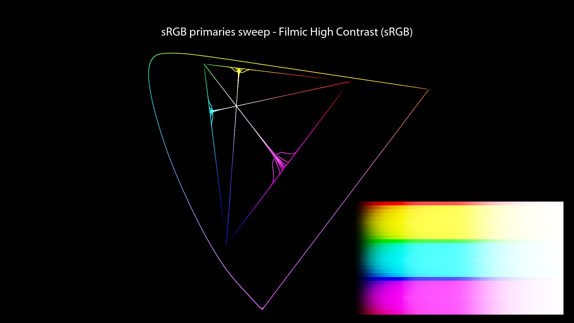
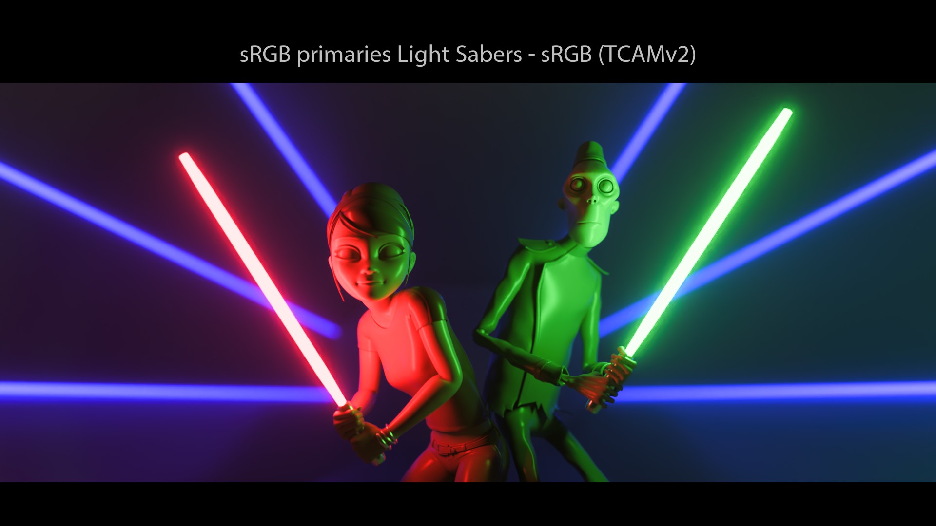
Filmic Blender visual examples
Let’s have a look at our images with Filmic!
140_misconceptions_0220_srgb_sweep_FHD
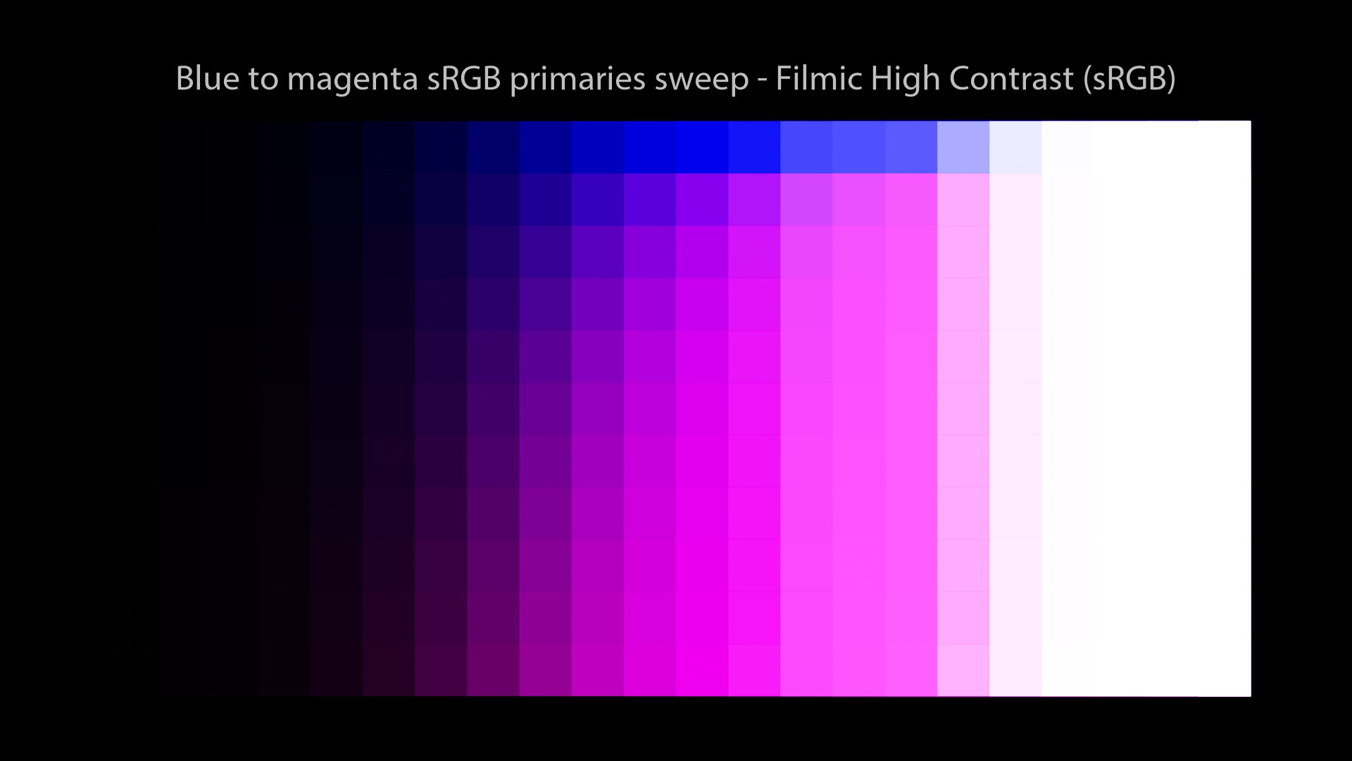
A few observations:
- Light sabers are white! Yay!
- We still end up on the “Notorious 6”! Noooo! Why?
If you ever wondered what animation feature film has been color managed by Troy’s Filmic, here is the trailer of this great movie (I loved it!):
Let’s keep on going with our investigations and see if we can find more answers to our questions!
ACES
ACES Displays and Views
I have already written a complete chapter about ACES… So I’ll try to come up with some new information here.
First of all, if we have a look at the ACES 1.2 OCIO Config, you may notice something weird. Revelation #6: Displays and Views have been inverted/swapped in the ACES OCIOv1 configs. This has caused me a bit of headache when I tried to learn about OCIO. Here is a sample from the current config:
displays:
  ACES:
    -!<View> {name: sRGB, colorspace: Output - sRGB}
    -!<View> {name: DCDM, colorspace: Output - DCDM}
    -!<View> {name: DCDM P3D60 Limited, colorspace: Output - DCDM (P3D60 Limited)}
    -!<View> {name: DCDM P3D65 Limited, colorspace: Output - DCDM (P3D65 Limited)}
    -!<View> {name: P3-D60, colorspace: Output - P3-D60}
    -!<View> {name: P3-D65 ST2084 1000 nits, colorspace: Output - P3-D65 ST2084 (1000 nits)}
    -!<View> {name: P3-D65 ST2084 2000 nits, colorspace: Output - P3-D65 ST2084 (2000 nits)}
    -!<View> {name: P3-D65 ST2084 4000 nits, colorspace: Output - P3-D65 ST2084 (4000 nits)}
    -!<View> {name: P3-DCI D60 simulation, colorspace: Output - P3-DCI (D60 simulation)}
    -!<View> {name: P3-DCI D65 simulation, colorspace: Output - P3-DCI (D65 simulation)}
    -!<View> {name: P3D65, colorspace: Output - P3D65}
    -!<View> {name: P3D65 D60 simulation, colorspace: Output - P3D65 (D60 simulation)}
    -!<View> {name: P3D65 Rec.709 Limited, colorspace: Output - P3D65 (Rec.709 Limited)}
    -!<View> {name: P3D65 ST2084 108 nits, colorspace: Output - P3D65 ST2084 (108 nits)}
    -!<View> {name: Rec.2020, colorspace: Output - Rec.2020}
    -!<View> {name: Rec.2020 P3D65 Limited, colorspace: Output - Rec.2020 (P3D65 Limited)}
    -!<View> {name: Rec.2020 Rec.709 Limited, colorspace: Output - Rec.2020 (Rec.709 Limited)}
    -!<View> {name: Rec.2020 HLG 1000 nits, colorspace: Output - Rec.2020 HLG (1000 nits)}
    -!<View> {name: Rec.2020 ST2084 1000 nits, colorspace: Output - Rec.2020 ST2084 (1000 nits)}
    -!<View> {name: Rec.2020 ST2084 2000 nits, colorspace: Output - Rec.2020 ST2084 (2000 nits)}
    -!<View> {name: Rec.2020 ST2084 4000 nits, colorspace: Output - Rec.2020 ST2084 (4000 nits)}
    -!<View> {name: Rec.709, colorspace: Output - Rec.709}
    -!<View> {name: Rec.709 D60 sim., colorspace: Output - Rec.709 (D60 sim.)}
    -!<View> {name: sRGB D60 sim., colorspace: Output - sRGB (D60 sim.)}
    -!<View> {name: Raw, colorspace: Utility - Raw}
    -!<View> {name: Log, colorspace: Input - ADX - ADX10}
In the above example, the Display is ACES which is incorrect since we do not buy ACES monitors… And the Views are sRGB, Rec.709 or “P3D65” which are basically “monitors”. It should be the other way around!
Thanks Thomas!
Good news is that it is super easy to fix it! And if you don’t want very long “Display” menus in Nuke or Maya, you may simply modify the OCIO config file. Let’s have a look! For instance, these are the “active_displays” and “active_views” in the default ACES 1.2 OCIO Config:
active_displays: [ACES]
active_views: [sRGB, DCDM, DCDM P3D60 Limited, DCDM P3D65 Limited, P3-D60, P3-D65 ST2084 1000 nits, P3-D65 ST2084 2000 nits, P3-D65 ST2084 4000 nits, P3-DCI D60 simulation, P3-DCI D65 simulation, P3D65, P3D65 D60 simulation, P3D65 Rec.709 Limited, P3D65 ST2084 108 nits, Rec.2020, Rec.2020 P3D65 Limited, Rec.2020 Rec.709 Limited, Rec.2020 HLG 1000 nits, Rec.2020 ST2084 1000 nits, Rec.2020 ST2084 2000 nits, Rec.2020 ST2084 4000 nits, Rec.709, Rec.709 D60 sim., sRGB D60 sim., Raw, Log]
So, if we want to shorten the long list of options and fix the “Display/View” menu, you may simply do this:
displays:
  sRGB:
    -!<View> {name: ACES, colorspace: out_srgb}
    -!<View> {name: Raw, colorspace: raw}
    -!<View> {name: Log, colorspace: acescct}

active_displays: [sRGB]
active_views: [ACES, Raw, Log]
And in case you didn’t know, there is an ACES 1.1 OCIOv1 CG config (which is very light, like less than 48 MB) available at the CAVE ACADEMY website. It can be used for full CG stuff for example.
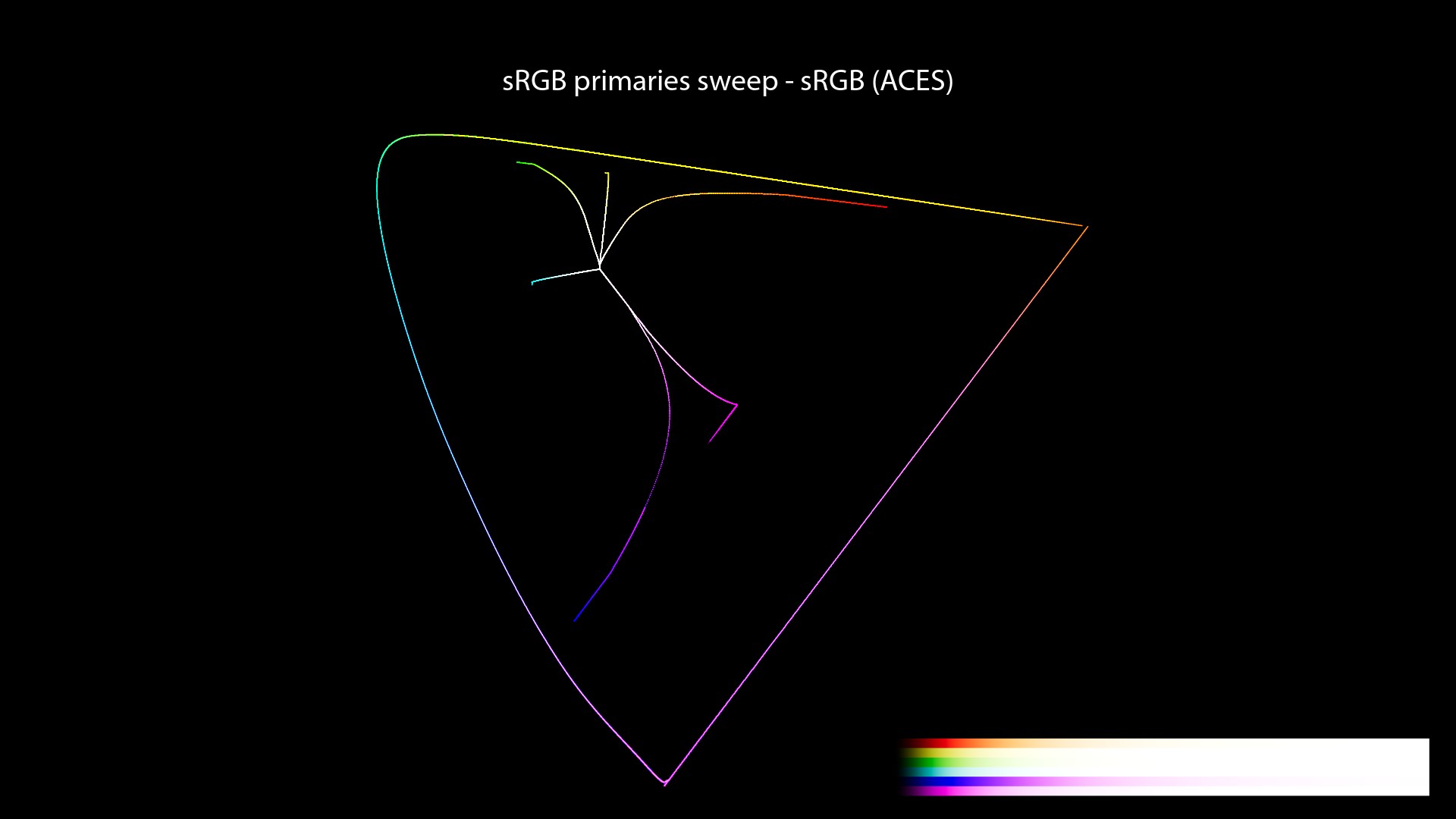
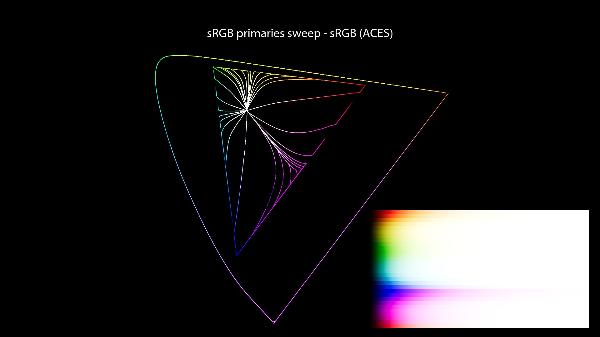
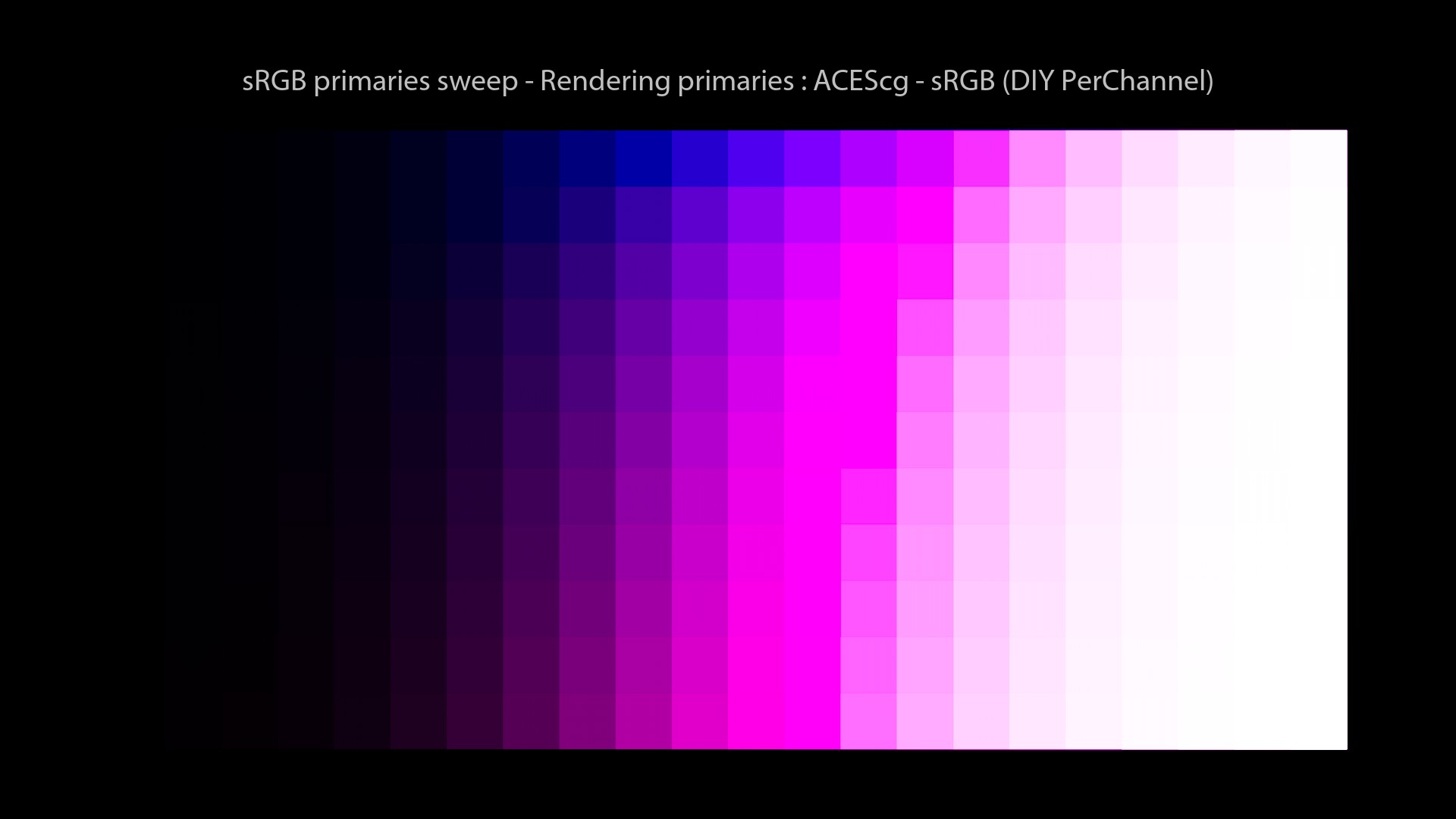
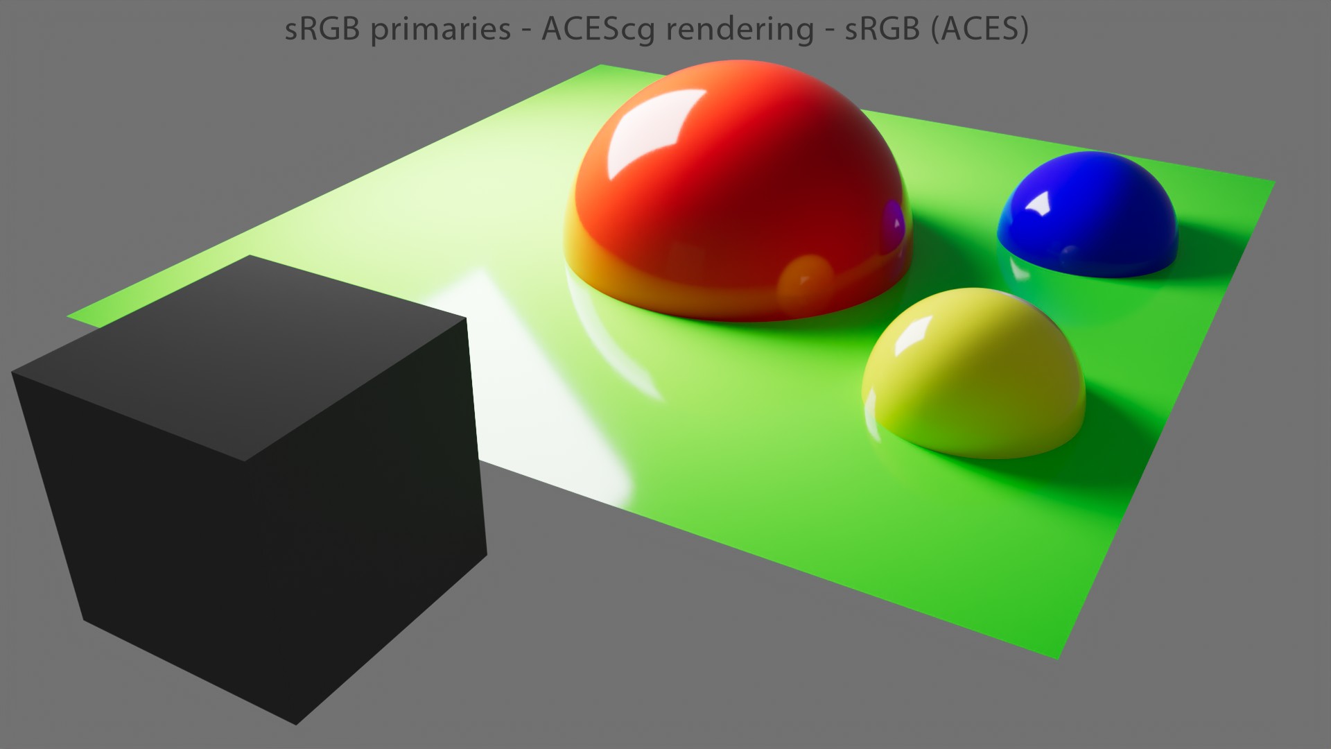
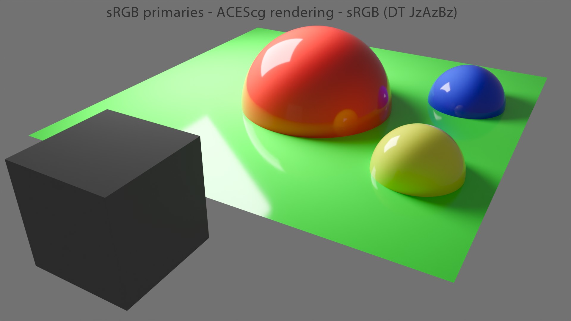
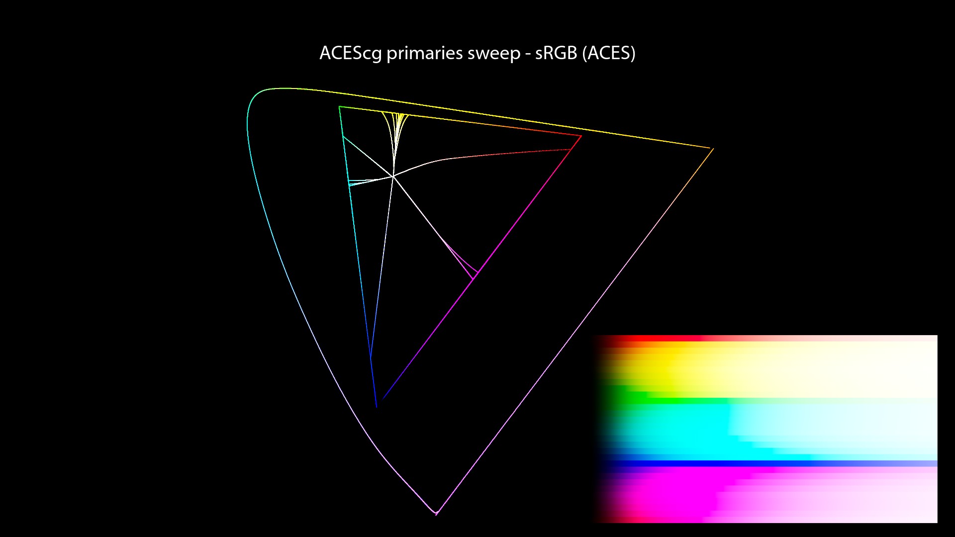
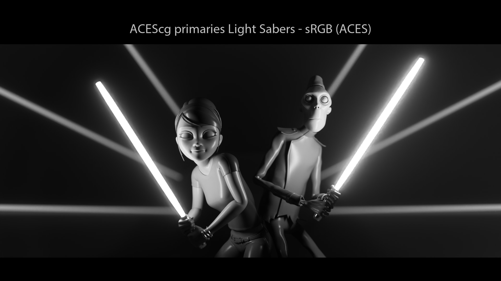
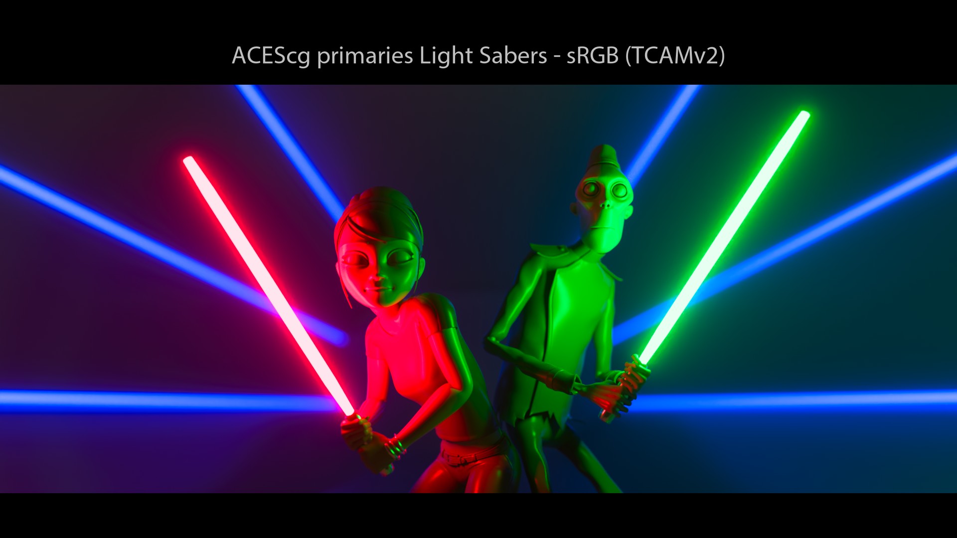
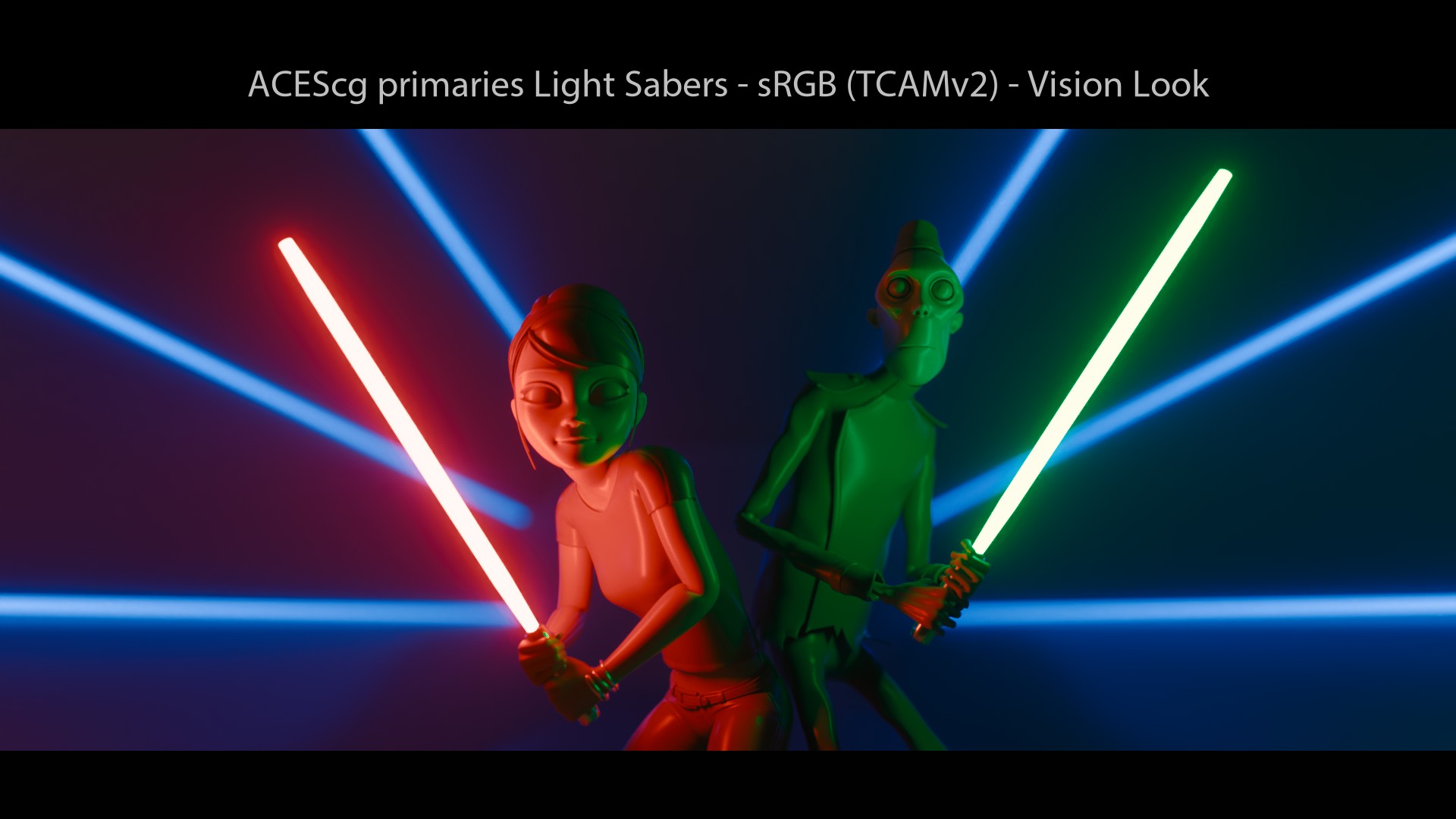
ACES visual examples
Let’s have a look at our images now!

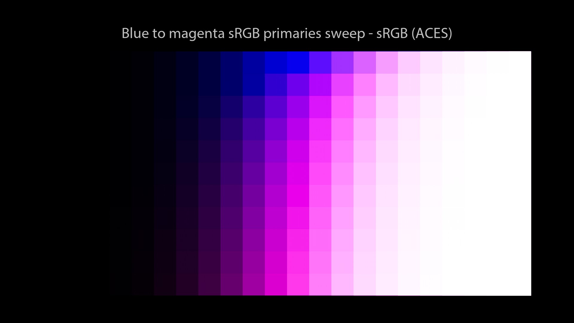
Hum, what’s going on? Two interesting things to observe:
- Light sabers are white! But the red light saber goes orange, the green one goes yellow and the blue neons go magenta… These are called Hue Skews/Shifts. It’s basically a “Look“.
- We still observe hue paths going towards the “Notorious 6”! Noooo! Why?
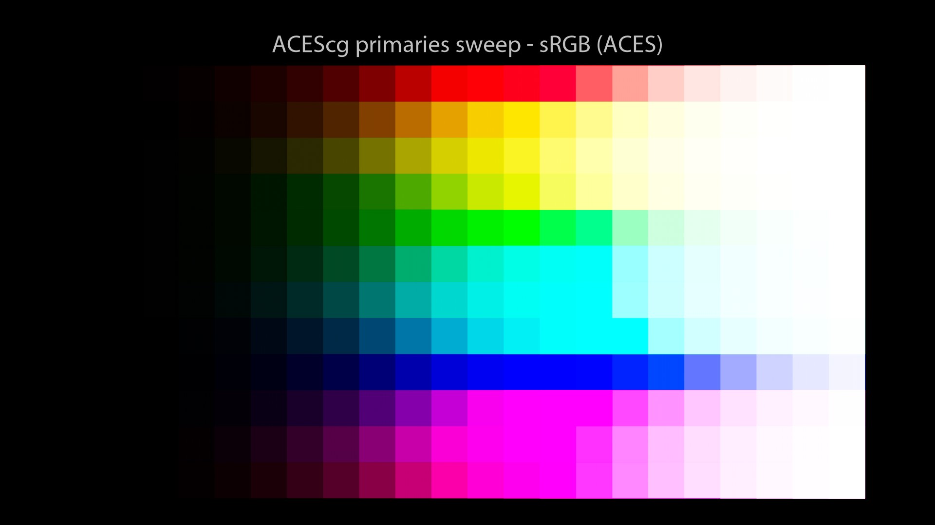
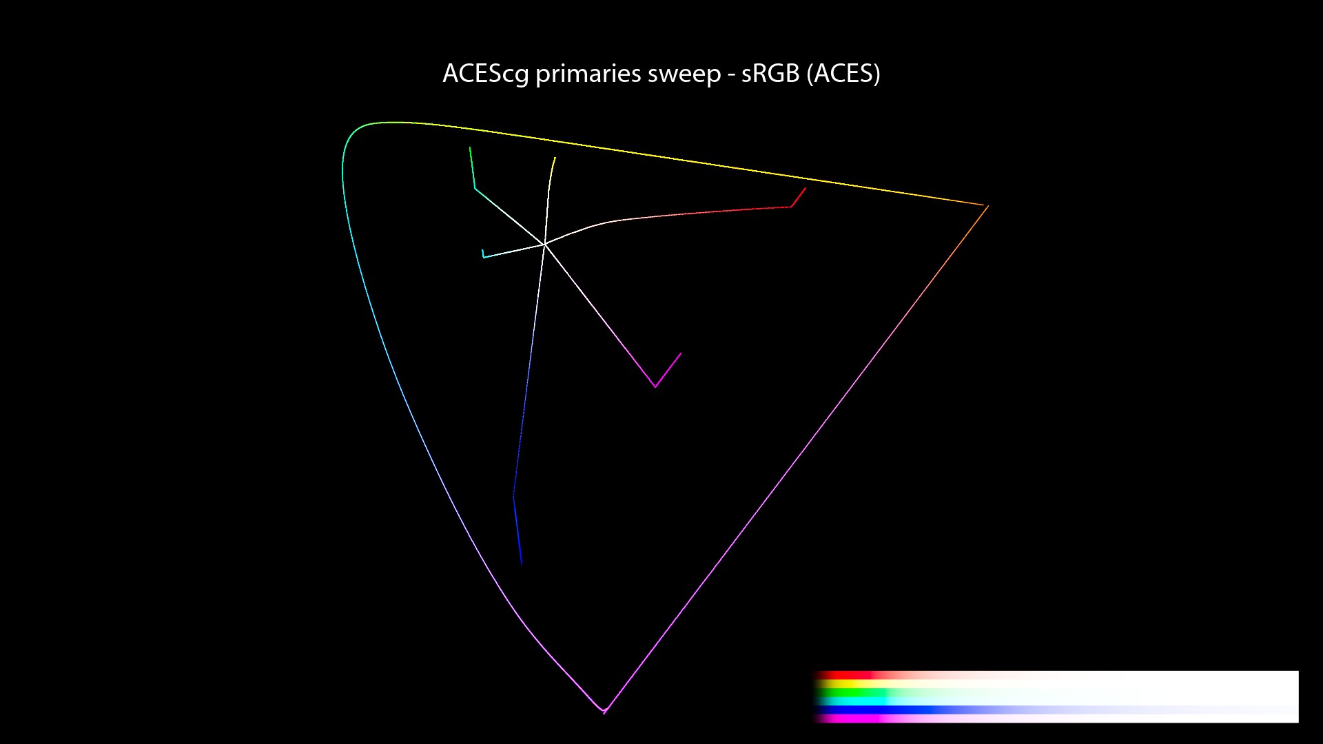
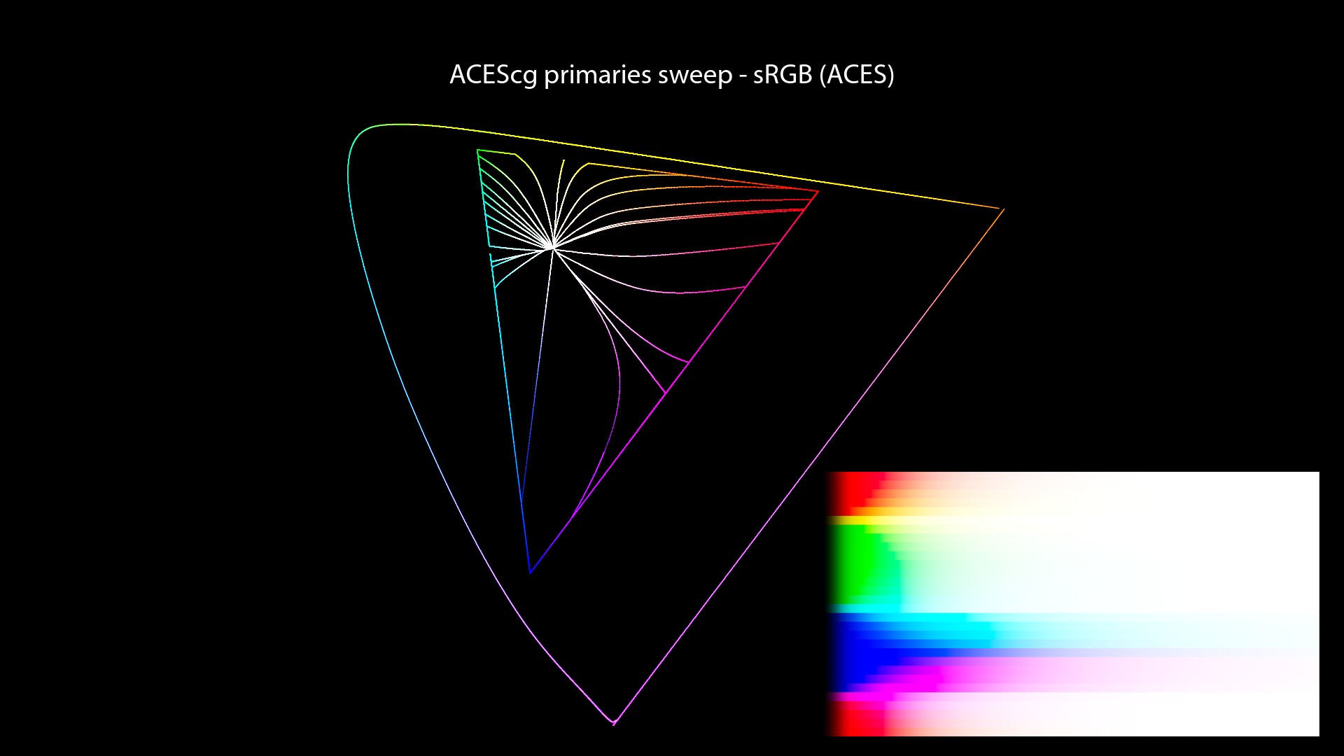
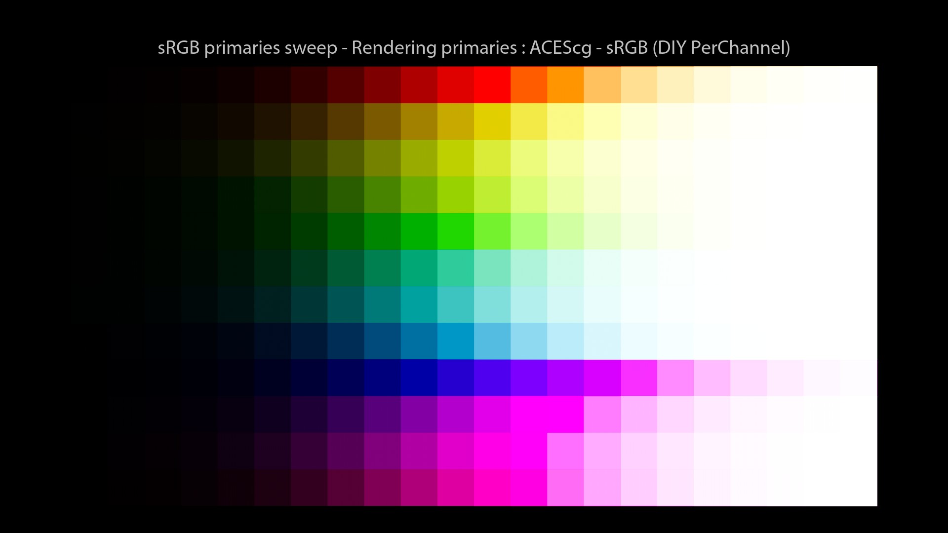
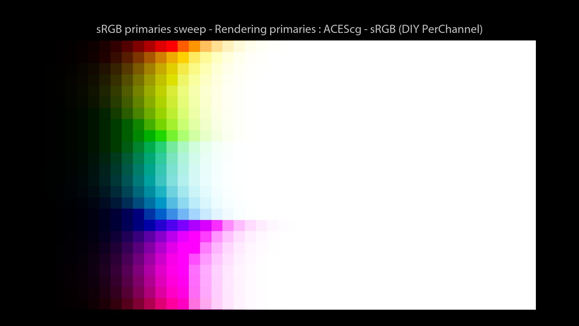
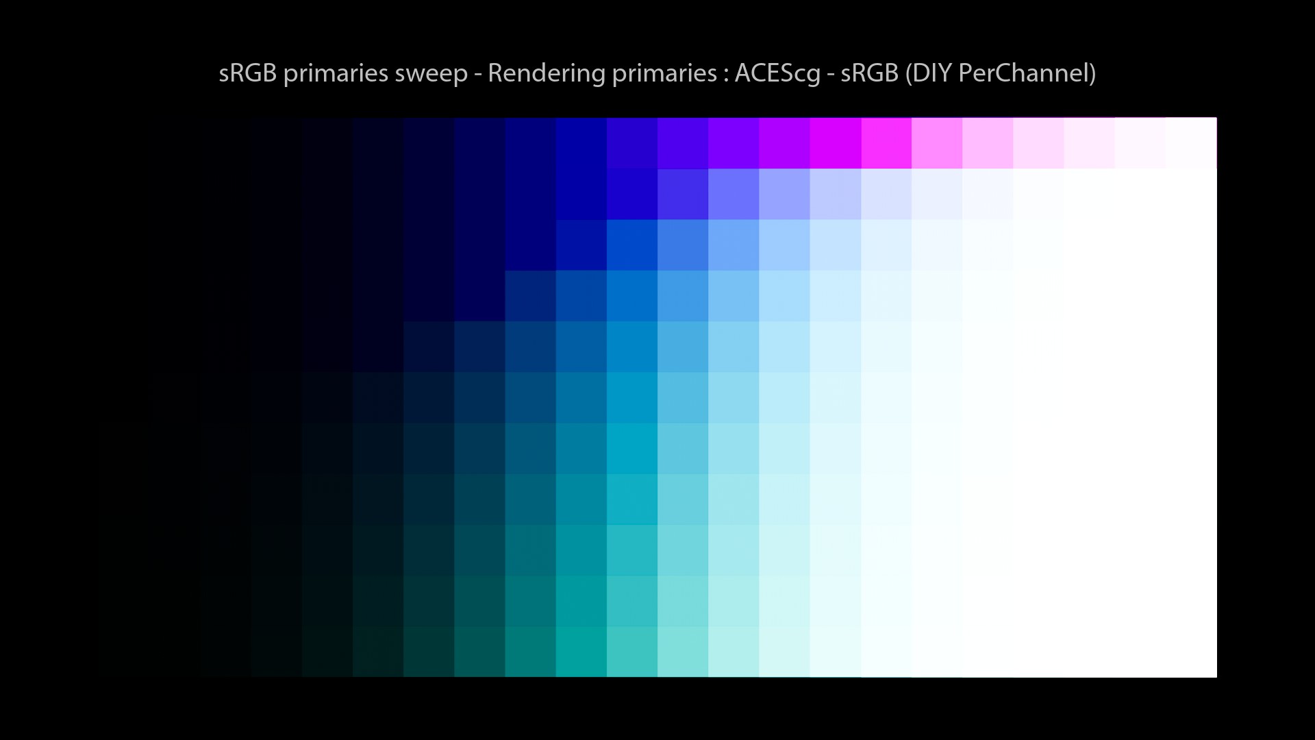
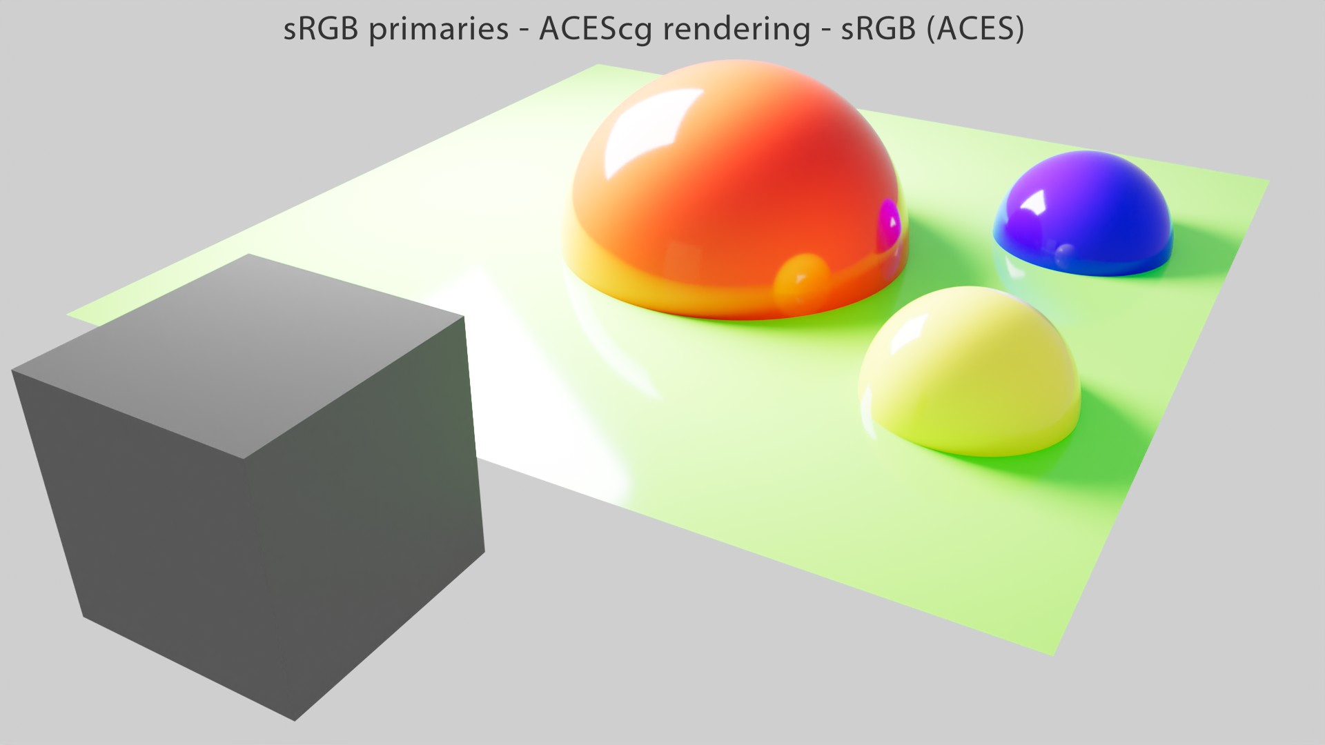
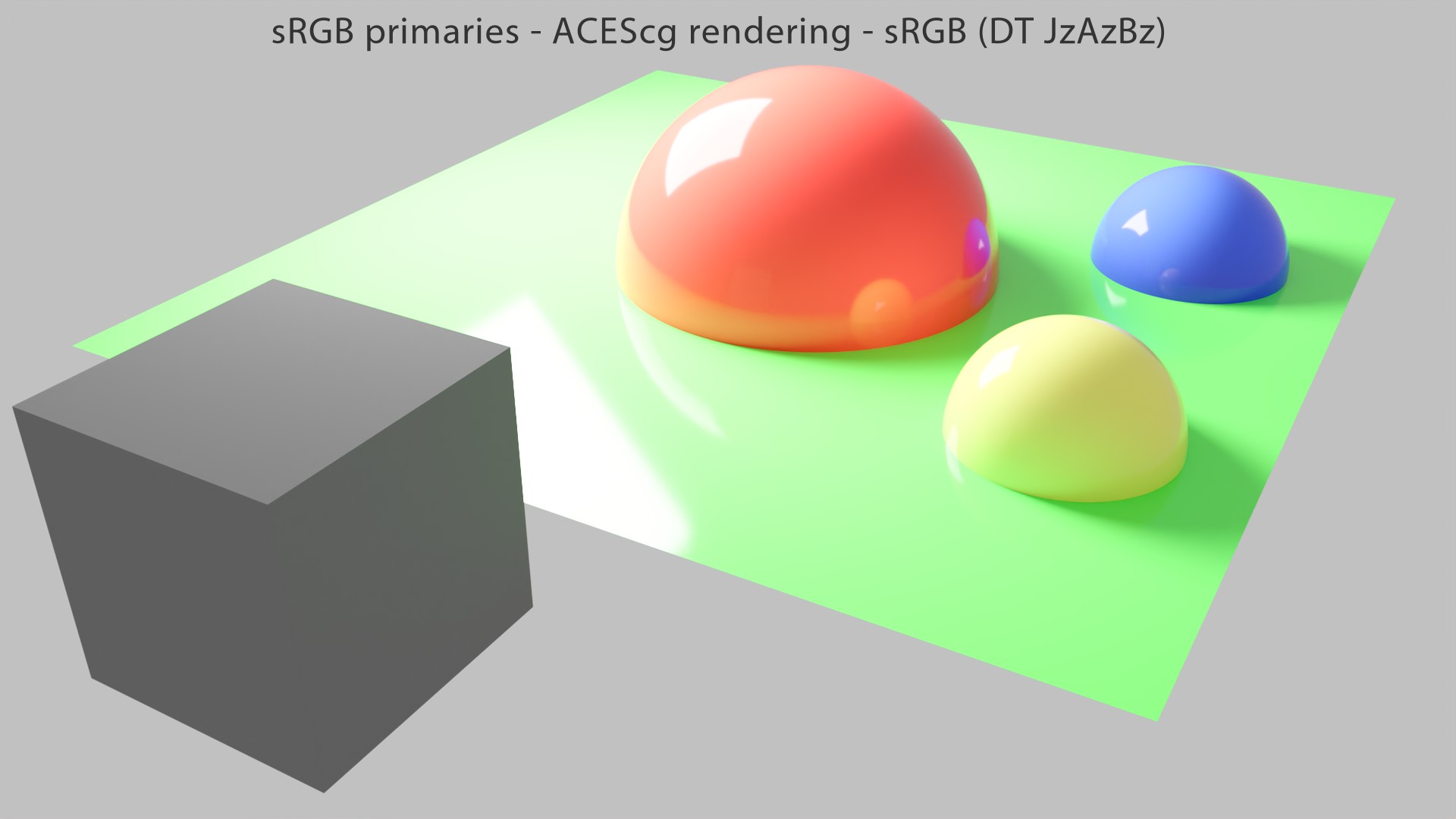
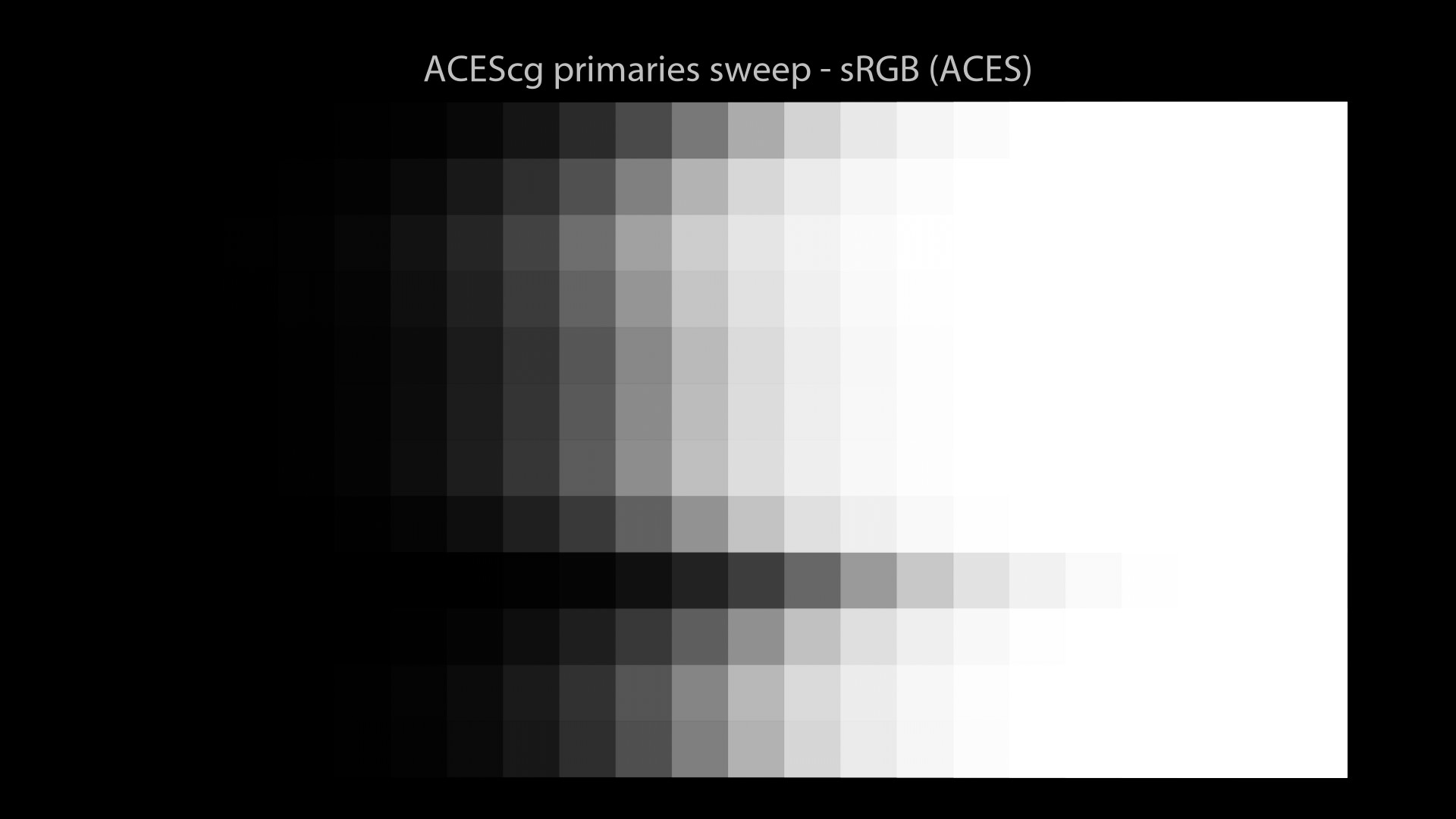
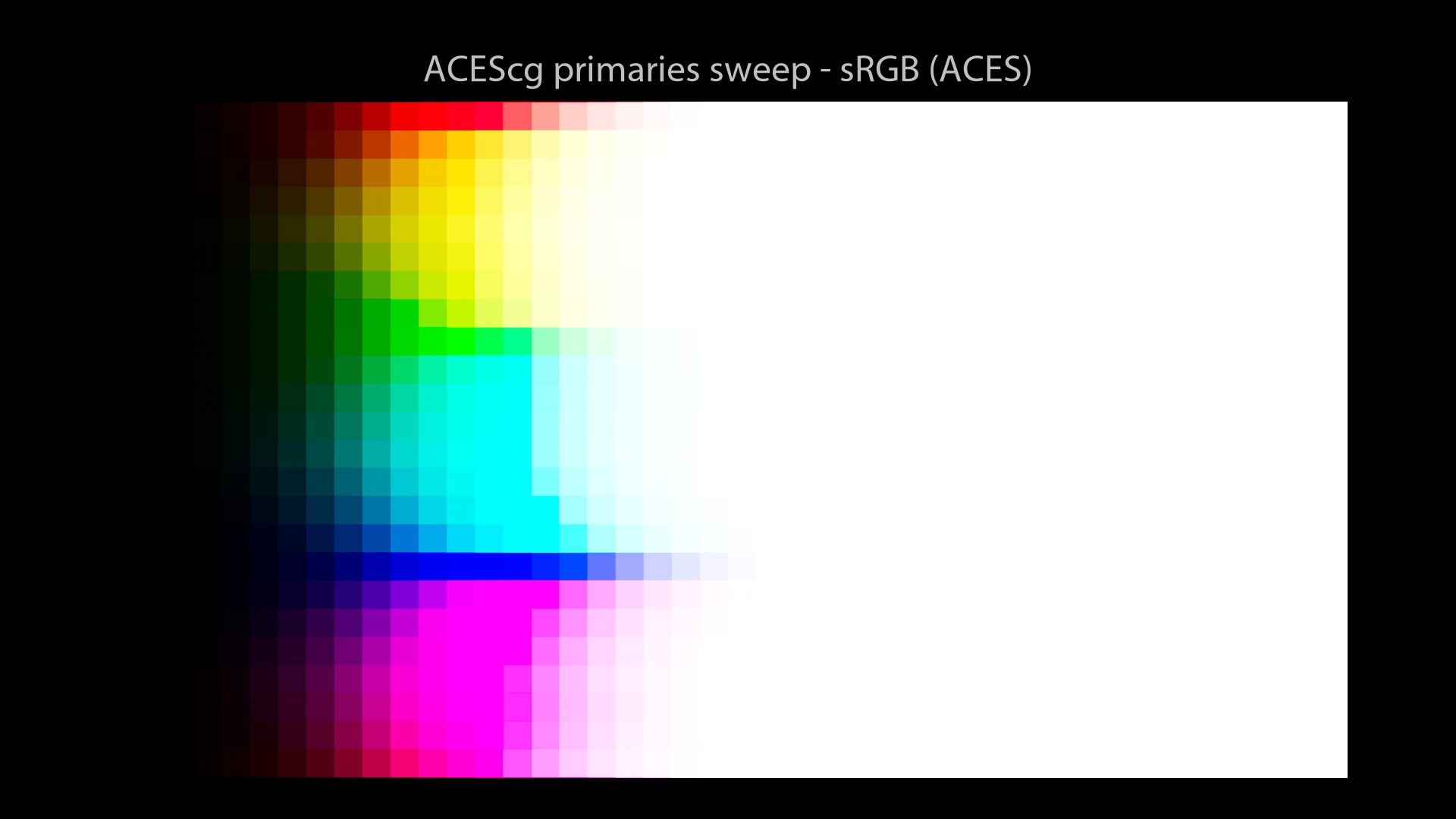
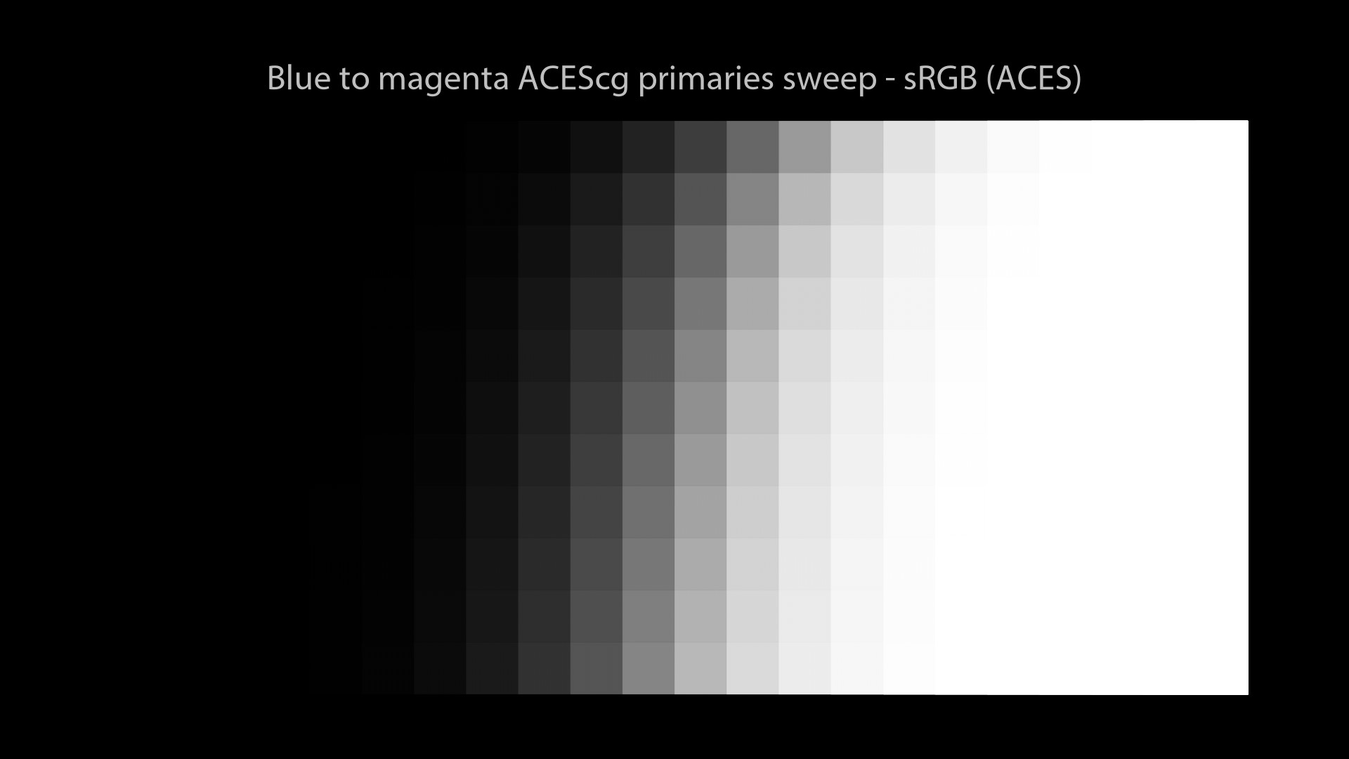
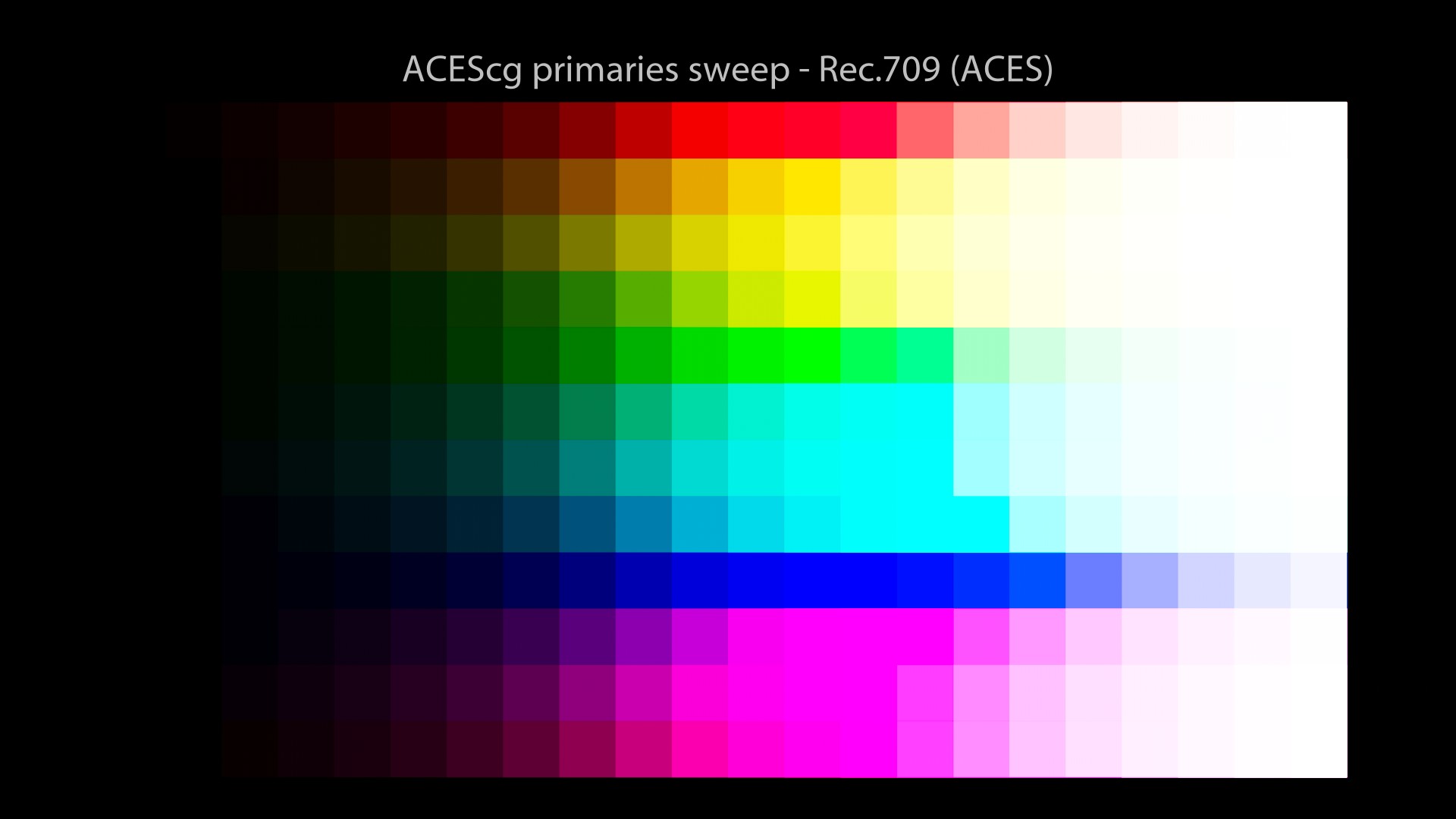
For completeness, I will run the same renders using ACEScg primaries this time. Let’s have a look!

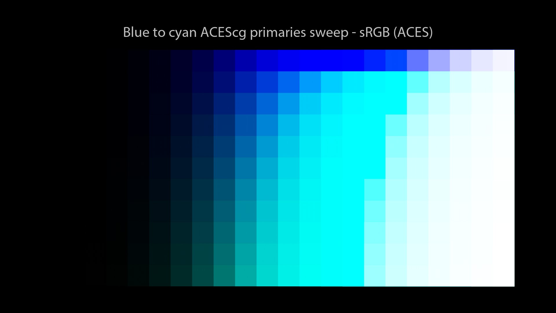
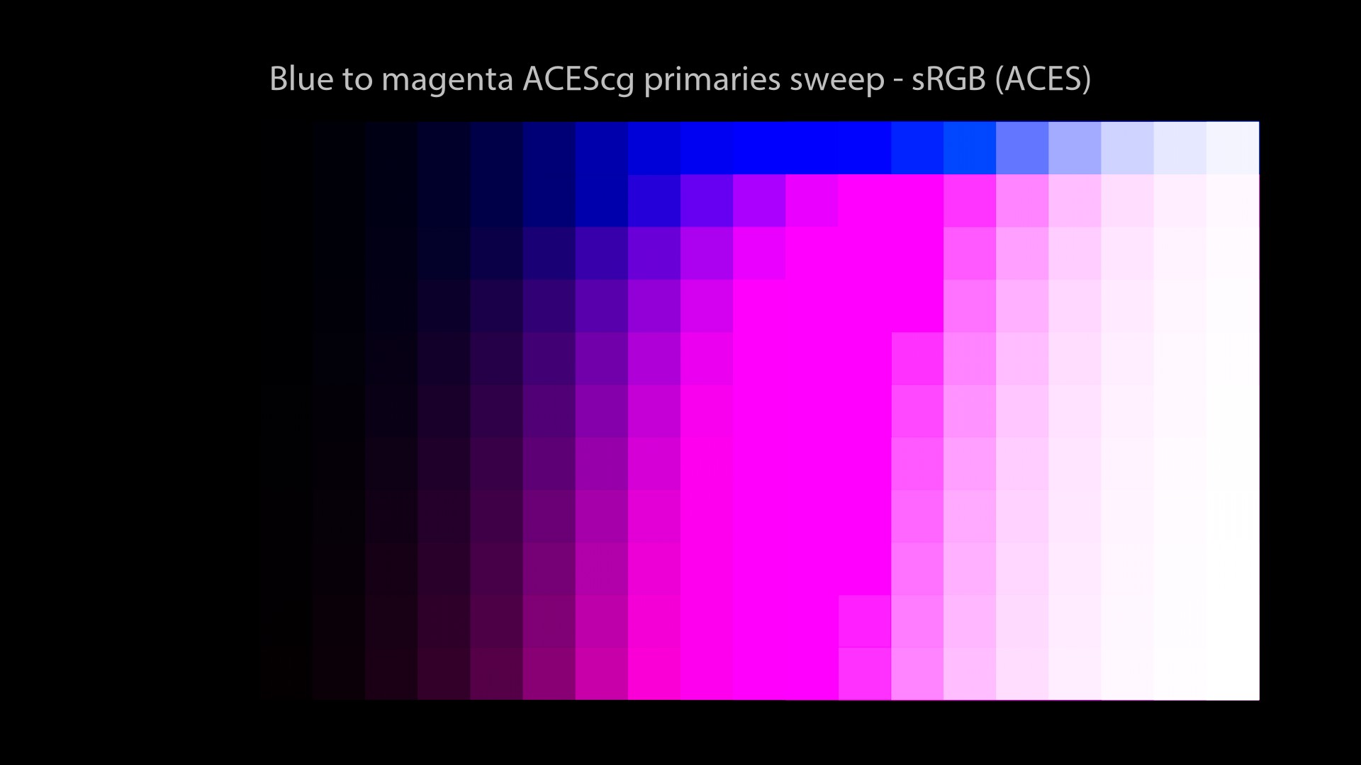
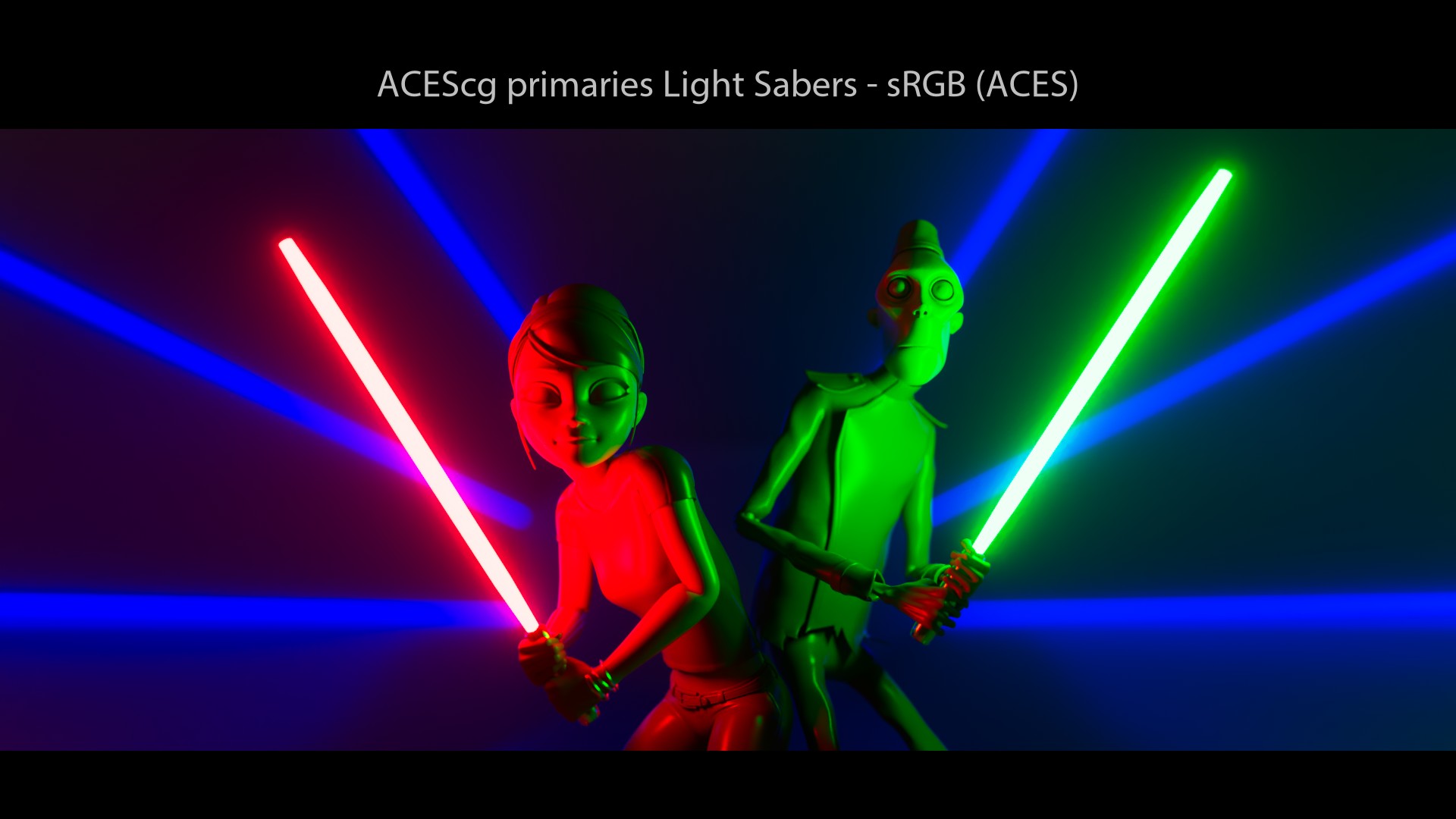
Same observations can be made… By using ACEScg primaries, we can see:
- Gamut Clipping.
- We still end up on the “Notorious 6” values, just like an sRGB EOTF! Why does this keep happening?
Revelation #7: Contrary to what I may have written in the past, the ACES Output Transforms do not solve anything. We observe with ACES a similar behaviour than the others OCIO configs.
It’s a bit tricky to know exactly which projects have used the ACES Output Transform. So I’ll just add a link to this video game since it has been confirmed on ACESCentral:
It took me a while to understand this but “going-to-white” (like on the light sabers for instance) is not an end in itself. I will repeat in bold and with emphasis because it is CRITICAL… Revelation #8: having these sweeps “going-to-white” does not mean necessarily that the Display Transform is working properly. The path itself is important! And this is where it gets tricky and awesome!
Comparison and Summary
We have compared four OCIO configs with some visual examples. Here is a little summary with pros and cons for each of them.
| Pros | Cons | Date | |
|---|---|---|---|
| nuke-default | Super light, less than 3 MB. | Should be avoided at all costs for CGI work. Useful in some edge cases for albedo textures, for example. | 2011 |
| spi-anim/vfx | Super light, less than 30 MB. Used on several Sony movies. Free. | No path-to-whiteon sRGB/BT.709 primaries. “Notorious 6”. No Wide Gamut rendering. No HDR Display Transforms. | 2011 |
| Filmic Blender | Super light, less than 20 MB. Path-to-white. Contrast Looks. Free. | “Notorious 6”. No Wide Gamut rendering. No HDR Display Transforms. | 2017 |
| ACES 1.2 | Cross platform “standard”. Wide Gamut rendering. Free. | Super heavy, more than 1.89 GB. “Notorious 6”. Hue Shifts. Gamut clipping. Color appearance mismatch. | 2014 – 2021 |
We could stop this post right there, right? We have compared several OCIO configs, pointed out their strength and flaws. So the image maker can make an informed choice when it comes to pick a Color Management Workflow. We could even finish on this beautiful quote:
This is a great quote by Daniele Siragusano. Zeitgeist is the defining spirit or mood of a particular period of history as shown by the ideas and beliefs of the time.
But no… We cannot stop here, we’re only half-way. We need to dig deeper to understand where the “Notorious 6” come from and what Tone Mapping really is about.
So, what we have learned so far?
- We have compared several Color Management OCIO Configs.
- All of them have shown the same “Notorious 6” behaviour.
- Maybe because they all use the same fundamental mechanics!
- So where these mechanics would come from? Let’s see…
Lost in misconception
In the context of the ACES Output Transforms VWG, we have been challenged to define some terms such as “Tone” or “Filmic“. Since I was not able to define them precisely, I wanted to go back to the first time I ever heard them. Friendly reminder: yes, my goal is still the same! Understanding how my own misconceptions have lead me on the wrong path for the past 15 years.
Here are the few questions I have been torturing myself in 2021:
- When was the first time I ever heard about tone-mapping?
- What does tone-mapping really mean? What does it do?
- What does an s-curve do?
- What does “filmic” really mean?
All these concepts may seem overloaded but I was curious to question my whole Knowledge about them. And funny thing, I was wrong about most of them! So let’s go back in time for another beautiful journey through color.
A bit of History
First time I ever heard the words “tone-mapping” was at Axis Studios back in 2012… They were mentioned in this fx guide article about Mass Effect 3 and Digic Pictures. It confused me a lot back then!
Then at Illumination I heard those terms again! They came from the John Hable’s talk at GDC about Uncharted 2 (Video and slides), which was probably a game changer in the industry! In his presentation John Hable describes a 1D LUT called “Filmic” that originally came from Haarm-Pieter Duiker (here are two of his presentations: one at Electronic Arts and one at SIGGRAPH 2010).
Revelation #9: this 1D s-curve LUT is not applied on open domain, aka on infinite values or scene-linear values. It is applied on logarithmic values!
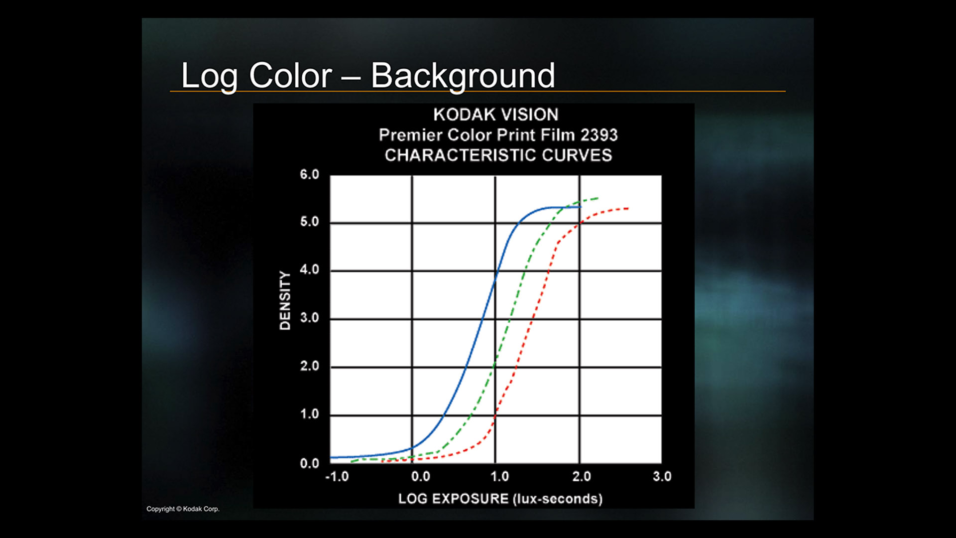
This Gamut Mapping/Compress thing seems like an important thing…
The per-channel approach
So here is the fundamental mechanics at play:
- The “filmic s-curve” is a 1d LUT…
- Applied on the channels R, G, B separately…
- This is called per-channel/RGB lookup…
- And it will ALWAYS results in the “Notorious 6”!
Revelation #10: Any curve that asymptotes/converges/saturates at 1, like this “filmic s-curve“, will end up on the “Notorious 6“.
A fellow colour nerd.
And if that was not clear enough:
A fellow colour nerd.
There’s nothing better than a CIE 1976 diagram to show what’s happening. But before that I would strongly recommend to read Question#15 and Question#16 by Troy Sobotka. It explains very clearly what the CIE 1976 chromaticity diagram is. And it has this very cool diagram where it shows the connection between “spectral light energy” (aka the wavelengths) to “numbers” (aka chromaticities). A must-read!
Plots and Chromaticity Diagrams
Let’s have a look at some plots:
Revelation #11: All the scenes I have lit, rendered and displayed for the past 15 years have the “Notorious 6” look. Yes, that’s a biggie! It took me a while to accept it, like a leap of faith almost: I have NEVER seen the colours as encoded. They have always been distorted at display by a “filmic s-curve 1d LUT“. OMG.
This is how I have been working for the past 15 years:
Jed Smith.
And at the risk of repeating myself, I’ll add a similar explanation here:
A fellow colour nerd.
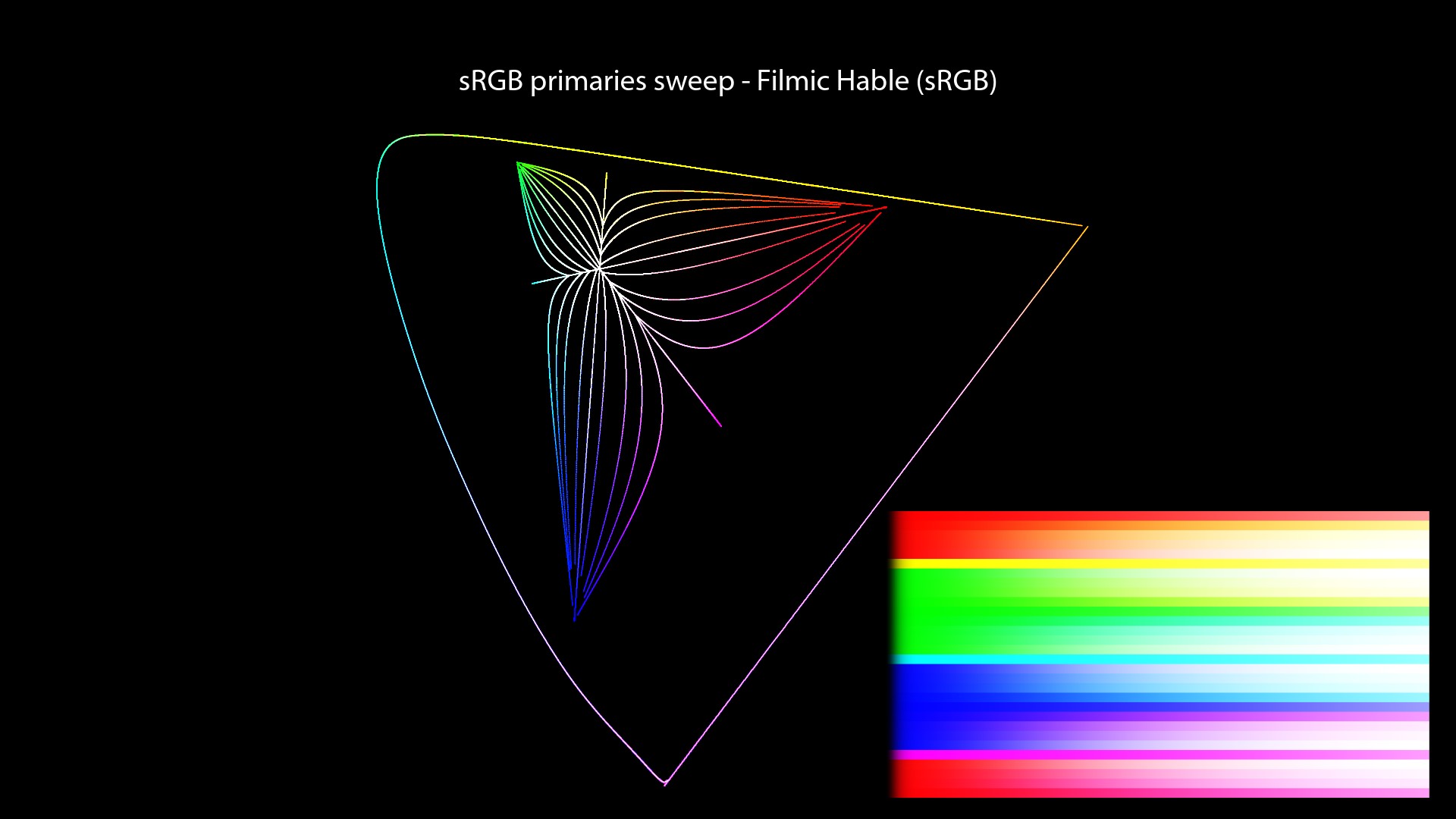
Values for the plots
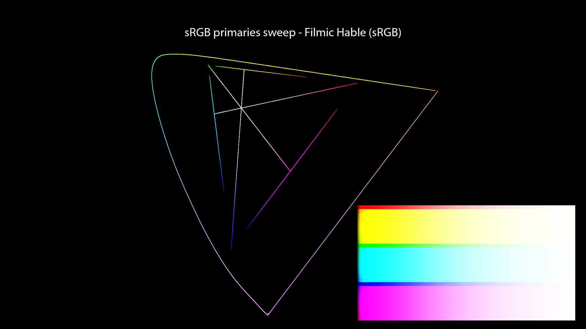
To be very clear about which values have been used for each plot, here is a recap of the colors used in the “Red to Yellow Notorious 6 sweep”:
| Color Management | Sweep Primaries | R | More G | More G | More G | More G | Y |
|---|---|---|---|---|---|---|---|
| Filmic Hable | sRGB | 1, 0.00001, 0.00001 | 1, 0.0001, 0.00001 | 1, 0.0003, 0.00006 | 1, 0.0003, 0.0001 | 1, 0.0003, 0.0002 | 1, 1, 0.00001 |
| spi-anim | sRGB | 1, 0.00001, 0.00001 | 1, 0.0001, 0.00001 | 1, 0.0003, 0.00006 | 1, 0.0003, 0.0001 | 1, 0.0003, 0.0002 | 1, 1, 0.00001 |
| spi-vfx | sRGB | 1, 0.00001, 0.00001 | 1, 0.0001, 0.00001 | 1, 0.0003, 0.00006 | 1, 0.0003, 0.0001 | 1, 0.0003, 0.0002 | 1, 1, 0.00001 |
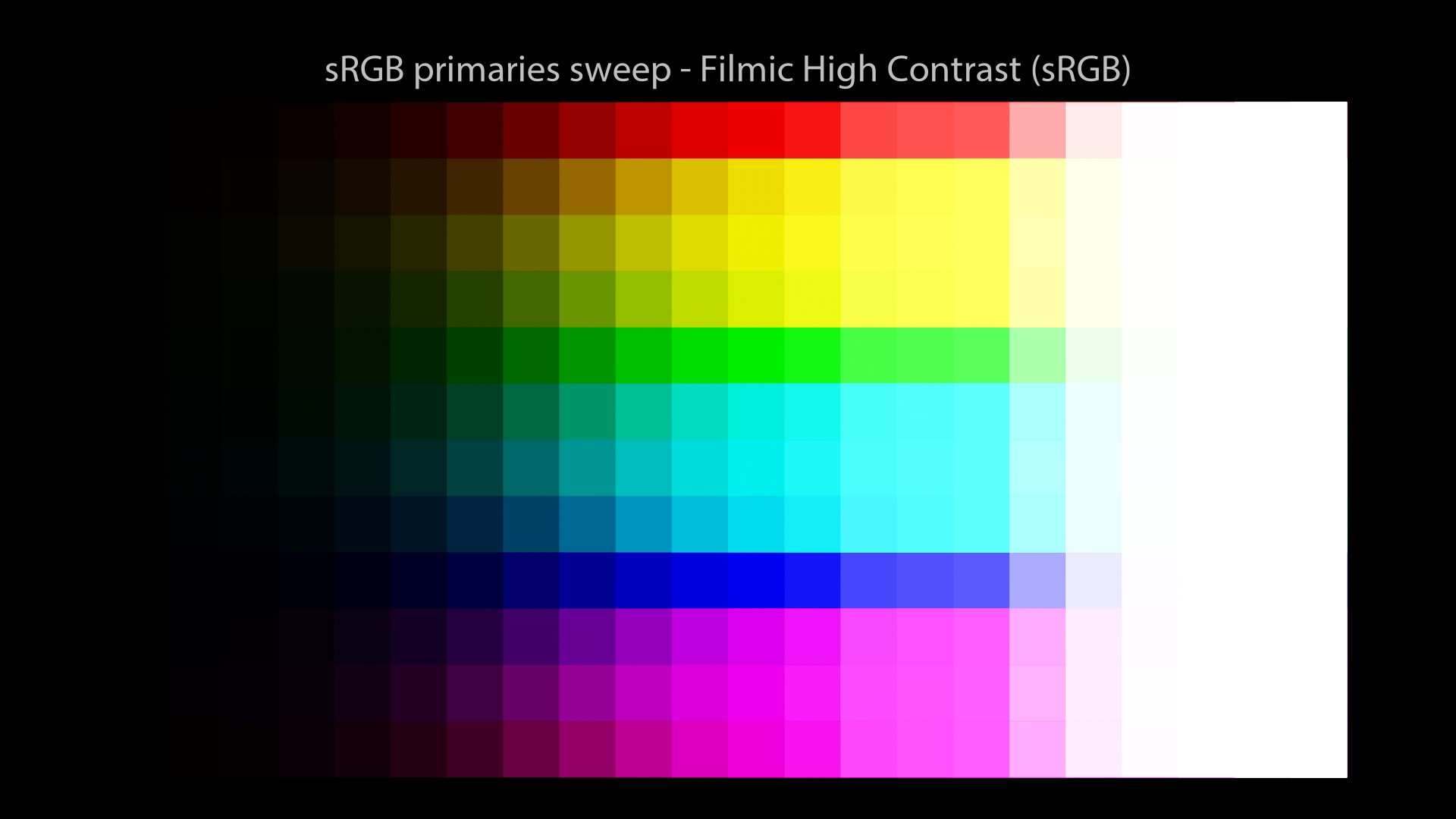
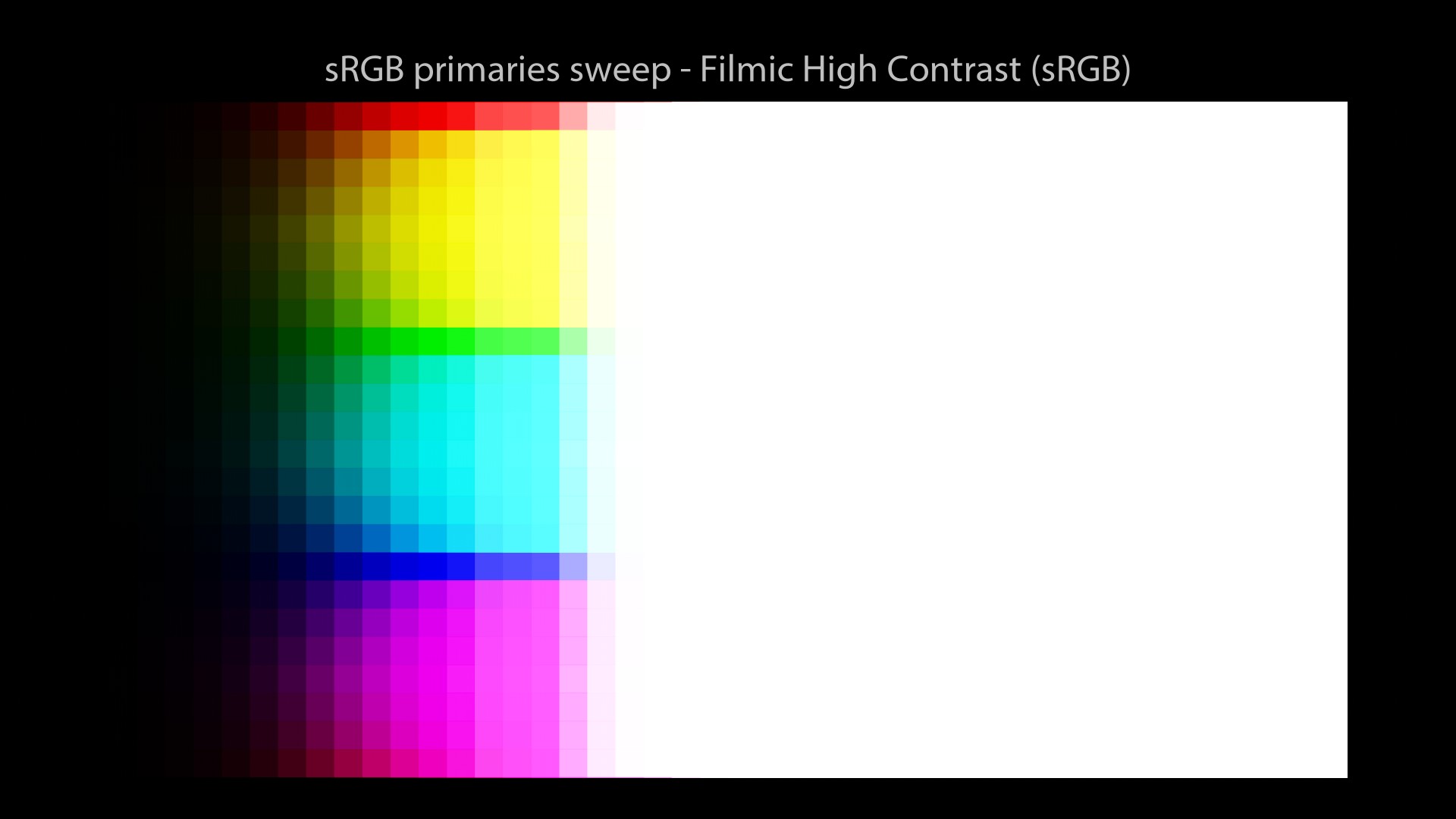
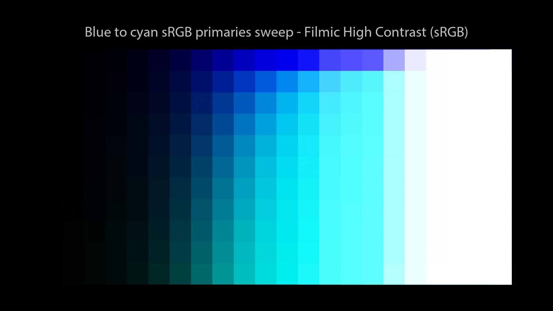
| Filmic High Contrast | ACEScg | 1, 0, 0 | 1, 0.003, 0 | 1, 0.01, 0 | 1, 0.05, 0 | 1, 0.2, 0 | 1, 1, 0 |
| sRGB (ACES) | ACEScg | 1, 0, 0 | 1, 0.05, 0 | 1, 0.2, 0 | 1, 0.5, 0 | 1, 0.8, 0 | 1, 1, 0 |
| sRGB (ACES) | ACEScg | 1, 0, 0 | 1, 0.005, 0 | 1, 0.015, 0 | 1, 0.03, 0 | 1, 0.1, 0 | 1, 1, 0 |
Please notice what kind of crazy tiny values I had to use in order to get these “nice readable” plots… Insane! We’ll do more plots later with a regular step, so you can see the differences!
More about per-channel
So are we doomed? Since all these open-source approaches use the same mechanics. Well, let’s have a look at other rendering solutions?
Wait, what? Rendering solutions? What do you mean? Like Arnold, Renderman or Guerilla Render? No, I’m talking about a complete different rendering operation here. So before we have a look at these other possibilities, we need to talk about something super important and just mind-blowing… Buckle up!
Rendering exr files
When I was starting in the industry, my supervisor Barbara Meyers gave me this great definition of “rendering”:
It has taken me 15 years to realize that this definition could be split in two because there are actually two different types of rendering in the CG world! Yes! This is HUGE! Let’s take a deep breath and explain it properly.
When you hit “render” in a 3d software and wait for sampling to happen, what you are generating? Most likely, you’ll be saving exr files from a batch render. Can this EXR file be considered an image? Well, not exactly… It becomes an image once it is “Viewed” on a “Display“.
Revelation#12: a “beauty” EXR file is NOT an image, it is a file containing light data. It only becomes an image when displayed on your monitor. Hence the expression “Image Formation Chain”: we’re trying to form/create an image from “light data” that can be “Viewed” on a “Display”.
A fellow colour nerd.
Two types of rendering
Therefore we can distinguish two types of rendering in CG. Just like this:
3D scene -> Data -> Image
Revelation#13: There are two rendering operations in CG. The first one is from scene to data and the second one from data to image.
Here are some quick definitions in case of it is not clear enough:
- Scene rendering: this is what I have been doing for the past fifteen years… Hit “render” and wait for sampling to happen and generate an exr file. This can take hours.
- Display rendering: then load this exr and display it in your Render View, maybe using OCIO… And yes! This is a color rendering operation, that most likely will be in real-time.
And here is the best part! These two rendering operations are both dependent on the primaries! Yes, this is crazy! Revelation#14: applying an s-curve on different primaries will yield a different result. Boom! Mind blown!
Custom Display Rendering Primaries experiment
So when we talk about “Display Transforms“, or “Display Rendering Transforms” as Baselight calls them… We must acknowledge that these words have a meaning:
- Display: the monitor/screen.
- Rendering: from data to image.
- Transform: we need to change the values from scene-referred to display-referred (change of primaries, White point, EOTF…)
Jed Smith did an amazing per-channel experiment to show the importance of primaries for “Display Rendering“. It is a super simple setup based on ARRI K1S1 model, described here by Jed:
Jed Smith and another amazing experiment!
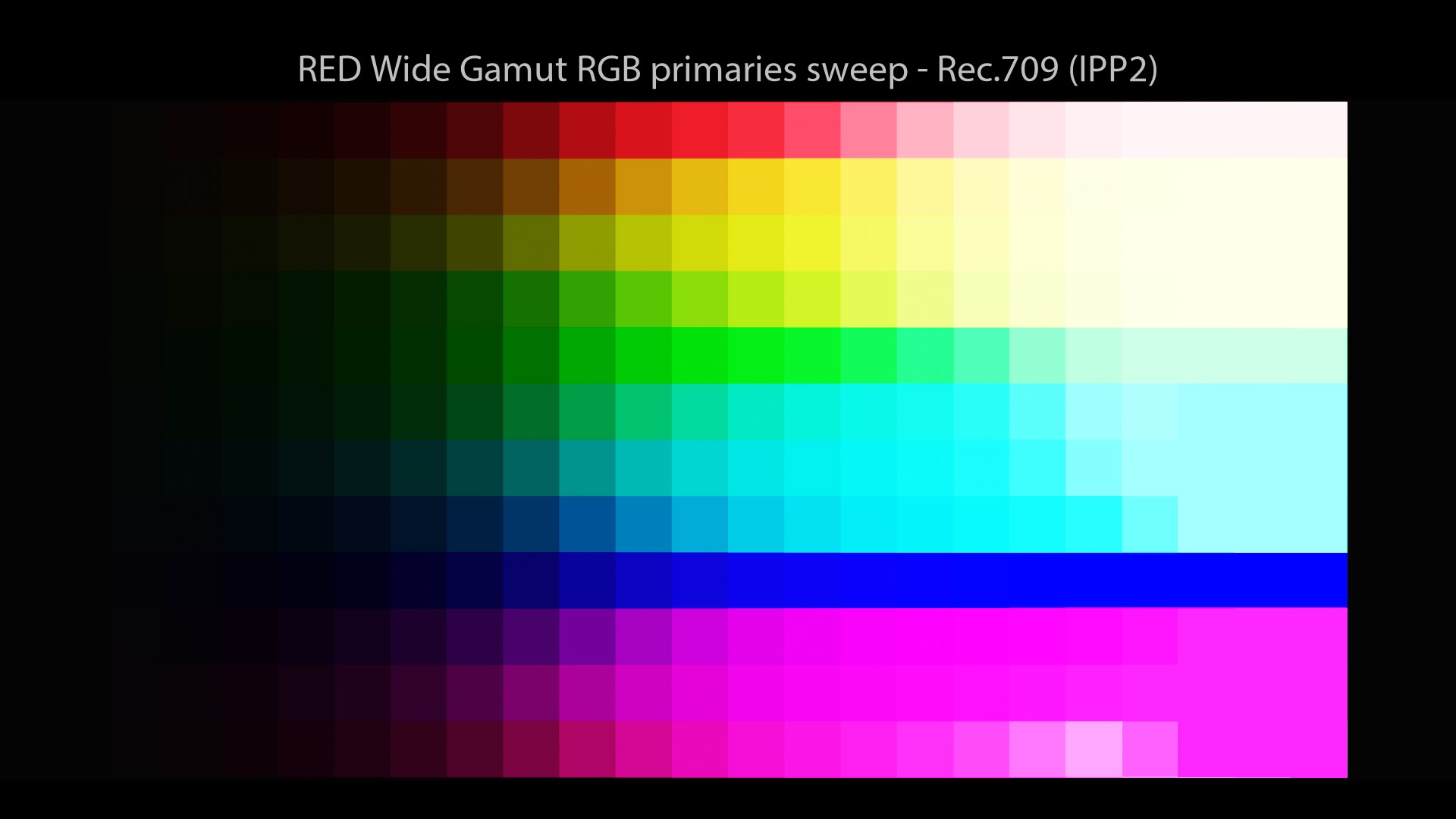
Here are a few examples, comparing a tonemap applied on RED Wide Gamut primaries and ACEScg ones:
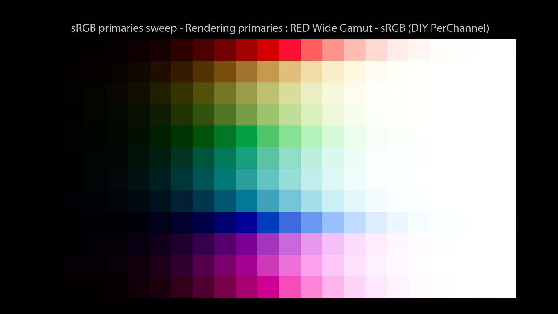
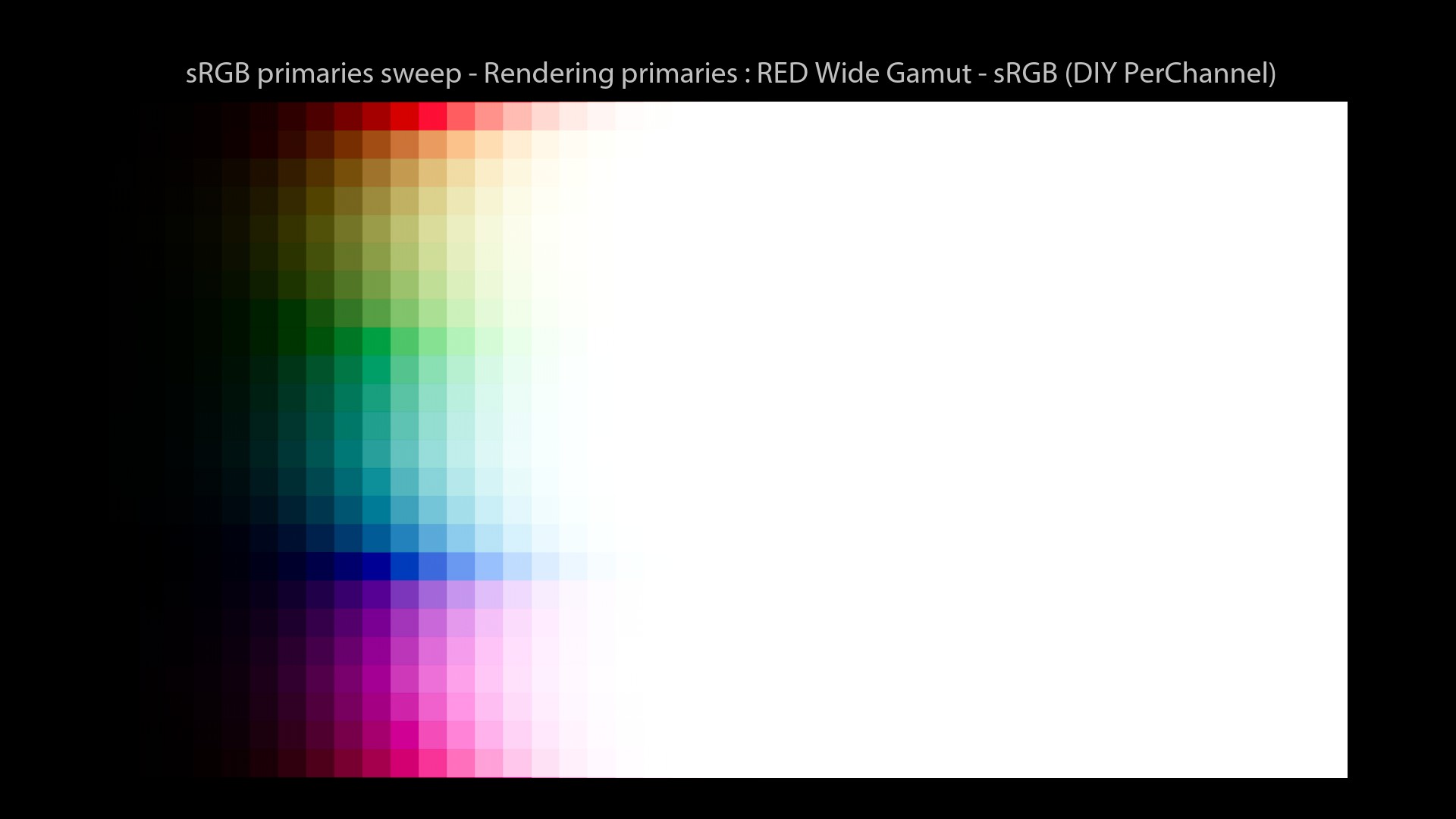
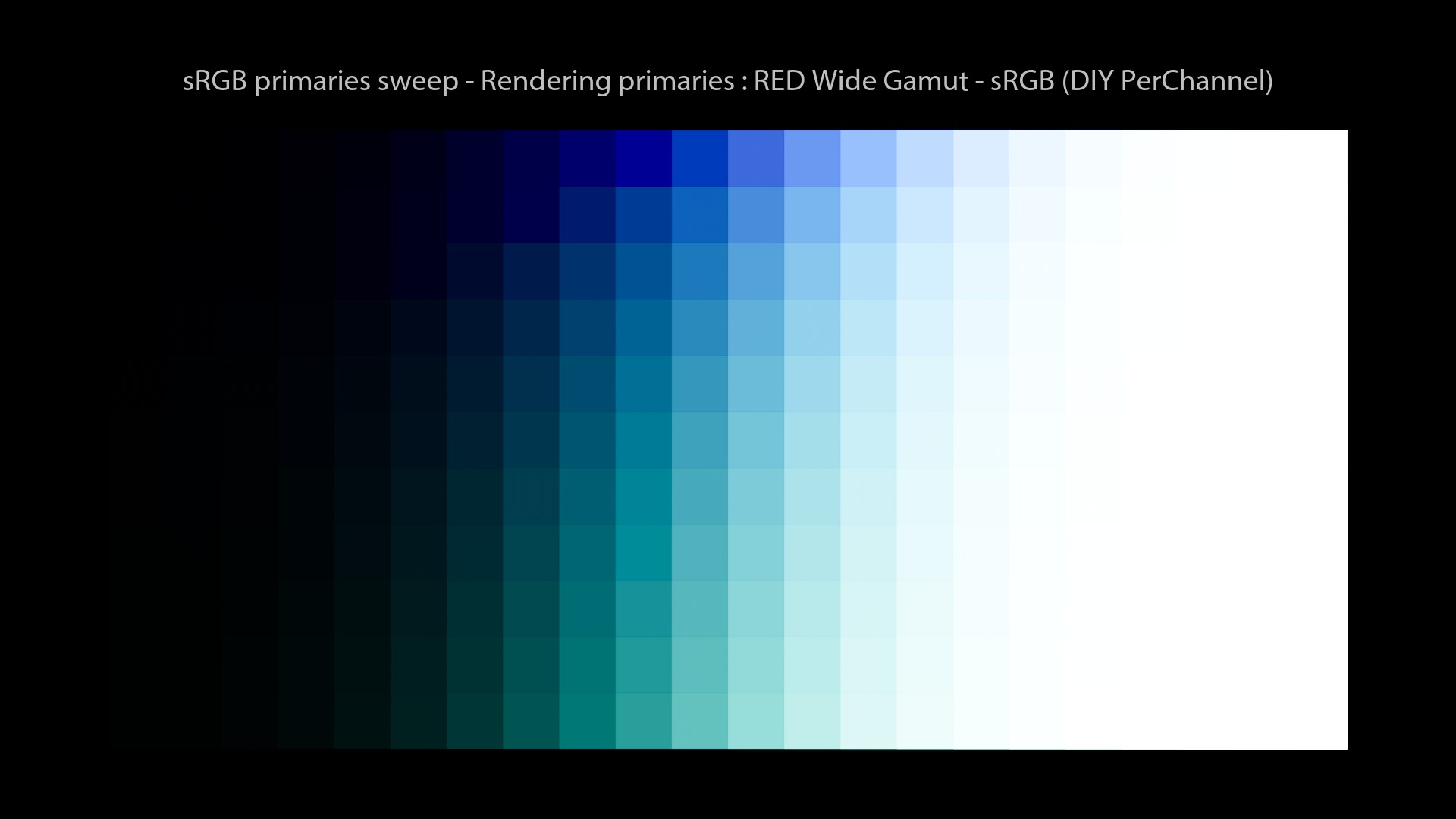
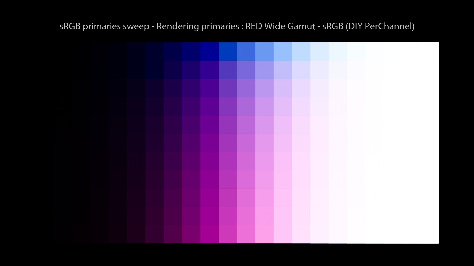
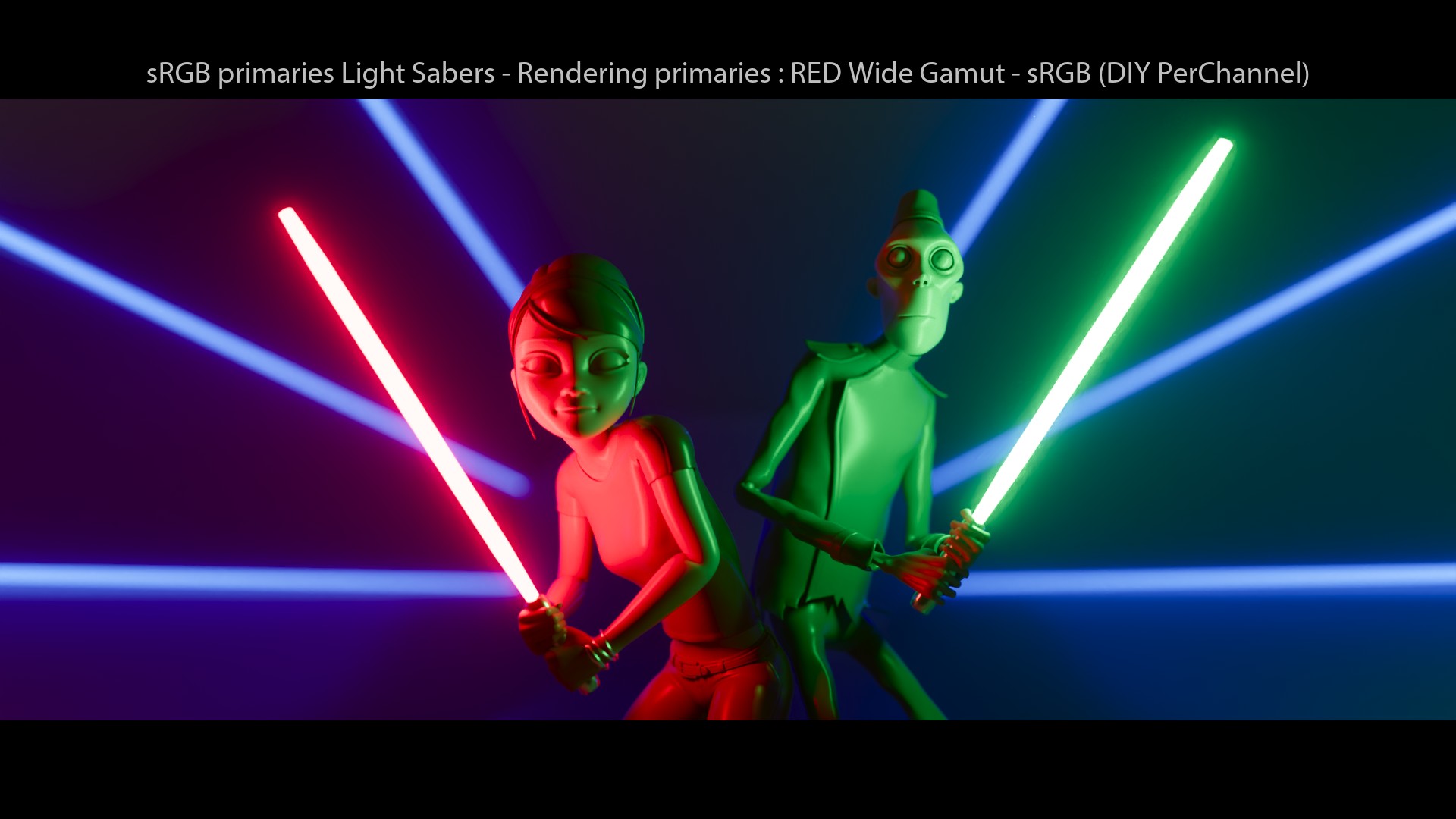
Crazy, right? It is the exact same setup using different “Display Rendering” primaries to apply the tonescale. Here is the list of operations:
- First, we choose the source gamut of the input. In this case, it is ACEScg.
- Then we convert to some “Display Rendering” primaries. Using a simple Matrix 3×3.
- Then we apply the tone-mapping. In this example, it is the “Siragusano” one.
- And then we convert back to the”Display Gamut”, using again a simple Matrix 3×3.
And for clarity, this beautiful quote:
Daniele Siragusano.
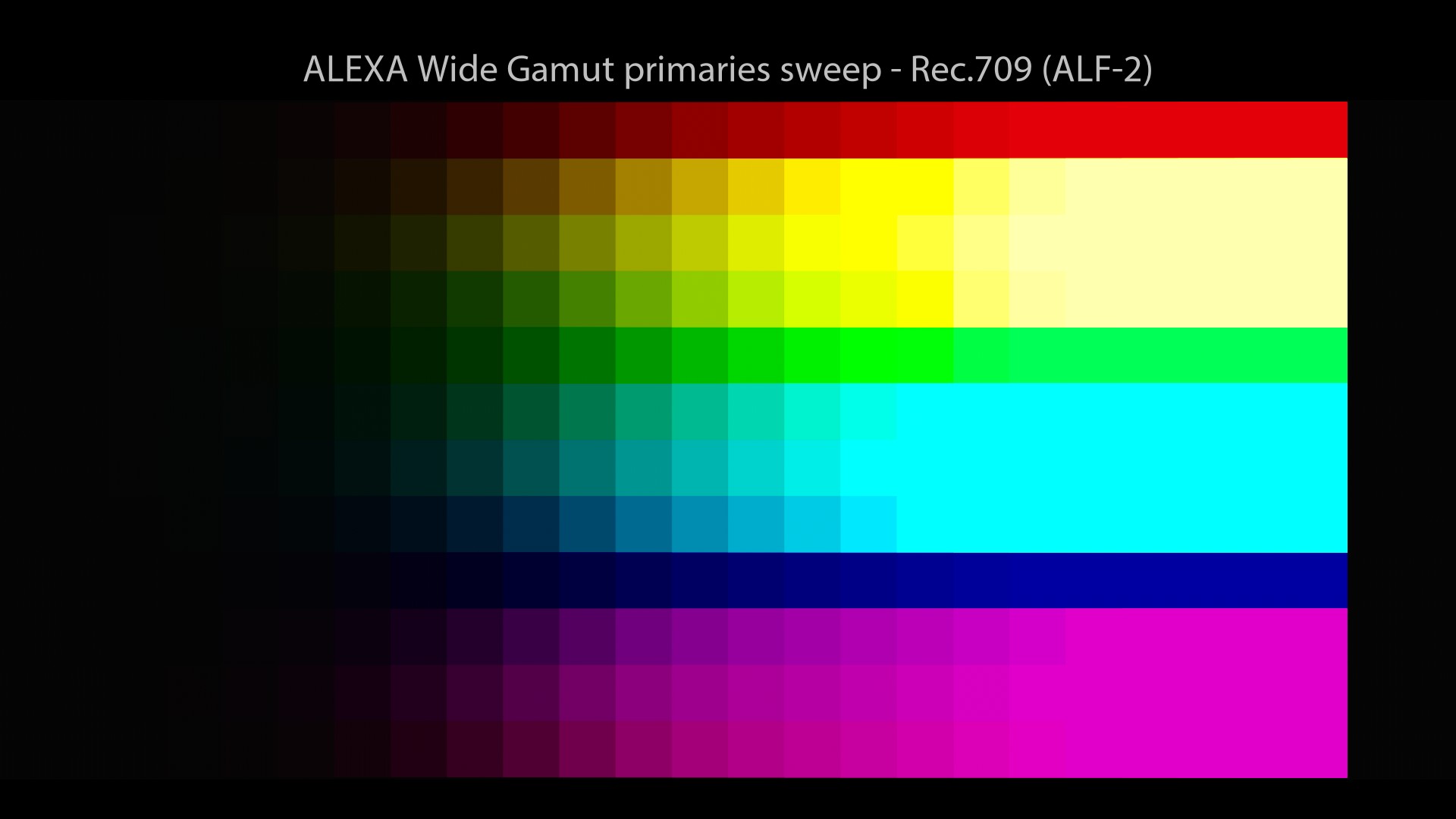
ARRI ALF-2
So, back to our main thread. Let’s have a look at an another rendering solution. I would have loved to talk about ARRI K1S1 since it is probably the most famous colour rendering solution out there. But I was not able to generate an OCIO config based on it. So I will use its newer version as an example: ARRI Look File 2 (ALF-2), which is quite similar.
From Nick Shaw.
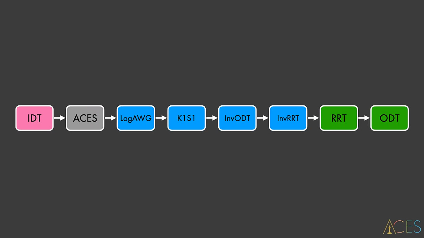
Jed Smith was kind enough to summarize the whole K1S1 process here:
Scene-Linear AWG -> Tonemap to display-linear AWG -> 3x3 Matrix to BT.709 -> 3x3 Matrix 10% BT.709 weighted desaturation -> Custom 2.4 Power Inverse EOTF with Linear Extension
Here are the two K1S1 matrices if you’re curious:
ALEXA Wide Gamut to ITU-R BT.709:

 [[ 1.61752447 -0.53728621 -0.08023815]
 [-0.07057271  1.33461286 -0.26404021]
 [-0.02110205 -0.22695361  1.24805592]]

ALEXA Wide Gamut to ITU-R BT.709, 90% saturation:

 [[ 1.48496742 -0.40117349 -0.08379383]
 [-0.03432004  1.28353567 -0.24921569]
 [ 0.01020356 -0.12187415  1.11167083]]
Okay, let’s have a look at our images:
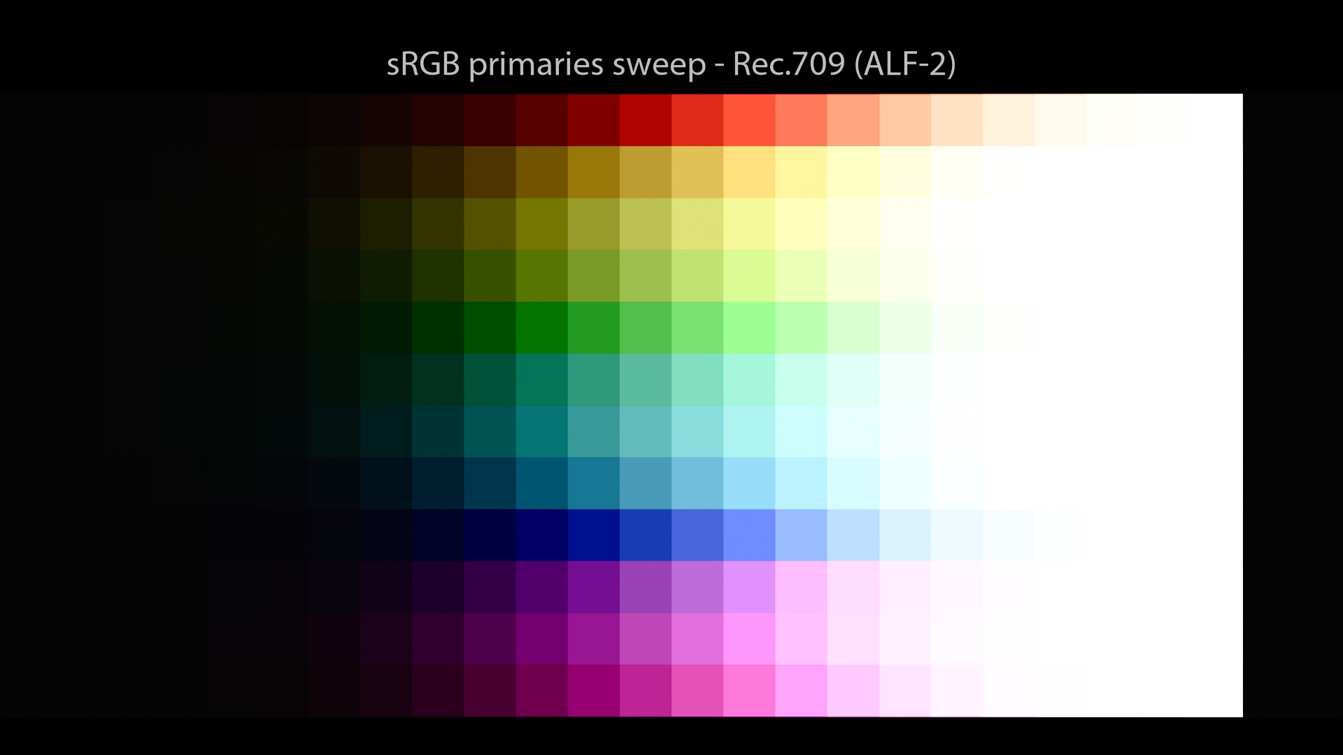
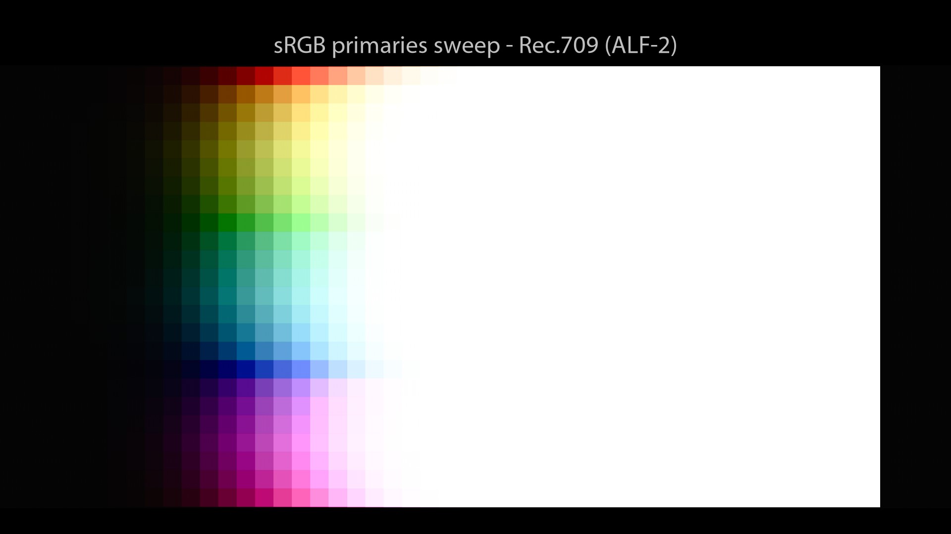
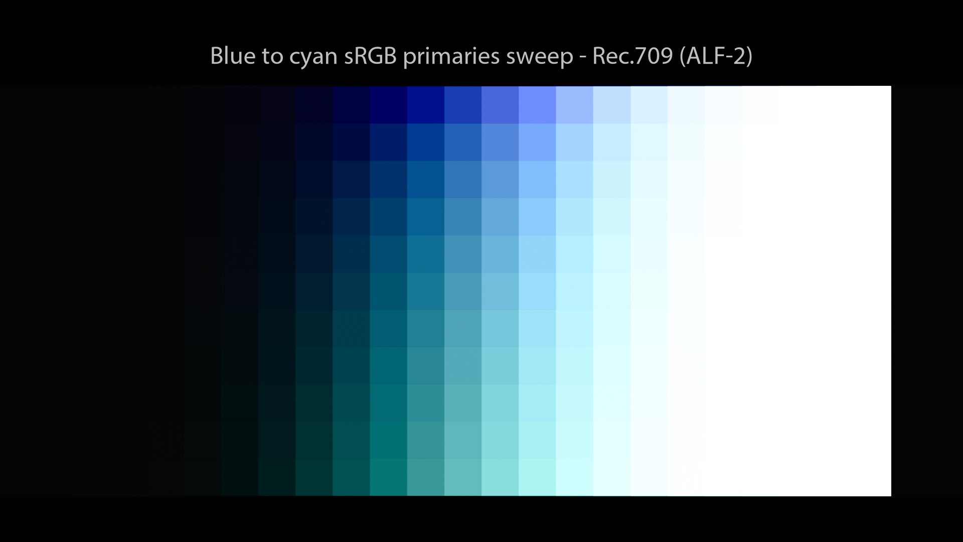
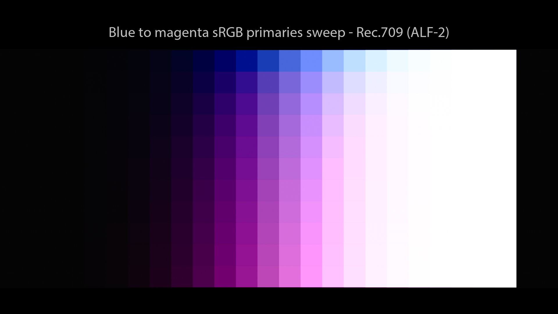
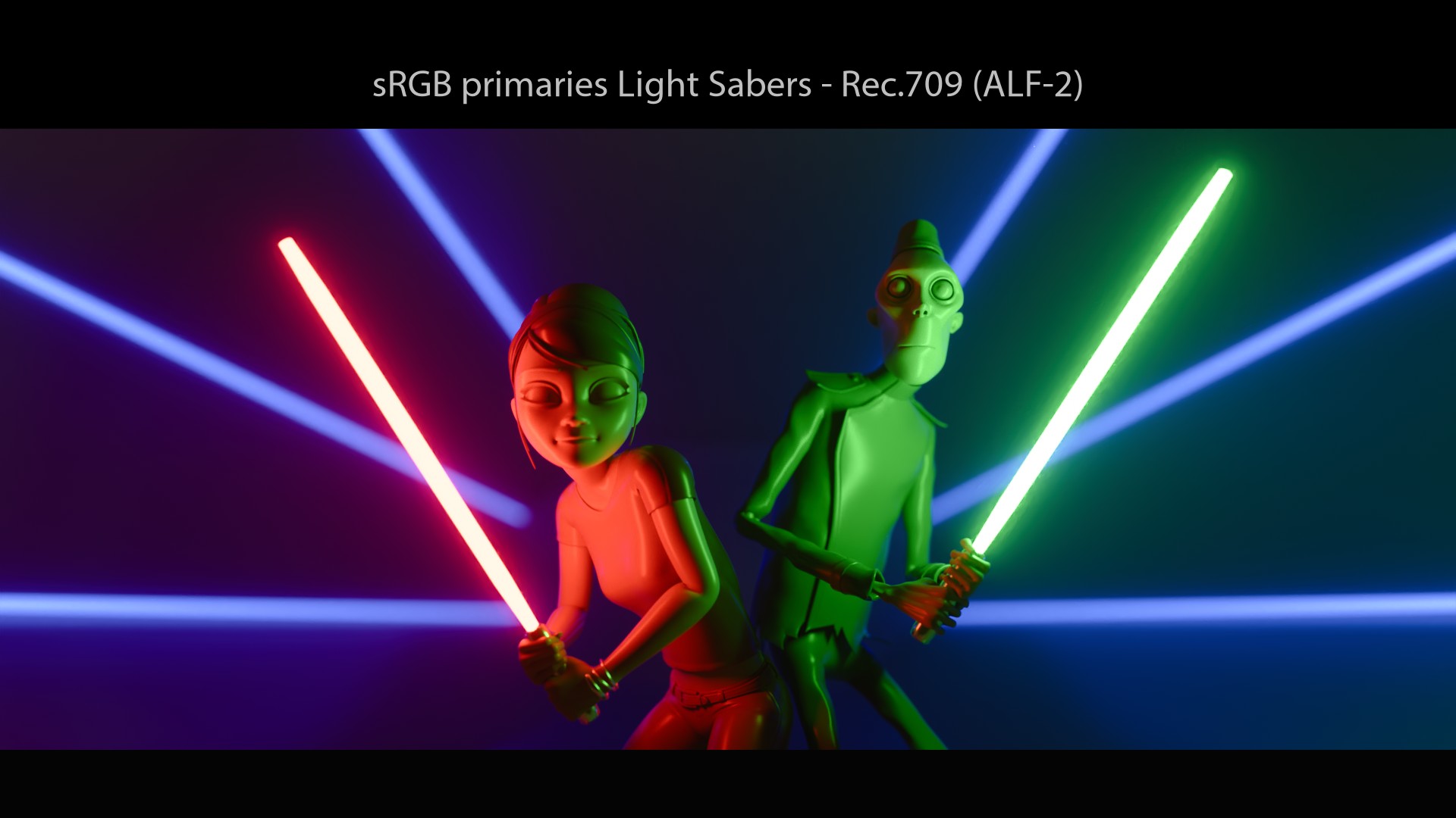
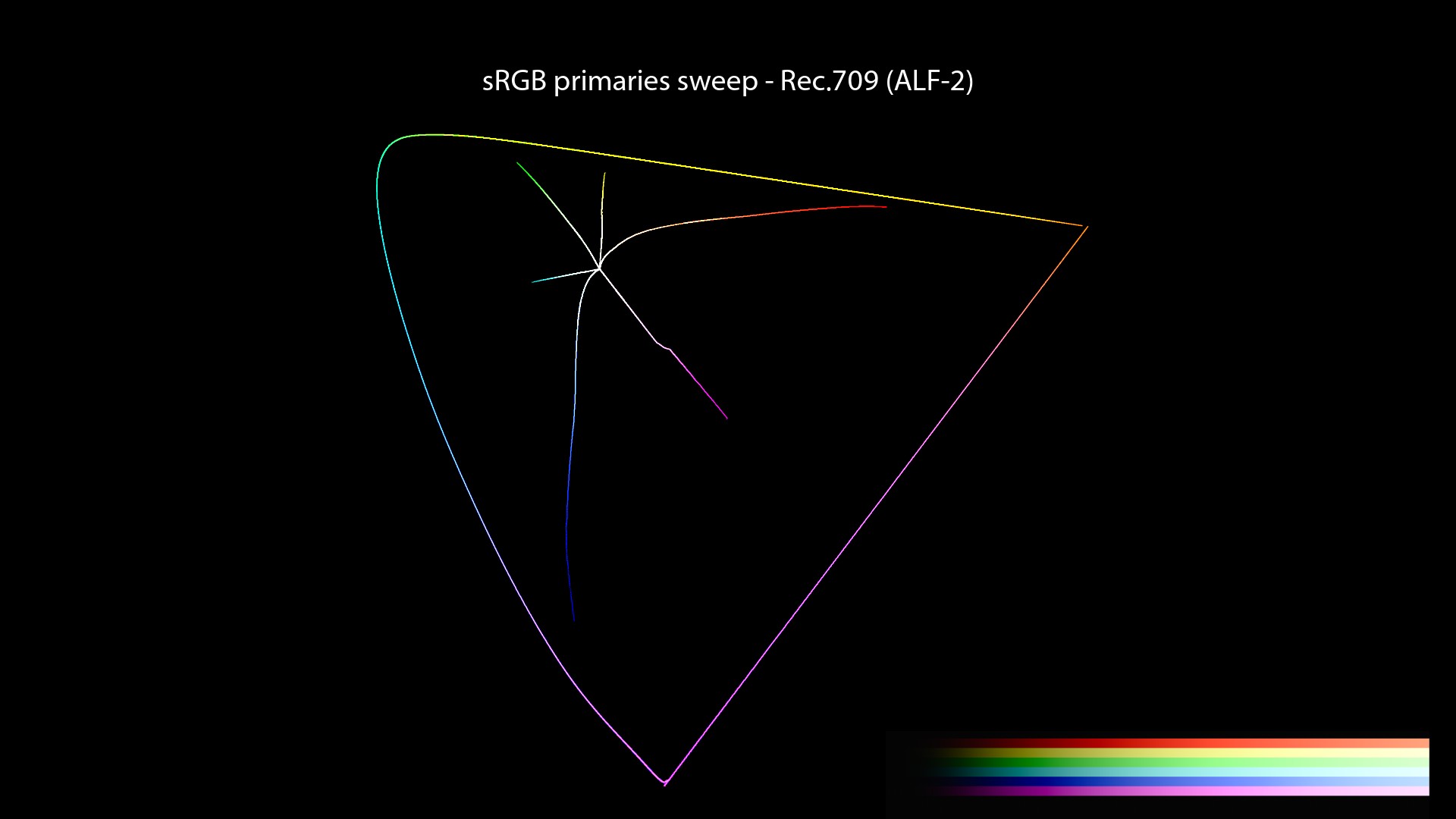
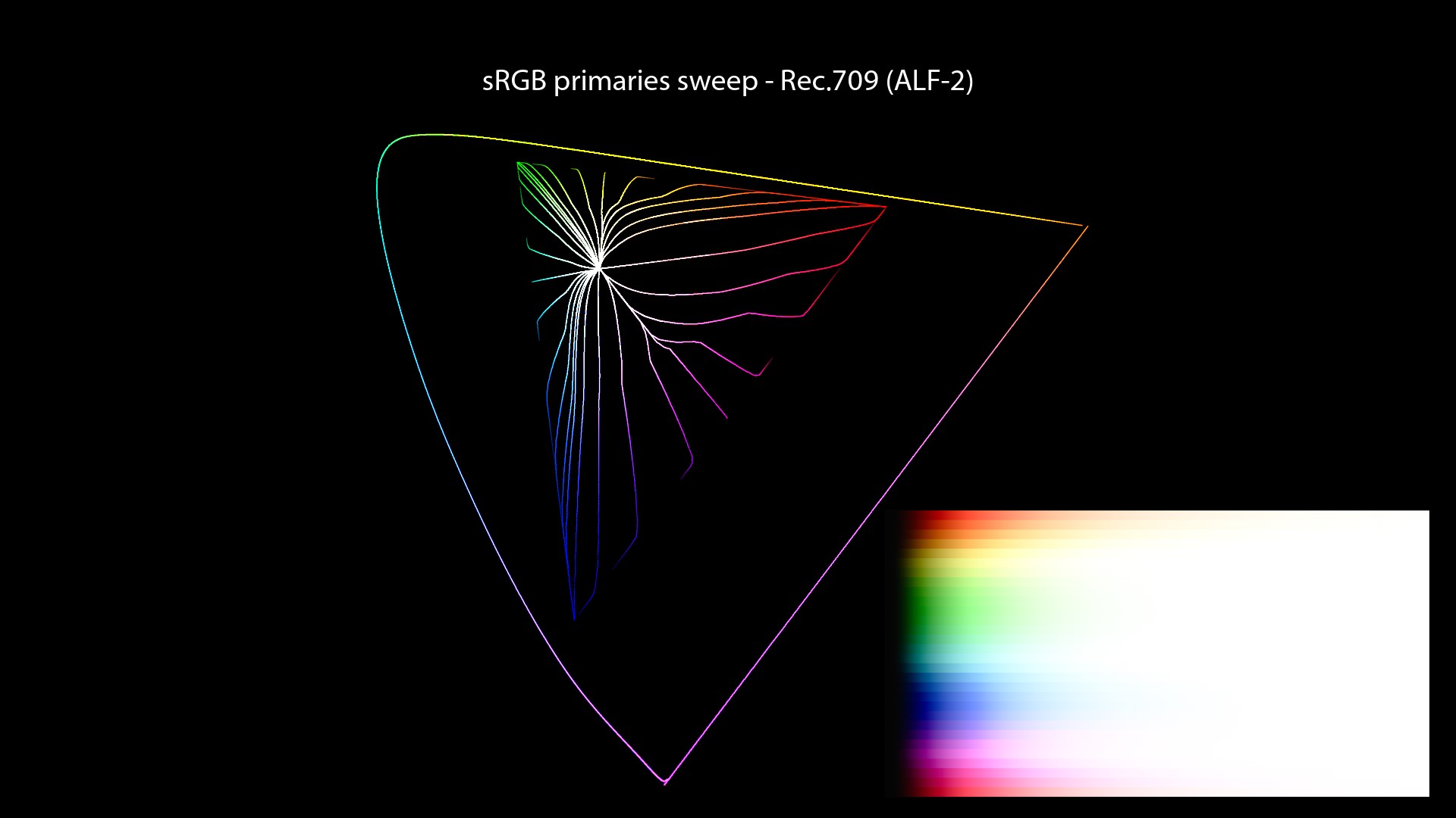
This an interesting colour rendering solution, that is used really often. It is still using the per-channel mechanics that will skew towards the “Notorious 6“. But the change of primaries makes it more “acceptable“. To be very clear about the ALF-2 plot, here is a recap of the values used in the “Red to Yellow Notorious 6 sweep”:
| Color Management | Sweep Primaries | R | More G | More G | More G | More G | Y |
|---|---|---|---|---|---|---|---|
| Filmic Hable | sRGB | 1, 0, 0 | 1, 0.03, 0 | 1, 0.1, 0 | 1, 0.25, 0 | 1, 0.6, 0 | 1, 1, 0 |
We’re on the right path!
I am also mentioning ARRI K1S1 because it is somehow related to the ACES 2.0 talks and some inacurracies I did in a talk last year (summer 2020). Let’s dive in!
Mea Culpa
ACES History
First of all, a few informations I have recently discovered about ACES worth sharing:
- The making of ACES 1.0 was “complex” because of “contradictory design requirements”.
- No CG images were available during the conception of ACES 1.0.
- Originally ACES was just the color space and encoding (IIF – Image Interchange Framework).
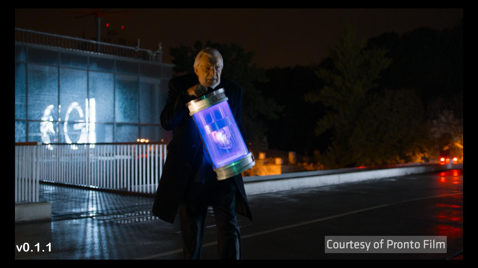
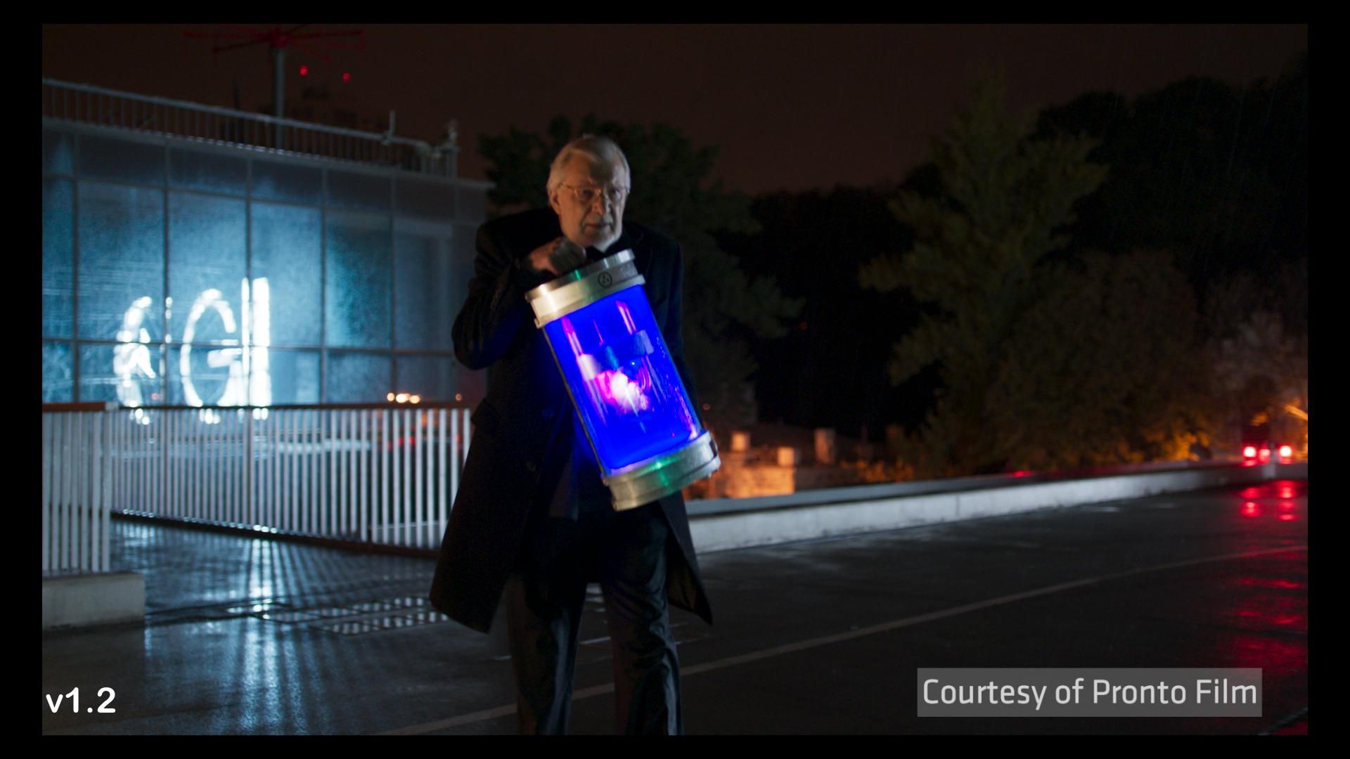
- ACES 0.1.1 is still available and used by some colorists out there since it is quite popular.
- ACES 0.1.1 was arguably an interesting color rendering solution as the images below show.
Lego movies and ACES
During the talk I mentioned this video about ACES. A few things worth noticing though:
- The Lego movies were rendered in Linear – P3-D60, not ACEScg.
- Lego 1 used ACES 0.1.1.
- Animal Logic has an in-house colorist using BaseLight…
- Who used the Gamut compress tool from Baselight 5.0 to create the Rec.709 delivery for Lego Batman.
List of ACES movies and Output Transforms
Another mistake I did in the talk was to mention a list of movies done with ACES. Here is the quote:
This is not exactly true. Kevin Wheatley mentioned it in the TAC meeting of February 2021 (1:02:28). If I understood correctly, ACES is mostly used for exchanging files and archival (in ACES 2065-1). Not necessarily for colour reproduction at display. I guess it will be impossible anyway to know exactly which movies are using the ACES Output Transforms.
VFX workflows and studio requirements
Here is the quote:
Kevin Wheatley.
OMG. I did not expect that! And it goes on like this:
Kevin Wheatley.
1 - This is the official ACES workflow 2 - This is what is happening on most ACES shows at VFX houses.
ACES looking better
Finally I have provided two examples in this talk, which are still on my website, saying that ACES was making them look better. Terrible choice of words! Because, and I hope this post will make up for it, if you pay attention to these renders:
- Overexposed green goes yellow…
- Overexposed red goes orange…
- We don’t see it but overexposed blue goes magenta!
It is basically a “look”, which doesn’t give you a choice. There is a look embedded in the Ouput Transform that you cannot compensate for. And you have every right to like the “ACES look” but I think it also important to be aware of it.
It’s just another great experiment from Jed.
Compensating the behaviour?
There is a couple of animated GIFS (done by Nick Shaw) that shows the issue very well. Could we tweak the values to compensate the ACES Output Transform’s behaviour? Like in the example above with the blue SRGB sphere: “Hey Chris, why don’t you add just a bit of green to compensate?” Sure, let’s have a look:
So, we may think that adding a bit of green would fix the issue? But it only makes the colors take a different path. In this case, towards cyan instead of magenta. That’s all. You cannot escape the “Notorious 6“.
Revelation#15: There is no compensation possible since the Display Transform is behaving like a kitchen sink, or a funnel if you will.
Rendering in ACEScg
My final inacurracy was about ACEScg being the “ultimate rendering space” or thinking that ACEScg would make my renders look better. First of all, “looking better” does not mean anything. It is just a “bait” word.
Secondly, I’m not convinced that all animated feature films should be rendered in ACEScg. The rendering primaries (or working space) could be a choice based on the Art Direction, just like the Display Transform.
And that’s our Revelation #16: RGB rendering is kind of broken from first principles. The different rendering spaces just try to make it a bit less broken.
Daniele Siragusano.
The only thing I can say is that rendering in ACEScg brings us closer to Spectral Rendering. Not that it looks better. Here a few tests done with some colored spheres. I’ll let you guess which ones have been rendered in ACEScg and which ones in “Linear_sRGB/Rec.709”:
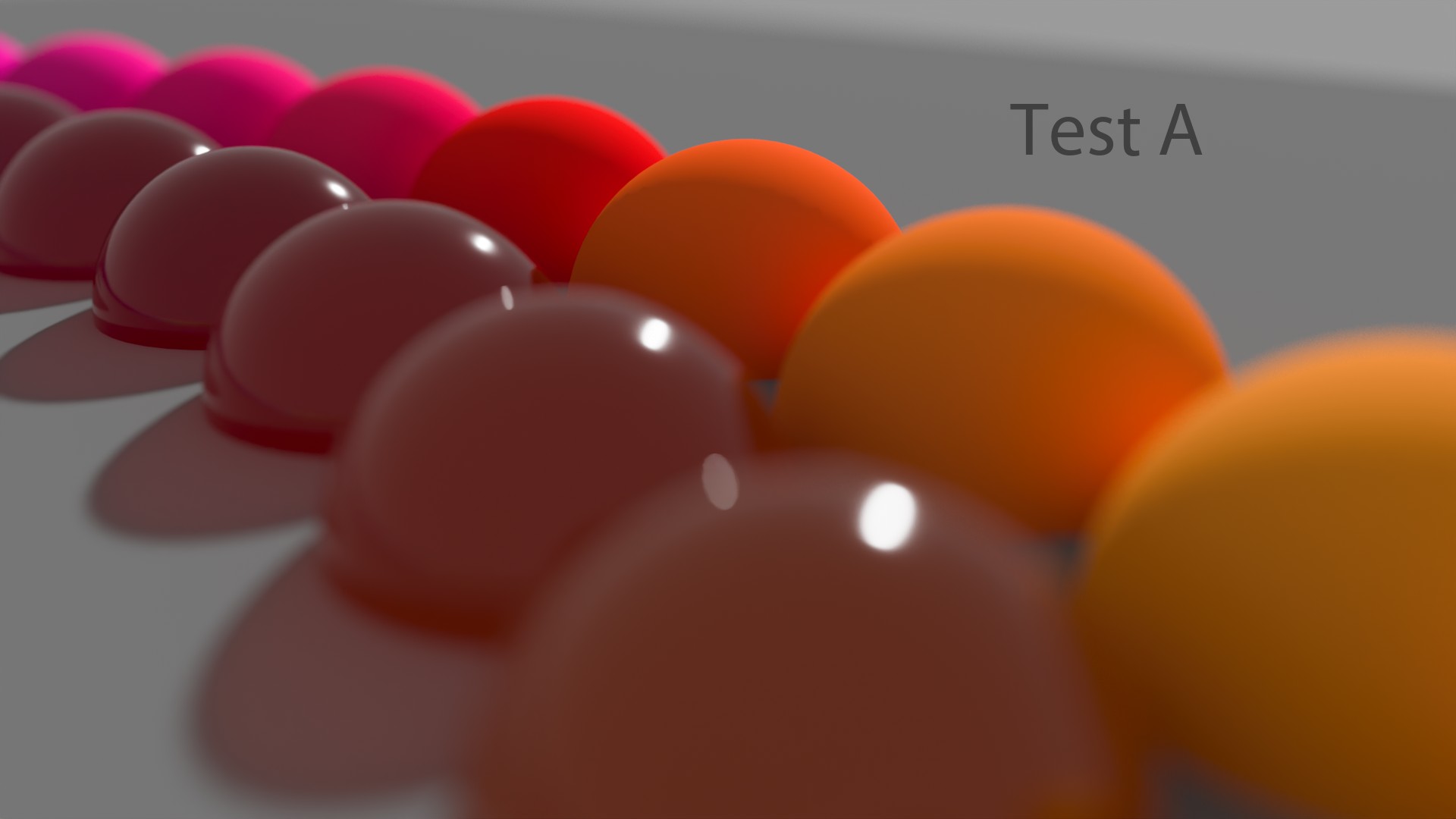
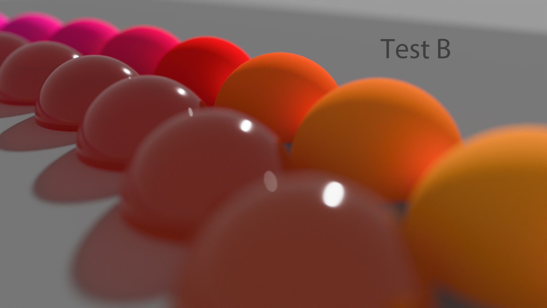
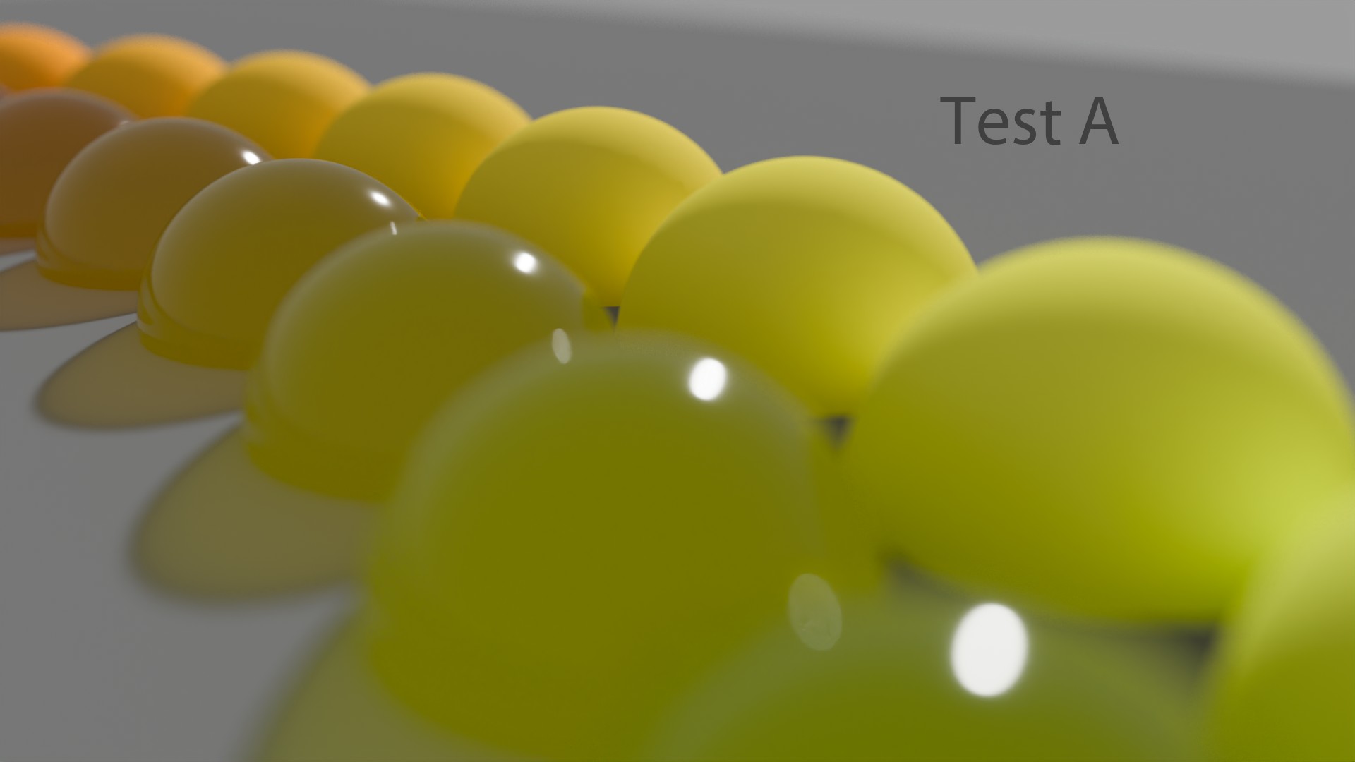
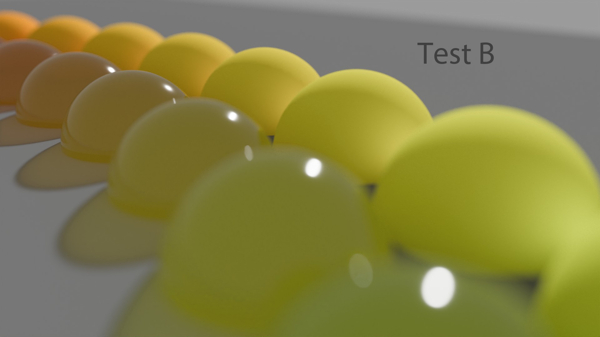
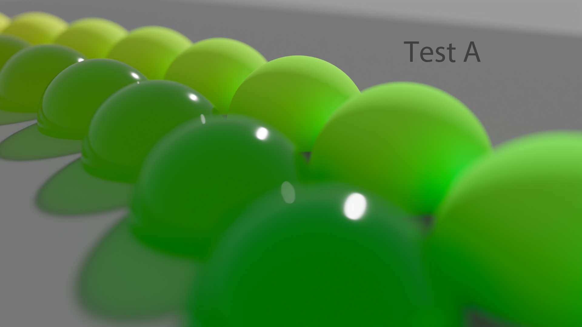
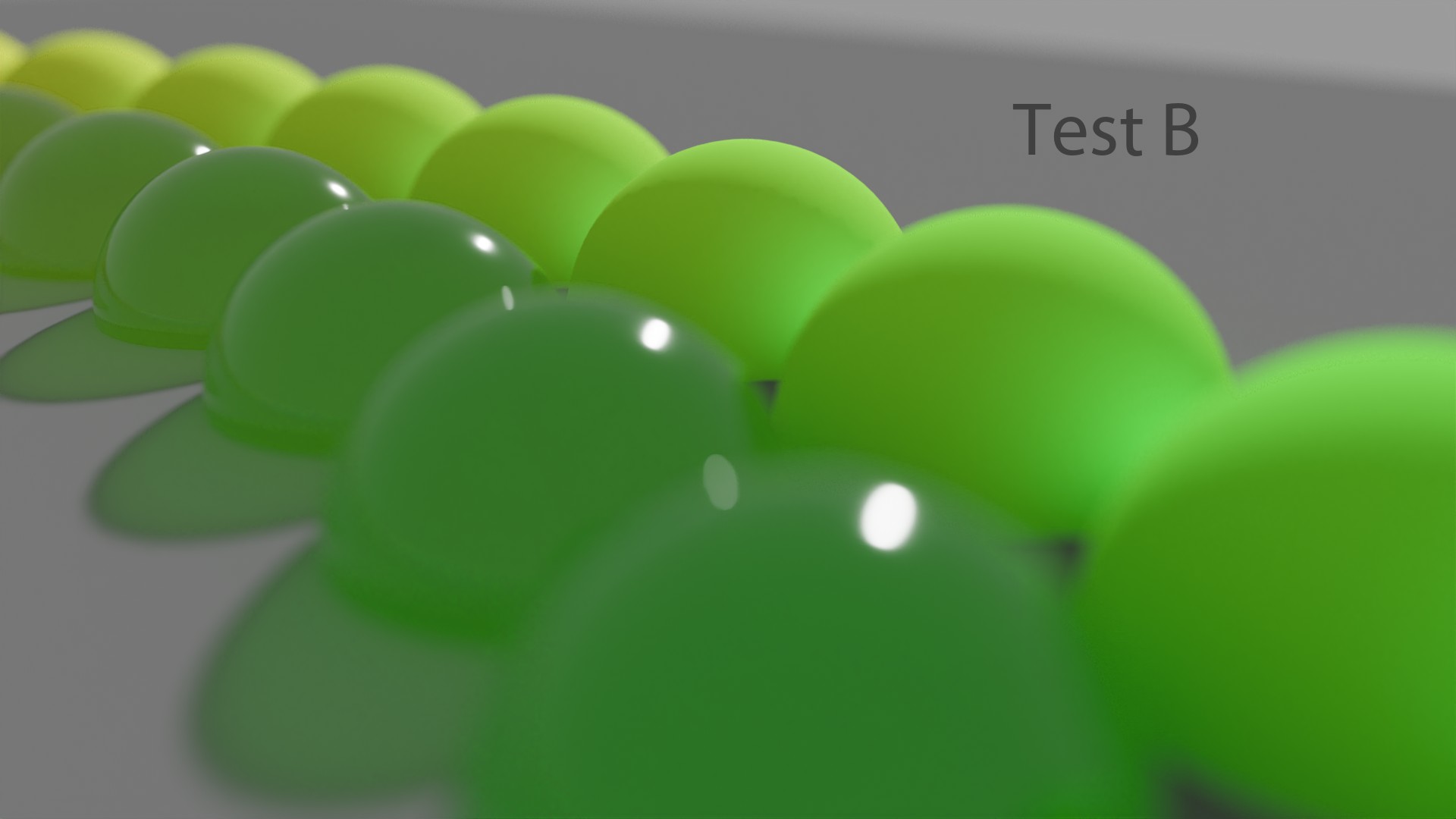
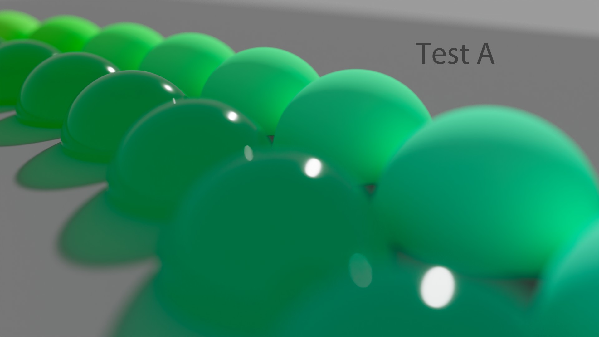
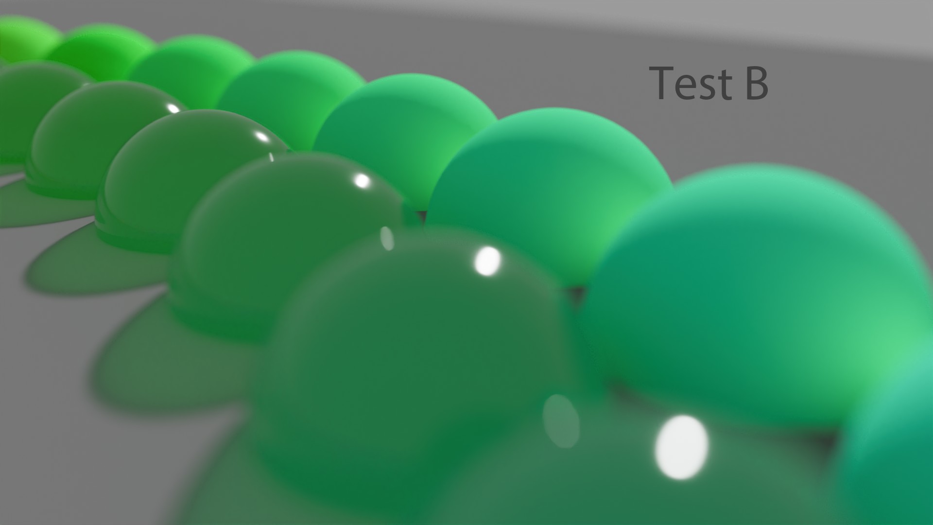
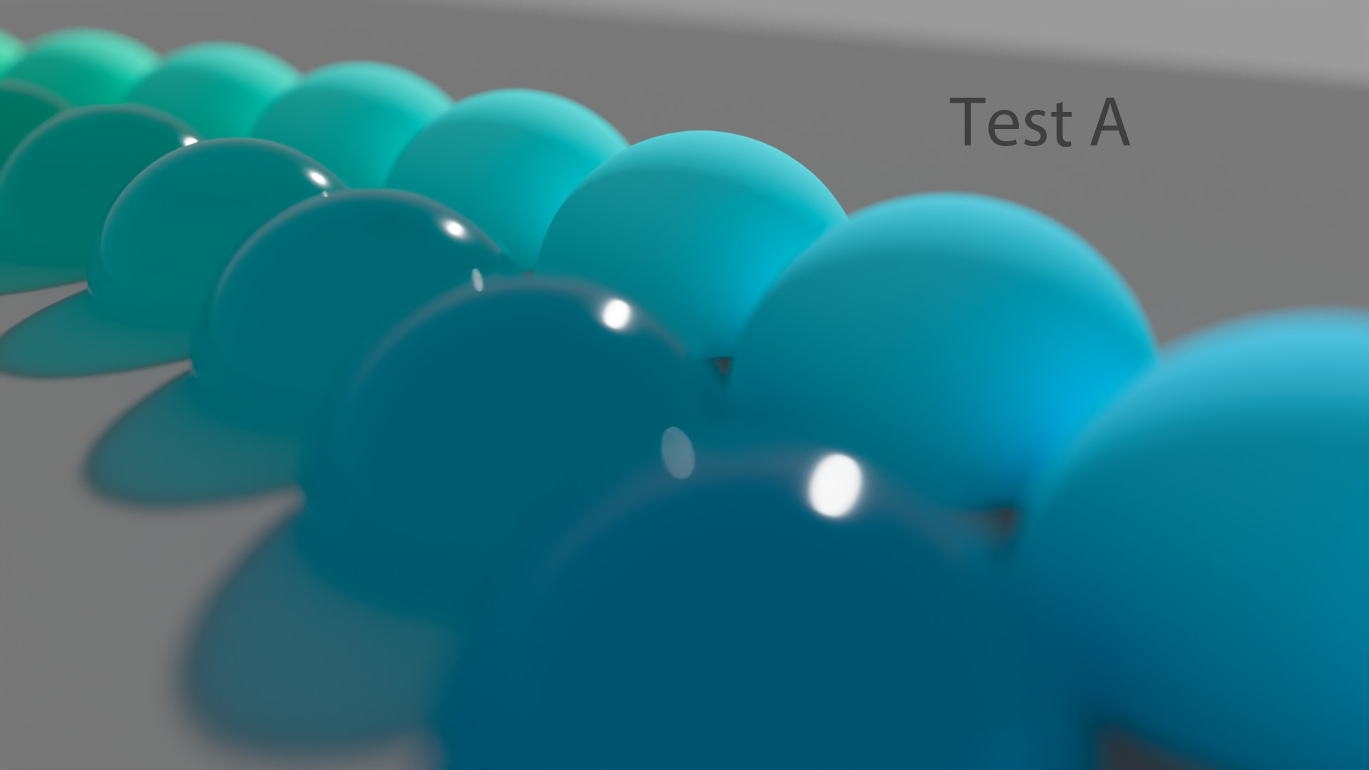
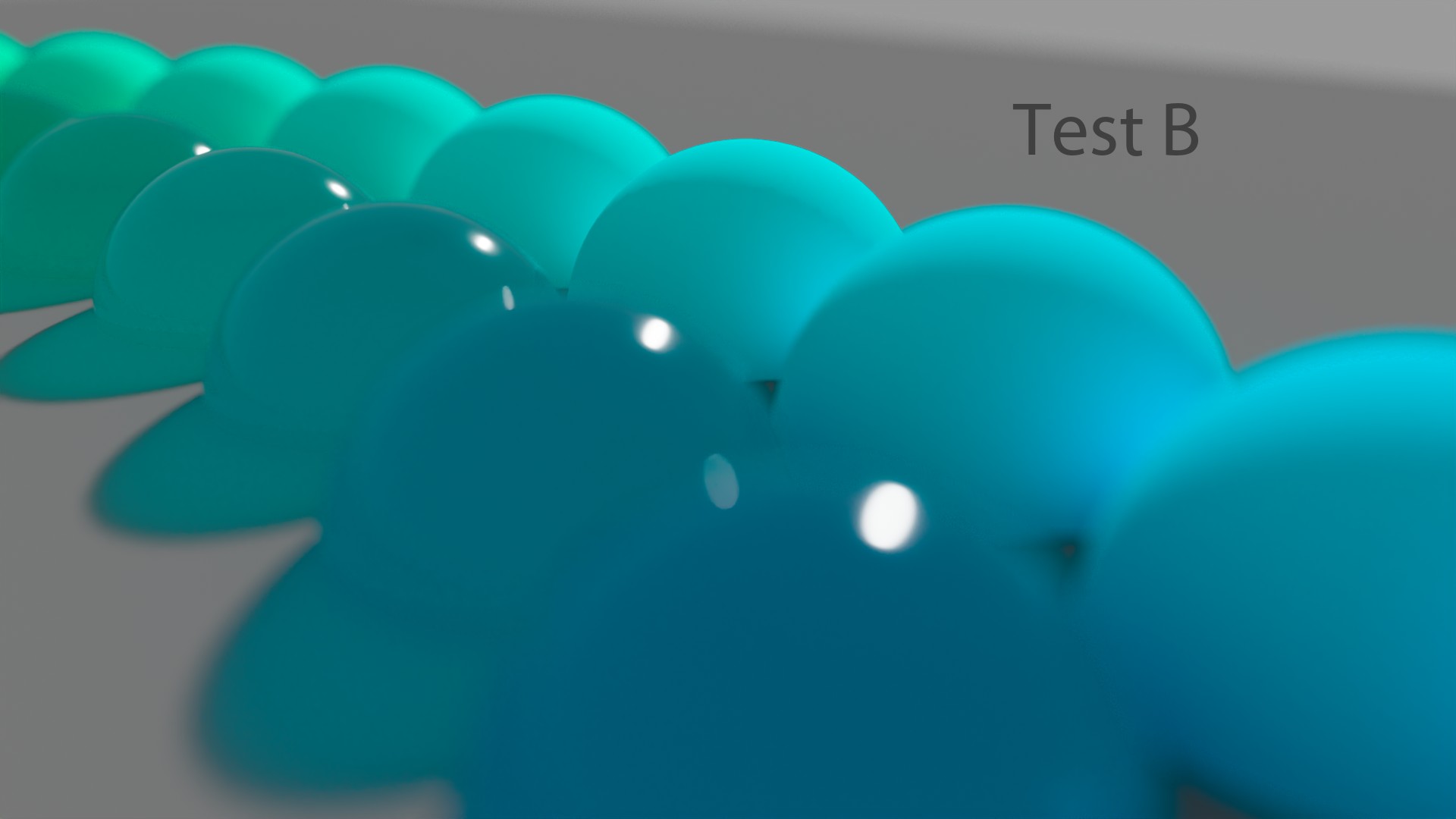
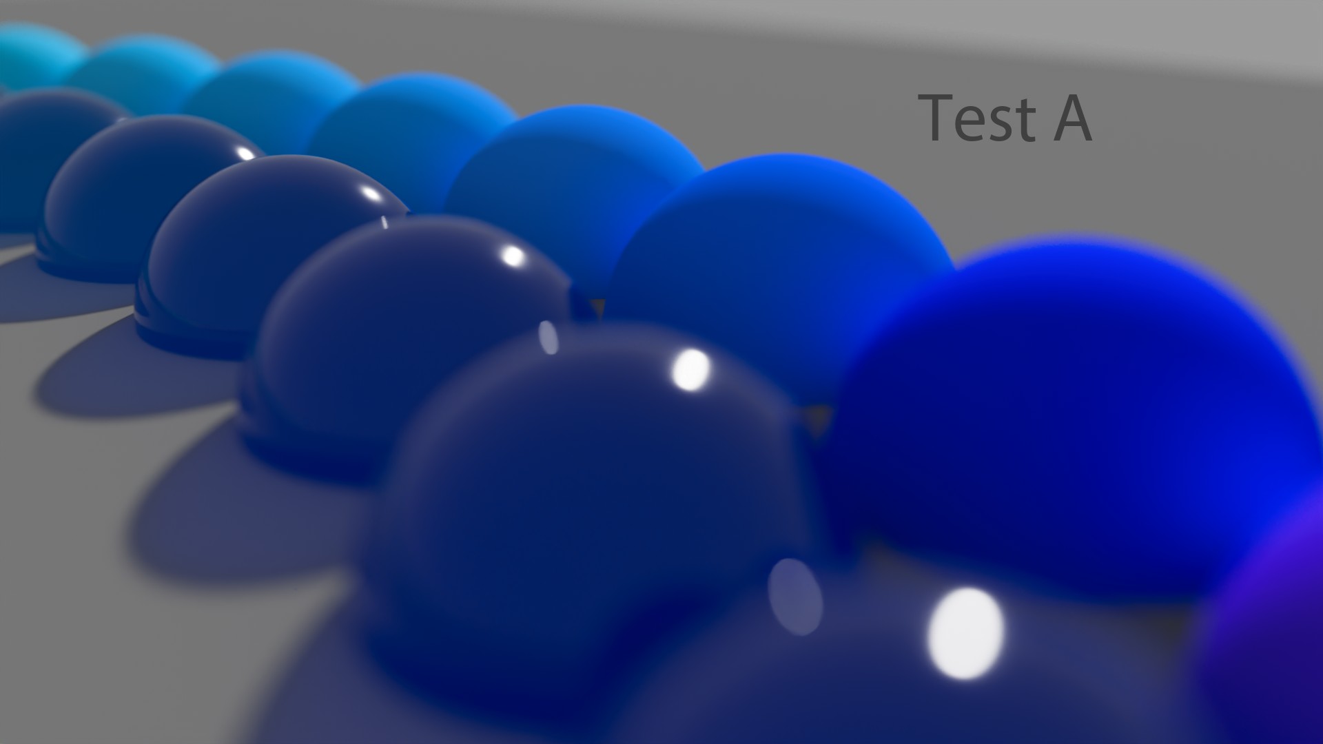
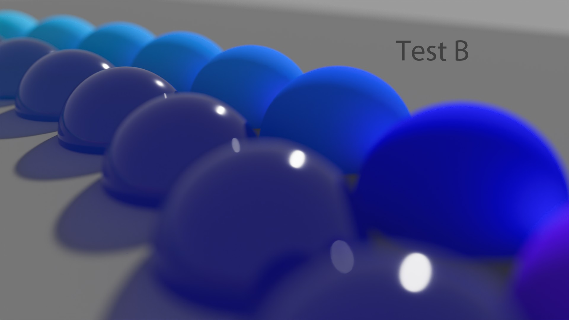
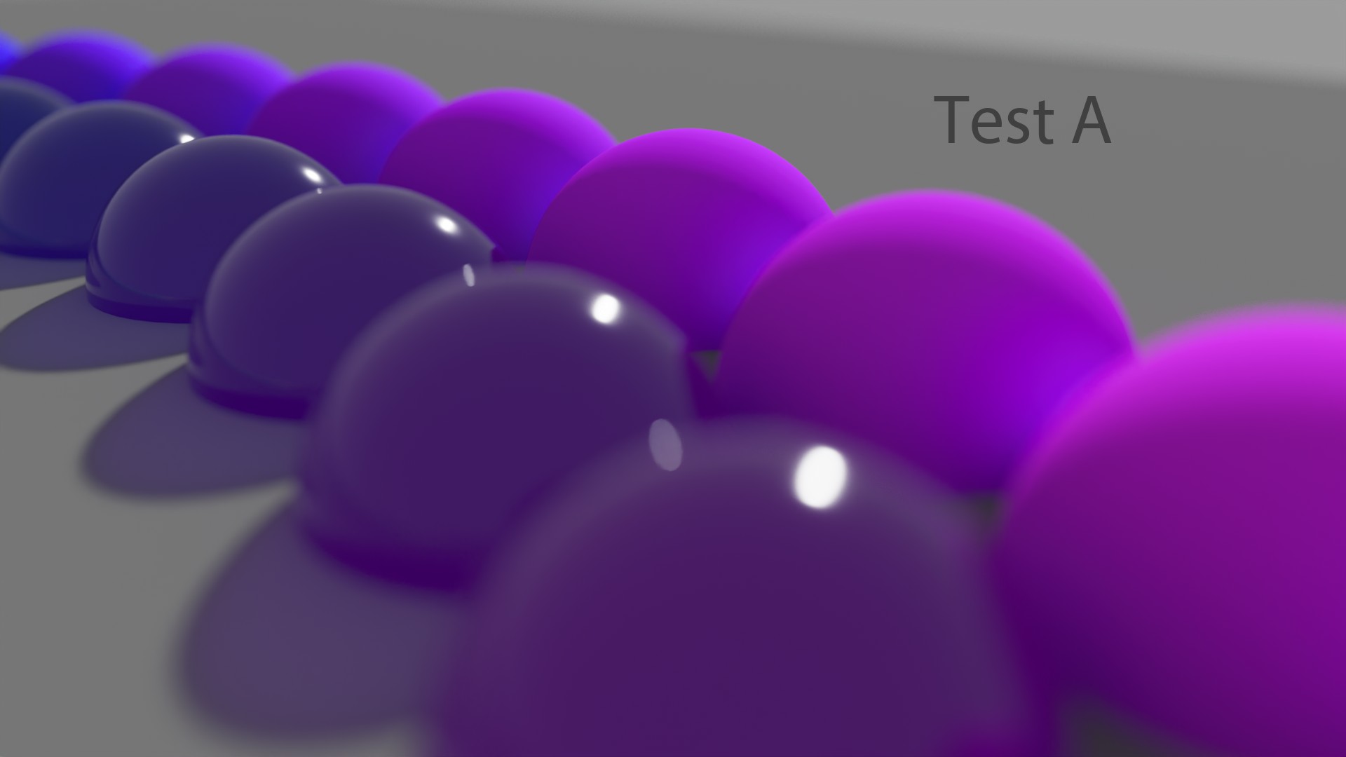
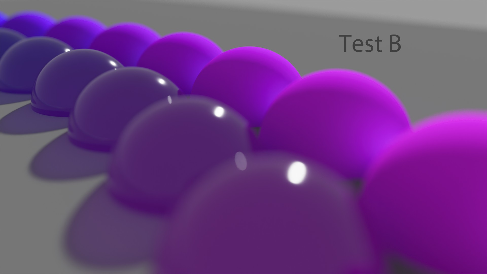
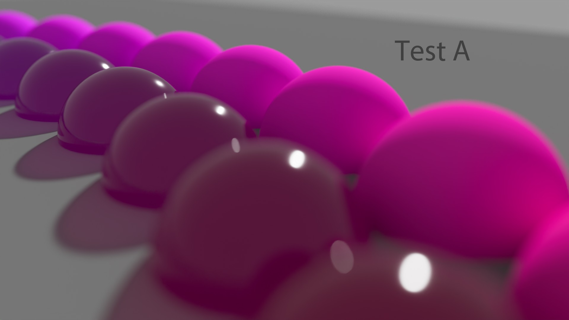
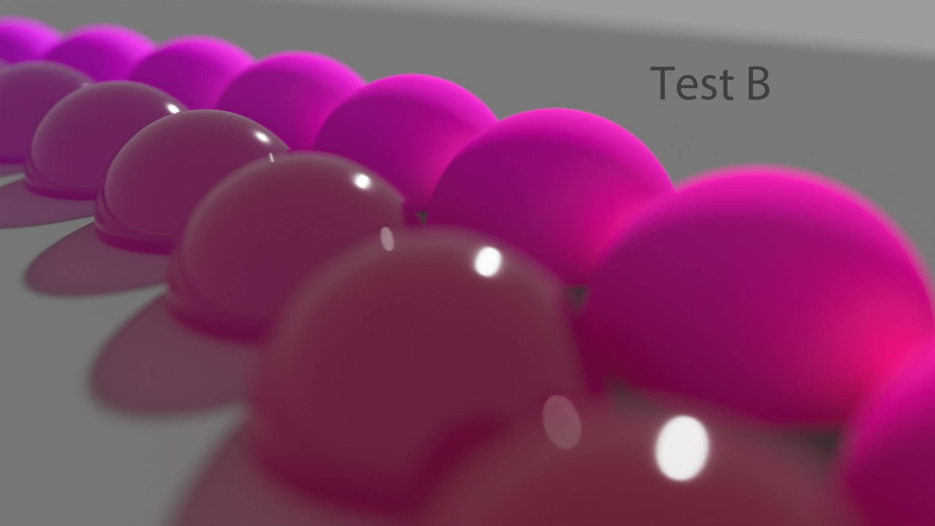
Thomas Mansencal, about RGB Scene Rendering.
So, yeah, normally the “typical” answer about these colored spheres is: “Easy! Test B has been rendered in ACEScg! There is more bounce and Global Illumination.” But nope! That’s the other way around. All of these “Test B” images have been rendering in “Linear_sRGB/Rec.709” and all the “Test A” in ACEScg. Crazy, right?
But I will not repeat my past mistake here: I cannot honestly say one colorspace is better than the other. They give different results and ACEScg is closer to Spectral Rendering. That’s all I can say.
Ground Truth
So, we have seen different Display Transforms, all based on Per-Channel/RGB lookup. Some of them work better than others. But where does this leaves us? Is there some kind of neutral ground truth somewhere? How can we possibly know if what we’re viewing is “correct”?
See Daniele’s post about that.
Chromaticity linear approach
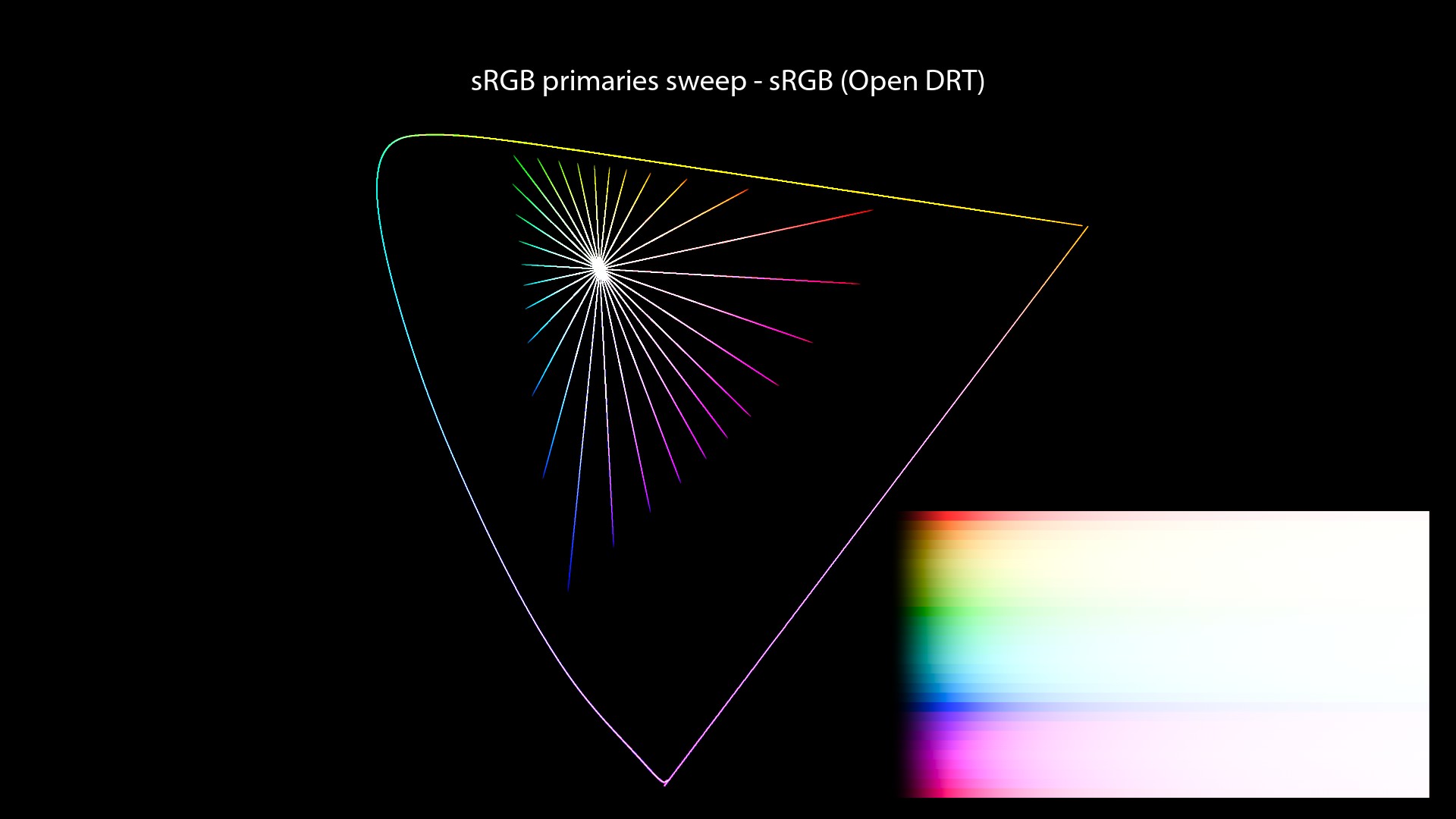
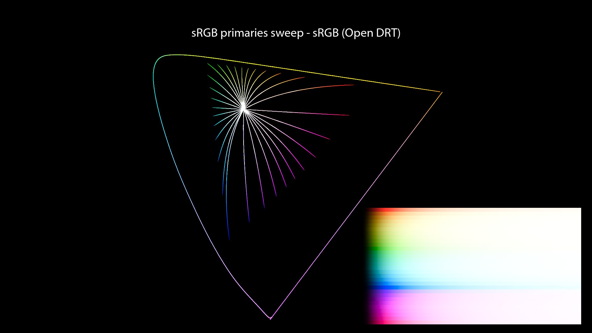
I can only think of two options so far… Remember the plots we have done for each Output Transform? We could consider straight lines in the Chromaticity domain as “neutral”, aka no deformation of the chromaticities through the Display Transforms.
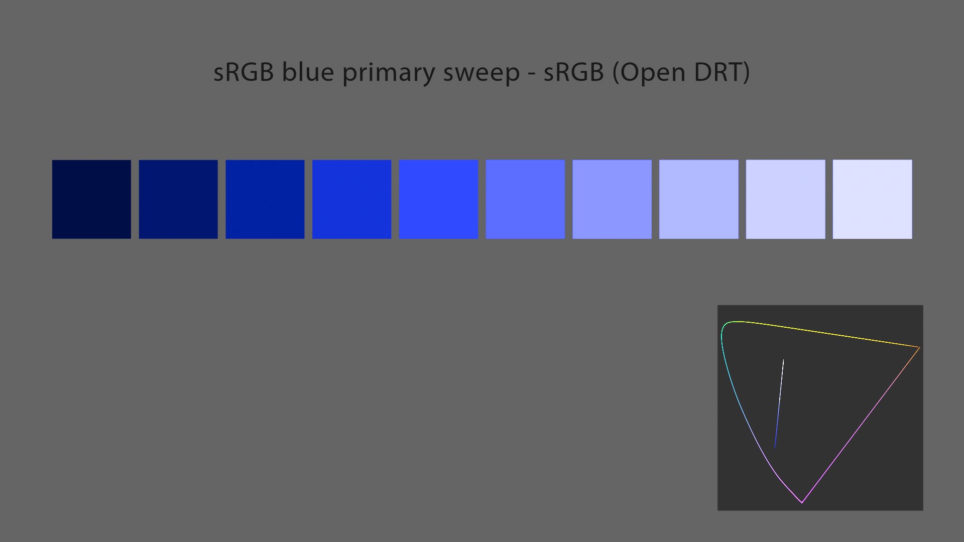
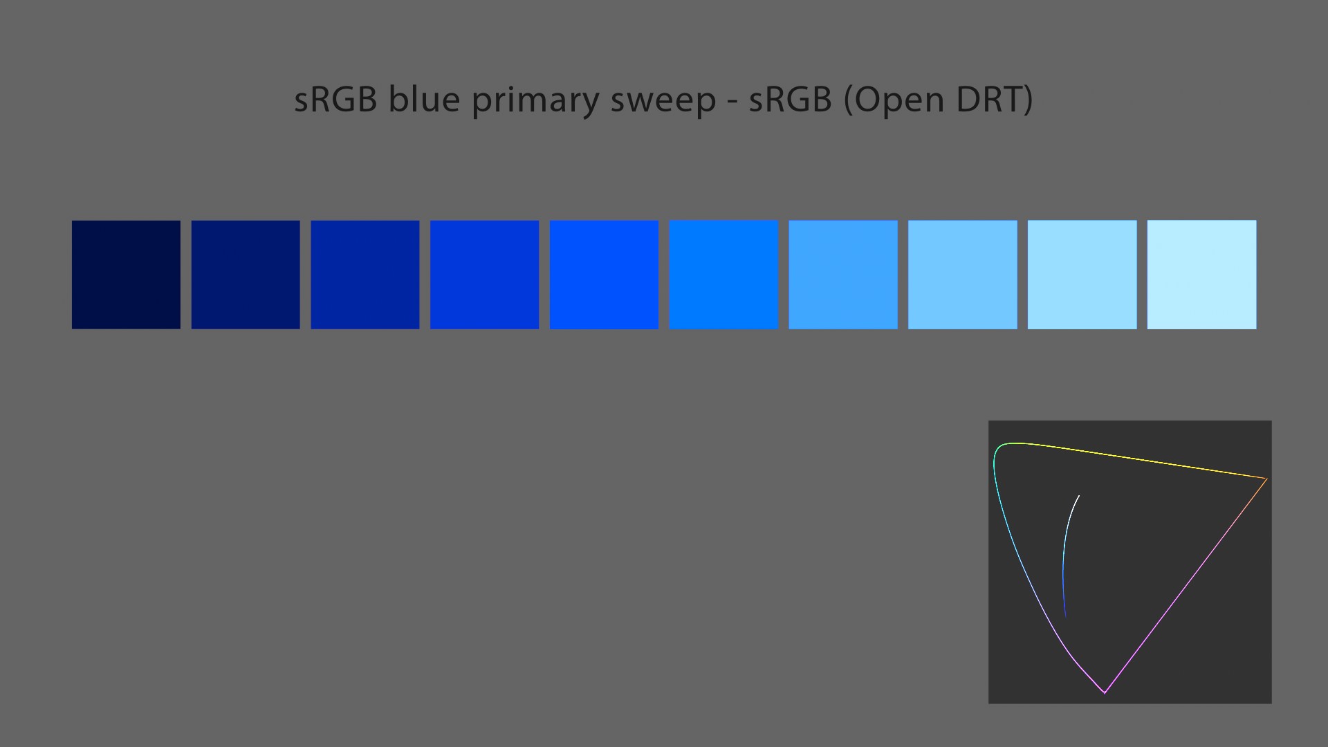
These plots with Open DRT (using v0.0.83b2) were the only ones where I did not have to put crazy tiny values to show properly the chromaticities’ paths towards the achromatic axis. Just look how the stepping is regular and neat. No distortion at all!
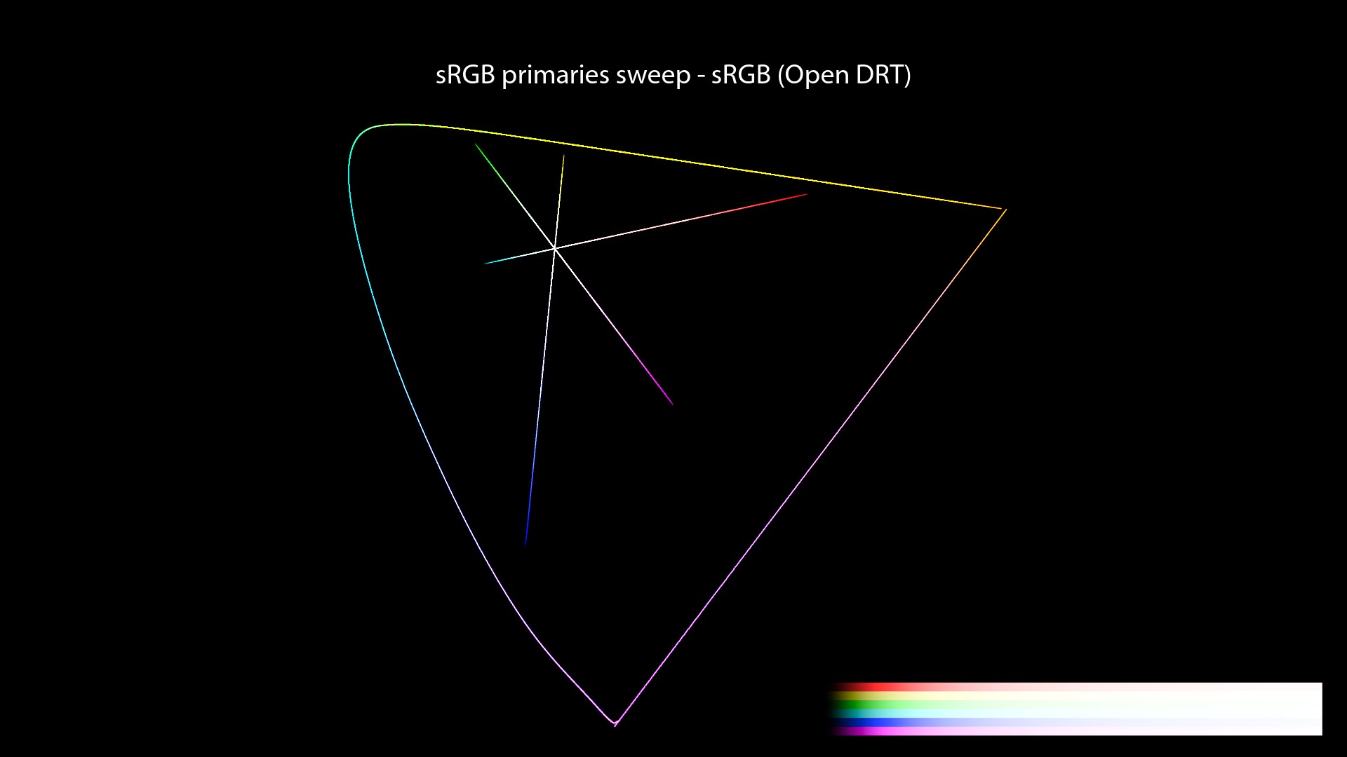


Here are the values used for these plots. A more regular step to show exactly what’s going on:
| Color Management | Sweep Primaries | R | + 0.2 G | + 0.4 G | + 0.6 G | + 0.8 G | Y | |
|---|---|---|---|---|---|---|---|---|
| Open DRT | sRGB | 1, 0, 0 | 1, 0.2, 0 | 1, 0.4, 0 | 1, 0.6, 0 | 1, 0.8, 0 | 1, 1, 0 | |
| Filmic Hable | sRGB | 1, 0.00001, 0.00001 | 1, 0.2, 0.00001 | 1, 0.4, 0.00001 | 1, 0.6, 0.00001 | 1, 0.8, 0.00001 | 1, 1, 0.00001 | |
| spi-anim | sRGB | 1, 0.00001, 0.00001 | 1, 0.2, 0.00001 | 1, 0.4, 0.00001 | 1, 0.6, 0.00001 | 1, 0.8, 0.00001 | 1, 1, 0.00001 | |
| spi-vfx | sRGB | 1, 0.00001, 0.00001 | 1, 0.2, 0.00001 | 1, 0.4, 0.00001 | 1, 0.6, 0.00001 | 1, 0.8, 0.00001 | 1, 1, 0.00001 | |
| Filmic High Contrast | ACEScg | 1, 0, 0 | 1, 0.2, 0 | 1, 0.4, 0 | 1, 0.6, 0 | 1, 0.8, 0 | 1, 1, 0 | |
| sRGB (ACES) | ACEScg | 1, 0, 0 | 1, 0.2, 0 | 1, 0.4, 0 | 1, 0.6, 0 | 1, 0.8, 0 | 1, 1, 0 | |
| sRGB (ACES) | ACEScg | 1, 0, 0 | 1, 0.2, 0 | 1, 0.4, 0 | 1, 0.6, 0 | 1, 0.8, 0 | 1, 1, 0 |
Chromaticity linear definition
It is probably worth taking a bit of time to define what those words mean. There has been some very interesting debate about them on ACESCentral. Several expressions have been used to describe what we’re trying to achieve: “hue-linear“, “hue-preserving“, “chromaticity preserving” or “dominant wavelength preserving“… I won’t go in which expression seems more appropriate since it has been debated by greater minds here.
So I’ll just quote Thomas because his explanation is simple and efficient:
Great definition by Thomas Mansencal.
Achromatic images
The second option I have been playing with is super simple and almost “stupid“. We can desaturate at 100% our images and the tonality is back! It sounds ridiculous but it is an interesting exercise to do. It was inspired to me by the excellent video by Peter Postma (tree example at 04:55).
There are probably more sophisticated ways to calculate the Luminance/Brightness of an image. I have used the simplest one because… I don’t know better!
Let’s have a look!


You need to use the proper “luminance math.” in order to desaturate correctly based on the primaries. You can use Jed’s Saturation tool for ACEScg.
That’s what I did in this post.
I think it is an interesting exercise because it can be very difficult to define exactly what looks “wrong” with the “colour versions“. Let’s try:
What is tone?
And we’re coming to a key element here! All these previous examples use a s-curve for tone-mapping. But what exactly does this mean? What do these two words mean?
- “Tone” as in “Tonality“, which is a range (or a system) of tones used in a picture.
- A range of tones? Like luminance for instance? Or brightness?
So what would Tone-Mapping mean then? This is best definition I have found online:
Rory Gordon nailing it.
I also like very much this definition:
This is what Tone-Mapping should do. Definition by a fellow color nerd.
Revelation #17: According to this definition, we have never tone-mapped. Never. Yeah, thats’s a big one. Hard to believe, right? But if you followed my steps closely, you should see and realize that none of the OCIO Configs described in this post maps properly the brightness to the display. None of them.
And if you have difficulties to trust me, I don’t blame you! But just look at these two images and tell me which one is using a simple sRGB EOTF and which one is “color managed”?
And even better, there is an amazing post on ACESCentral about tone-mapping that was a game changer for me! Let’s have a look!
An historic post
So let’s dive in this great post by Sean Cooper:
About tone
Sean goes on like this:
About Jones Diagram
This is really an historic post:
About Brightness
It is really an amazing explanation:
There’s more to it. Let’s keep going!
About Reproduction
About “Film”
This is the part where I struggle the most: define “Film”.
S-curves and Path-to-white
Finally this leads us directly to our next point… We have explained earlier that “s-curves” have nothing to do with this desired “path-to-white“. Nothing! So what is at play here?
Revelation #18: the s-curve is only one module out of several for a Display Transform. This took me a while as well! And without this enlightening post from Jed, I would have probably never figured it out myself!
If you have read carefully this post, you may have noticed that I have hinted at a very special ingredient. So special that it is only used in “Filmic Blender” and “OpenDRT“. Yes, I’m talking about Gamut Compress/Mapping. Check this demo out:
Revelation #19: In digital RGB land, the path-to-white must be engineered. Values do NOT go magically to white on a digital monitor. They can “only reach” 100% emission on R, G and B channels.
But wait! If all these OCIO configs use the same mechanics (per-channel or RGB lookup), why some of them “go-to-white” and some don’t? Here are a few hints:
- A change of primaries in the Output Transform, like ACES.
- Gamut compression, like Filmic Blender.
- Some secret sauce as well may interfere like the ACES “sweeteners” or the “ARRI Desaturation Matrix“.
I won’t go more in detail here but yeah, that’s a big one. The path-to-white must be engineered properly for digital displays. I’m still properly amazed by this finding!
Chromaticity linear looks weird
Okay, let’s take a deep breath. Where were we? Yes, we were looking at Open DRT and its “chromaticity-linear” approach on the path-to-white. So, problem solved? Colors don’t get distorted… Are we happy with that? Well not exactly! And this is where the most fascinating part kicks in.
Revelation #20: Even if a “chromaticity linear” approach is desirable, it does not create necessarily pleasing images. It is just a layer of “ground truth” that we may build upon.
As suprising as it sounds, we do NOT want necessarily straight lines in the Chromaticity domain to display our images. Because if you have a look at the BT.709 blue primary going to white on a straight line in the 1976 CIE diagram, you may observe what we call the Abney Effect.
Yup, we have just opened a big can of worms: psychophysical effects happening in our Brain (or to be more accurate in the “Human Visual System“). And you can only imagine the challenge it is to model those phenomenons with Mathematics! Because it is not only the Abney Effect… There’s a whole bunch of them!
Another great post by Sean Cooper.
Color Appearance Models
We have now entered the fascinating world of Color Appearance Models, which divide in four types:
- Contrast appearance (Stevens Effect, Simultaneous contrast…)
- Colorfulness appearance (Hunt effect…)
- Hue appearance (Abney effect, Bezold-Brücke effect…)
- Brightness appearance (Helmholtz-Kohlrausch effect, lateral-brightness adaptation…)
And Jed is using (in v0.0.83b2) the ICtCp colorspace to address this perceptual facet. Fascinating! This is another argument in favor of a “chromaticity linear” approach. How can you build a perceptual system (based on sensation) without nailing first the stimulus part (the chromaticities)?
What an eye opener!
This is what per-channel may never give you: a strong fundation to build your house on top. It is a happy engineered accident. There is this quote about Color Appearance Models that I found very interesting. It is from Ed Giorgianni, Color Management for Digital Cinema. I have slightly modified it to avoid any ambiguity:
Because per-channel is altering the colorimetry in an accidental way…
If you want to know more about the ACES Output Transform and Color Appearance models, I would suggest to read this thread from… 2017!
TCAMv2
So now we have understood what Display Transforms are about (hopefully!), you may ask yourself: is there an OCIO config out there that addresses the different topics discussed in this post? And the answer is yes! There is one!
TCAMv2 description
I would like to state clearly that TCAMv2 is NOT open-source. It is the work of Filmlight’s engineers and I am only mentioning it in this article because I have been given permission. Let’s have a look at the config itself:
displays:
  TCAMv2 100 nits office:
    -!<View> {name: "sRGB Display: 2.2 Gamma - Rec.709", colorspace: "sRGB Display: 2.2 Gamma - Rec.709"}
  TCAMv2 100 nits video dim:
    -!<View> {name: "Rec1886: 2.4 Gamma - Rec.709", colorspace: "Rec1886: 2.4 Gamma - Rec.709"}
  TCAMv2 48 nits cinema dark:
    -!<View> {name: "DCI: 2.6 Gamma - P3D65", colorspace: "DCI: 2.6 Gamma - P3D65"}
  TCAMv2 48 nits cinema dark - MWP D65:
    -!<View> {name: "DCI: 2.6 Gamma - XYZ", colorspace: "DCI: 2.6 Gamma - XYZ"}
  TCAMv2 100 nits videoWide dim:
    -!<View> {name: "Rec1886: 2.4 Gamma - Rec.2020", colorspace: "Rec1886: 2.4 Gamma - Rec.2020"}
  TCAMv2 100 nits officeWide:
    -!<View> {name: "AdobeRGB: 2.2 Gamma - AdobeRGB", colorspace: "AdobeRGB: 2.2 Gamma - AdobeRGB"}
  TCAMv2 1000 nits videoWide dim - OOTF 1.2:
    -!<View> {name: "Rec2100: HLG - 2020 - 1000 nits", colorspace: "Rec2100: HLG - 2020 - 1000 nits - OOTF 1.2"}
  TCAMv2 1000 nits videoWide dim:
    -!<View> {name: "Rec2100: PQ - 2020 - 1000 nits", colorspace: "Rec2100: PQ - 2020 - 1000 nits"}
  TCAMv2 4000 nits videoWide dim:
    -!<View> {name: "Rec2100: PQ - 2020 - 4000 nits", colorspace: "Rec2100: PQ - 2020 - 4000 nits"}
  USE ONLY FOR CHECKING COMPS:
    -!<View> {name: LowContrast, colorspace: "FilmLight: T-Log - E-Gamut"}
  USE ONLY FOR COMPARING RENDERS:
    -!<View> {name: ReferenceLINEAR, colorspace: "FilmLight: Linear - E-Gamut"}
“Displays” and “Views” are bit mixed up. But it’s not a big deal since we know how to fix this. This is what I have done in my custom TCAMv2 OCIO config:
displays:
  sRGB 100 nits office:
    -!<View> {name: TCAMv2, colorspace: TCAMv2 - sRGB - 2.2 Gamma}
    -!<View> {name: Raw, colorspace: acescg}
    -!<View> {name: Log, colorspace: acescct}
  Rec.1886 100 nits video dim:
    -!<View> {name: TCAMv2, colorspace: TCAMv2 - Rec.709 - 2.4 Gamma}
    -!<View> {name: Raw, colorspace: acescg}
    -!<View> {name: Log, colorspace: acescct}
  P3D65 48 nits cinema dark:
    -!<View> {name: TCAMv2, colorspace: TCAMv2 - P3D65 - 2.6 Gamma}
    -!<View> {name: Raw, colorspace: acescg}
    -!<View> {name: Log, colorspace: acescct}

active_displays: [sRGB 100 nits office, Rec.1886 100 nits video dim,
P3D65 48 nits cinema dark]
active_views: [TCAMv2, Raw, Log]
One possible improvement in terms of terminology in the TCAM OCIO Config (and that’s what I have done in mine) is that the “Views” name are ambiguous… If the View is called “sRGB Display: 2.2 Gamma – Rec.709“, there is absolutely no way for me to know if this is using a “simple” 2.2 power law or the actual TCAMv2 DRT.
TCAMv2 settings
I have been asked a couple of times about this config’s terminology. Yes, it is different from the ACES’ one and it can be unsettling… But don’t be afraid by a couple of terms that are here to help you! Let’s see if we can classify the information from the config:
| Name | Screen’s brightness | Type | Viewing Environment | Primaries | White Point | Transfer Function | ACES “equivalent” |
|---|---|---|---|---|---|---|---|
| sRGB Display | 100 nits | office | X | Rec.709 | X | 2.2 Gamma | Output – sRGB |
| Rec.1886 | 100 nits | video | dim | Rec.709 | X | 2.4 Gamma | Output – Rec.709 |
| DCI | 48 nits | cinema | dark | P3 | D65 | 2.6 Gamma | Output – P3D65 |
Zach and Jed to the rescue.
By having these details directly in the OCIO config, you don’t have to guess which primaries or EOTF is being used. The TCAM OCIO Config is pretty handy since you have most of the important information in one place.
With the ACES Output Transform, if you have any doubt, you can check the CTL reference code. It is actually super easy to read and has lots of useful information in it. For instance, it clearly states for the sRGB ODT:
// Display EOTF:
//  The reference electro-optical transfer function specified in
//  IEC 61966-2-1:1999.
//  Note: This EOTF is *NOT* gamma 2.2
So please note because this is dead important, that the ACES Output – sRGB uses the sRGB piecewise function when the TCAMv2 sRGB Display uses the Gamma 2.2. That’s a big difference.
TCAMv2 terminology
The TCAMv2 OCIO Config is super light (26 MB) and only contains two families: “SceneReferred” and “DisplayReferred“. Simple and neat! As you can see in the comparison below, the colorspaces and “general concepts” are the same. So it is fairly simple to switch from one to another (especially if you use “roles” properly):
| ACES OCIO terminology | TCAM OCIO terminology |
|---|---|
| ACES – ACEScg | “ACEScg: Linear – AP1” |
| Input – ARRI – Linear – ALEXA Wide Gamut | “ARRI: Linear – WG” |
| Output – sRGB | “sRGB Display: 2.2 Gamma – Rec.709” |
| Utility – sRGB – Texture | X |
| Utility – Linear – sRGB | “CGI: Linear – Rec.709” |
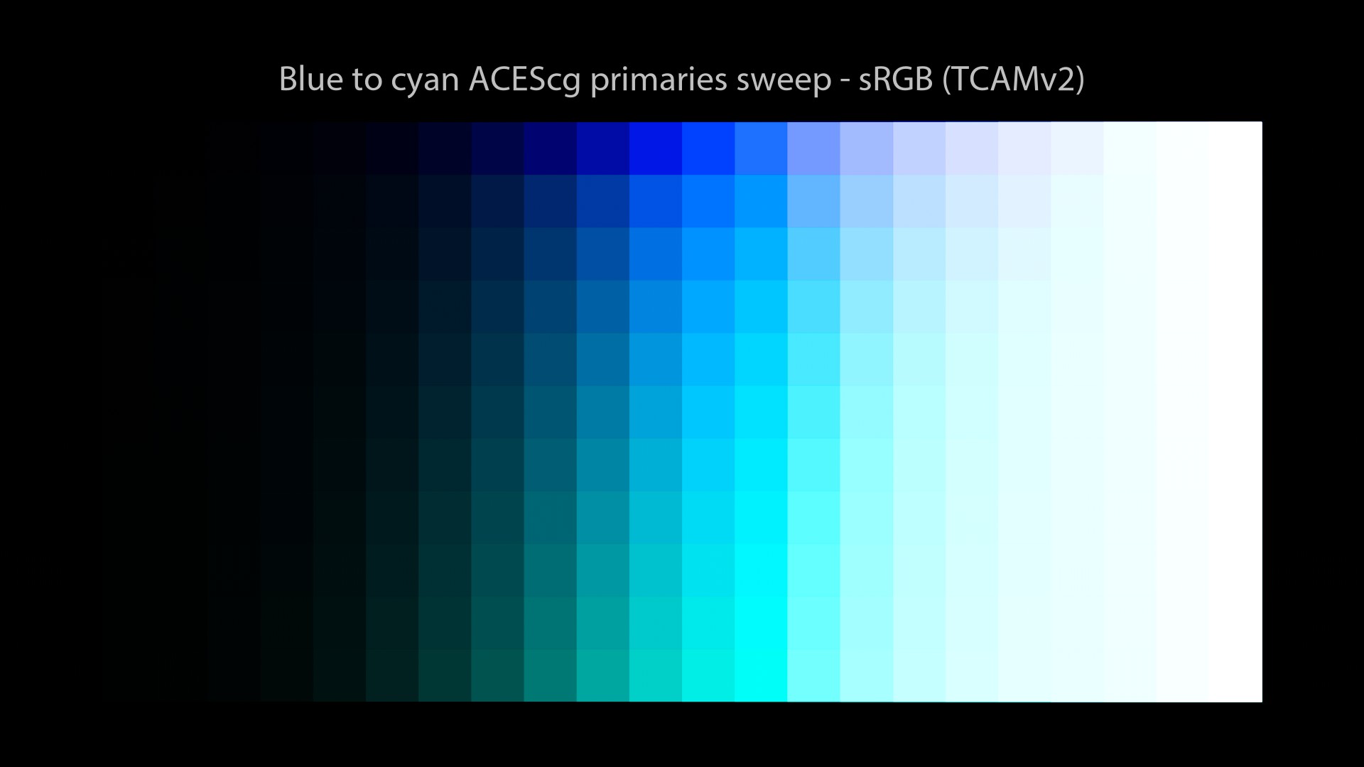
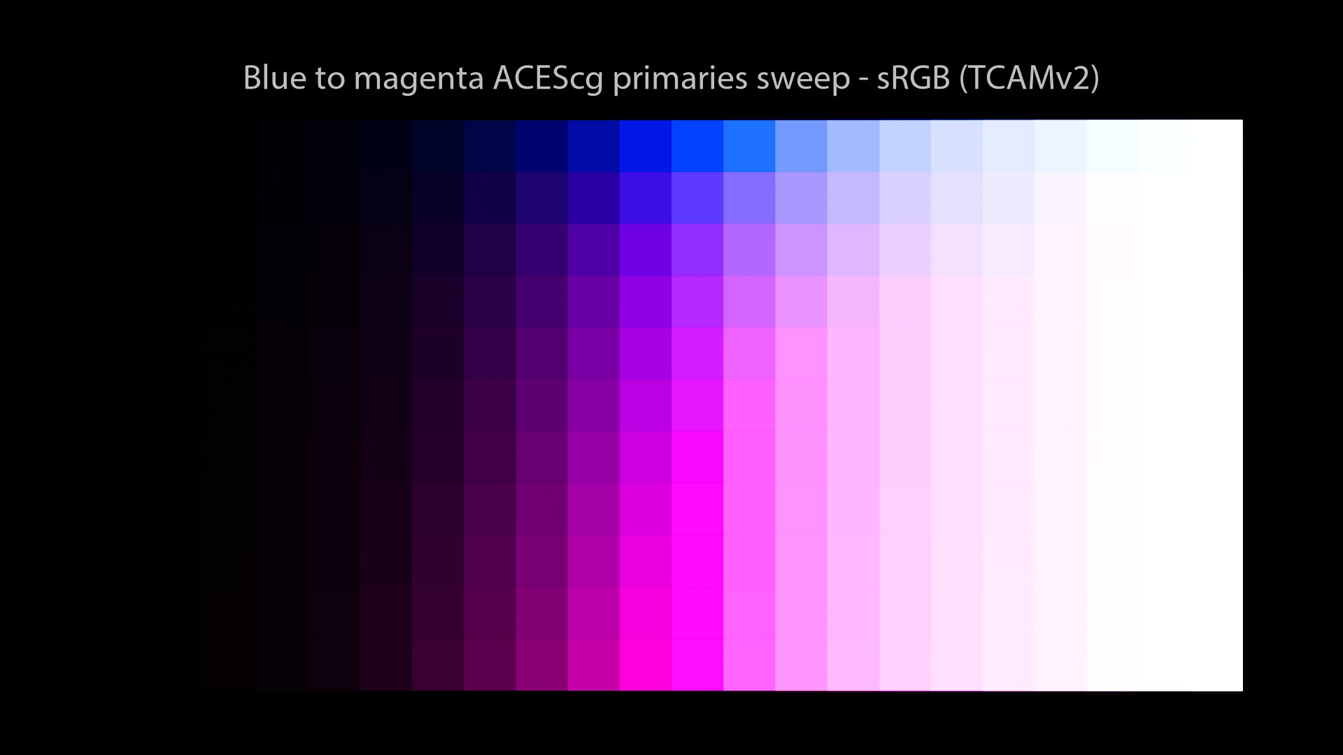
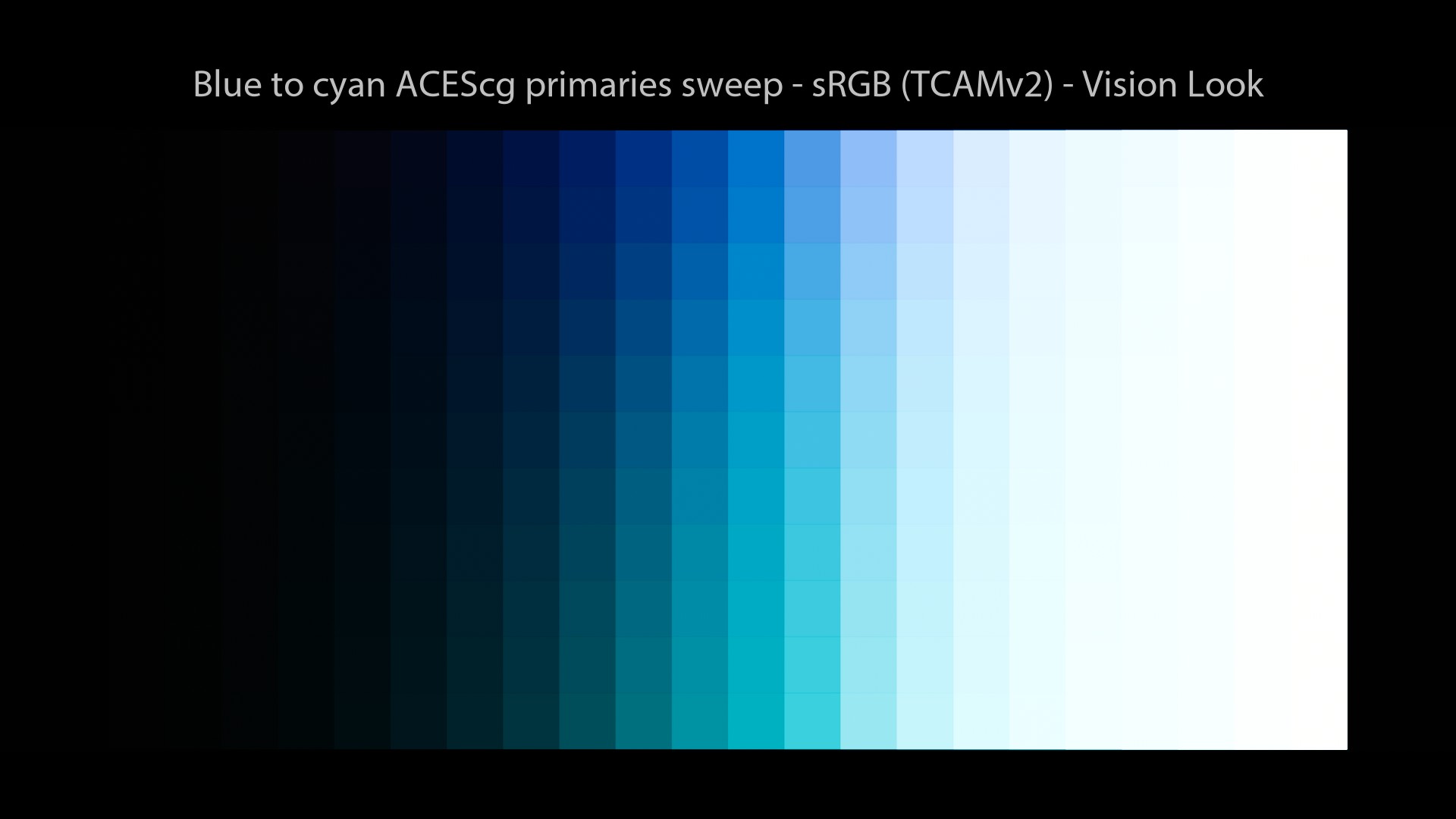
TCAMv2 visual examples
Cool! Let’s have a look at some images now to see how TCAMv2 performs.
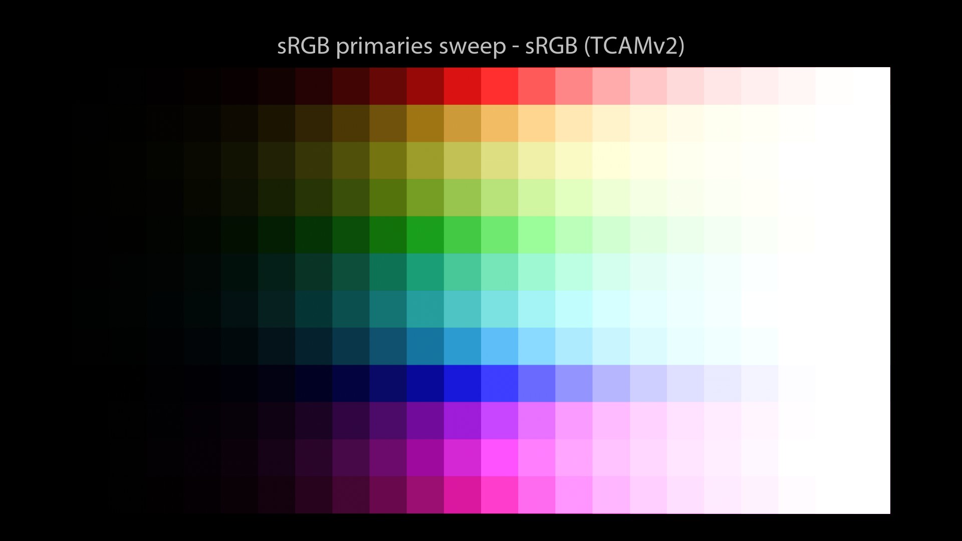
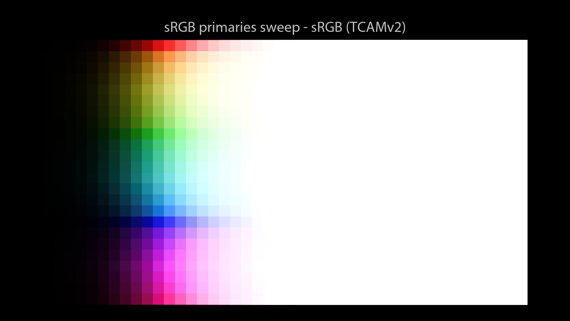
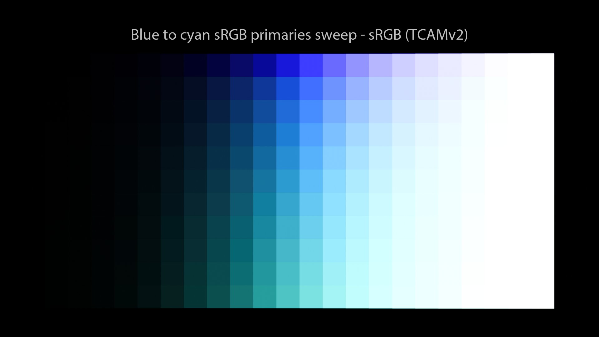
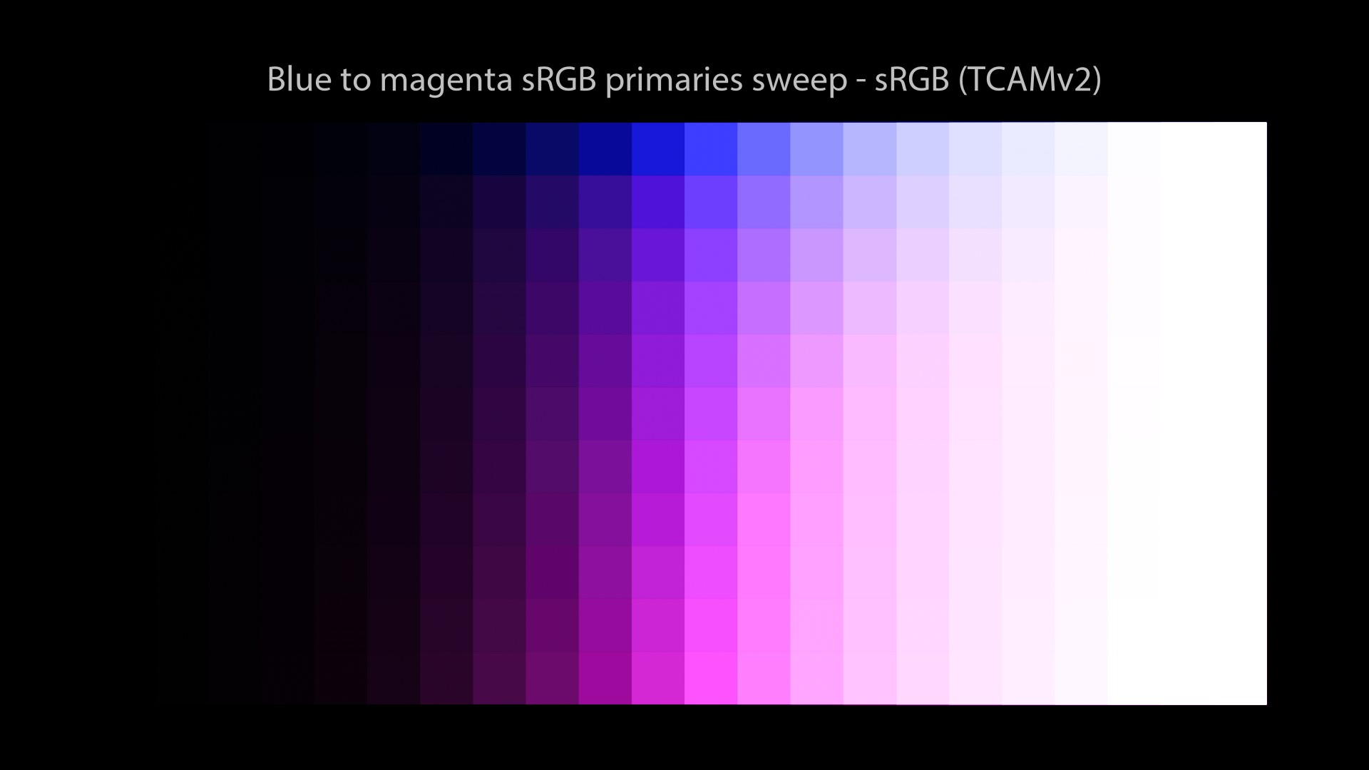
A couple of comments:
- These are pretty good sweeps! Path-to-white on sRGB primaries and no “Notorious6”!
- This looks like a neutral Display Rendering Transform. Finally!
Here is a great explanation about the TCAMv2’s philosophy:
Daniele Siragusano.
And this is a great vantage of this Color Management Workflow. For the first time in my career, I’m going to be able to lookdev an asset in a neutral way, without any arbitrary “happy accident” distortion. And then, when we move to the Lighting/Rendering stage, we can choose a “Look” based on our preferences. Awesome! If you want to know more about TCAMv2, here is a great video of explanation:
But, wait… Should we check our ACEScg images through TCAMv2 to see how they look? Sure, let’s do that! But before a quick recap on the different Color Management Workflows and their colorspaces.
Different colorspaces
I have been told that in order to do a fair comparison between different Color Management Workflows, I should do sweeps in their “native primaries“. For this article I rather decided to do sRGB sweeps for two main reasons:
-
sRGB/BT.709 primaries are our lowest common denominator (as explained above).
-
In the studios where I have worked, textures were still done in this colorspace. Probably for the following reasons:
-
Some softwares (such as Substance Painter) have no OCIO implementation.
-
By painting in ACEScg, you can reach extra-saturated values (such as lasers)… Not ideal for albedos!
-
Most resources (such as Megascans) are still in “Linear -sRGB” as far as I know.
-
Legacy. When you have a library of several terabytes in “Linear – sRGB” in several formats and bit depths…
For sure, some places (such as Rising Sun Pictures) have been texturing in ACEScg since 2017. I am mostly talking about my “limited” experience in a couple of animation studios here.
But I thought it was interesting to observe (as I was building these OCIO configs) that each Color Management Workflow comes with a “Linear space” and a “Log space“. I will just list them here for your information:
| “Linear” space | “Log” space | |
|---|---|---|
| ACES | ACES 2065-1 / ACEScg | ACEScc / ACEScct |
| ARRI | Linear – ALEXA Wide Gamut | LogC – ALEXA Wide Gamut |
| RED | Linear – REDWideGamutRGB | Log3G10 – REDWideGamutRGB |
| Sony | Linear – S-Gamut3 | S-Log3 – S-Gamut3 |
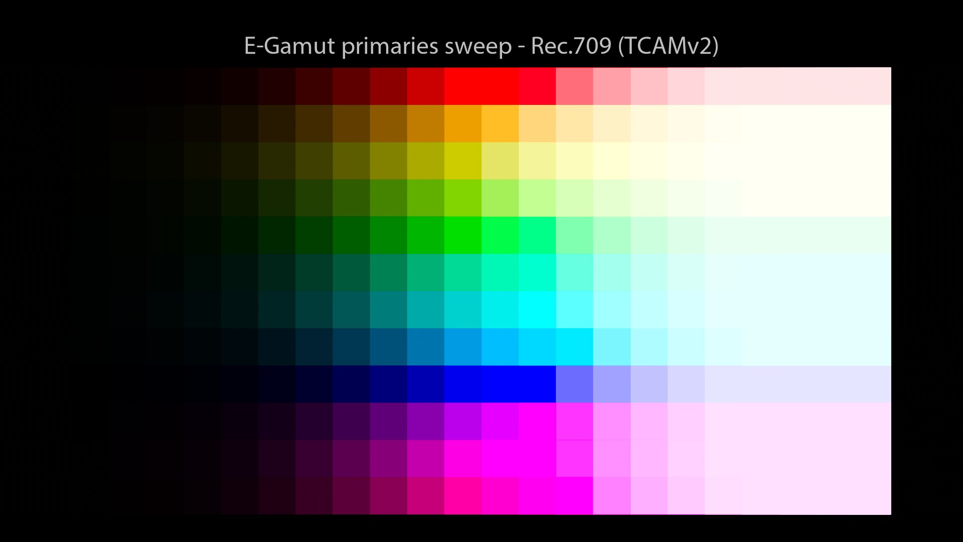
| TCAMv2 | Linear – E-Gamut | T-Log – E-Gamut |
“Native” primaries sweeps
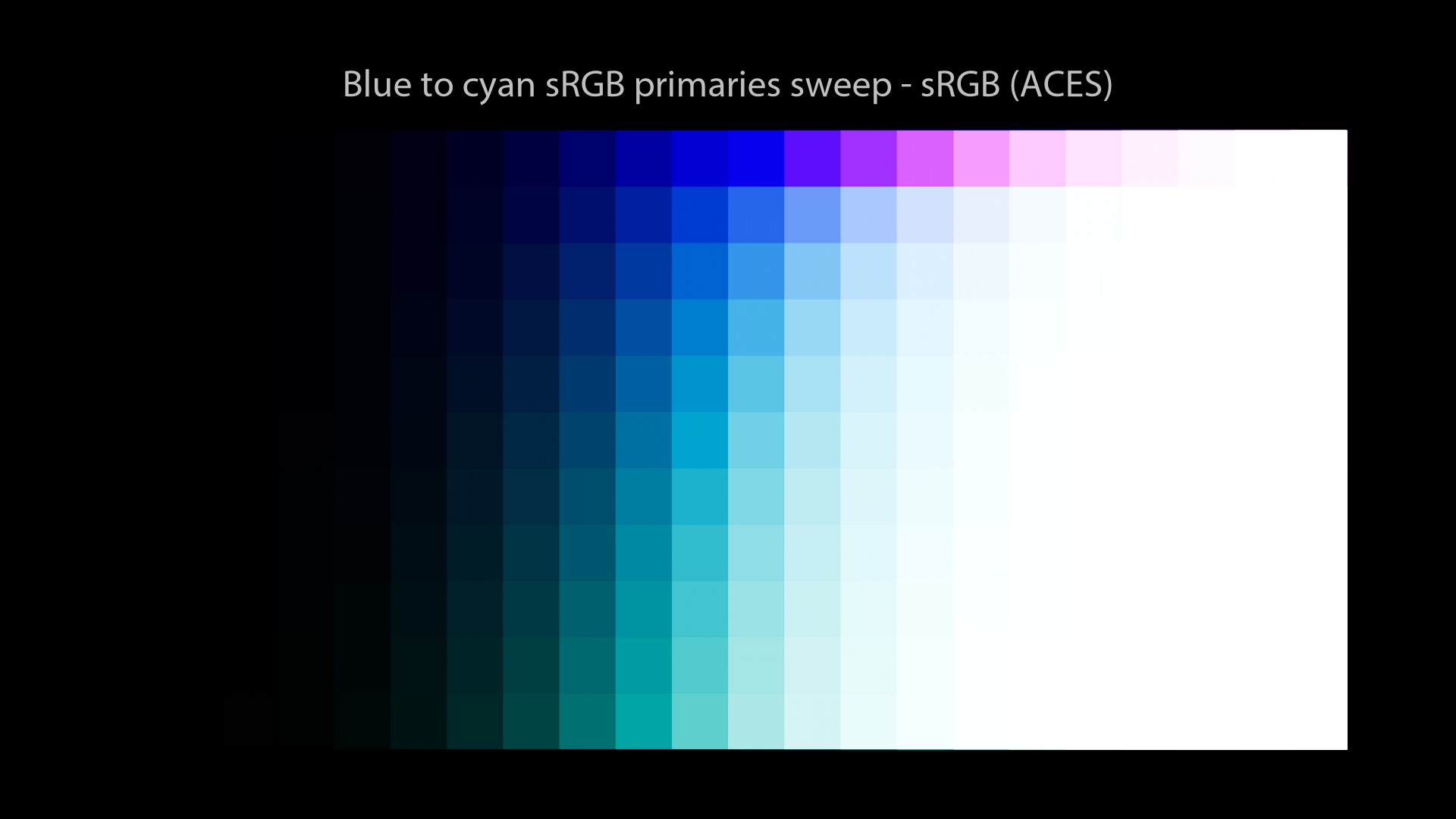
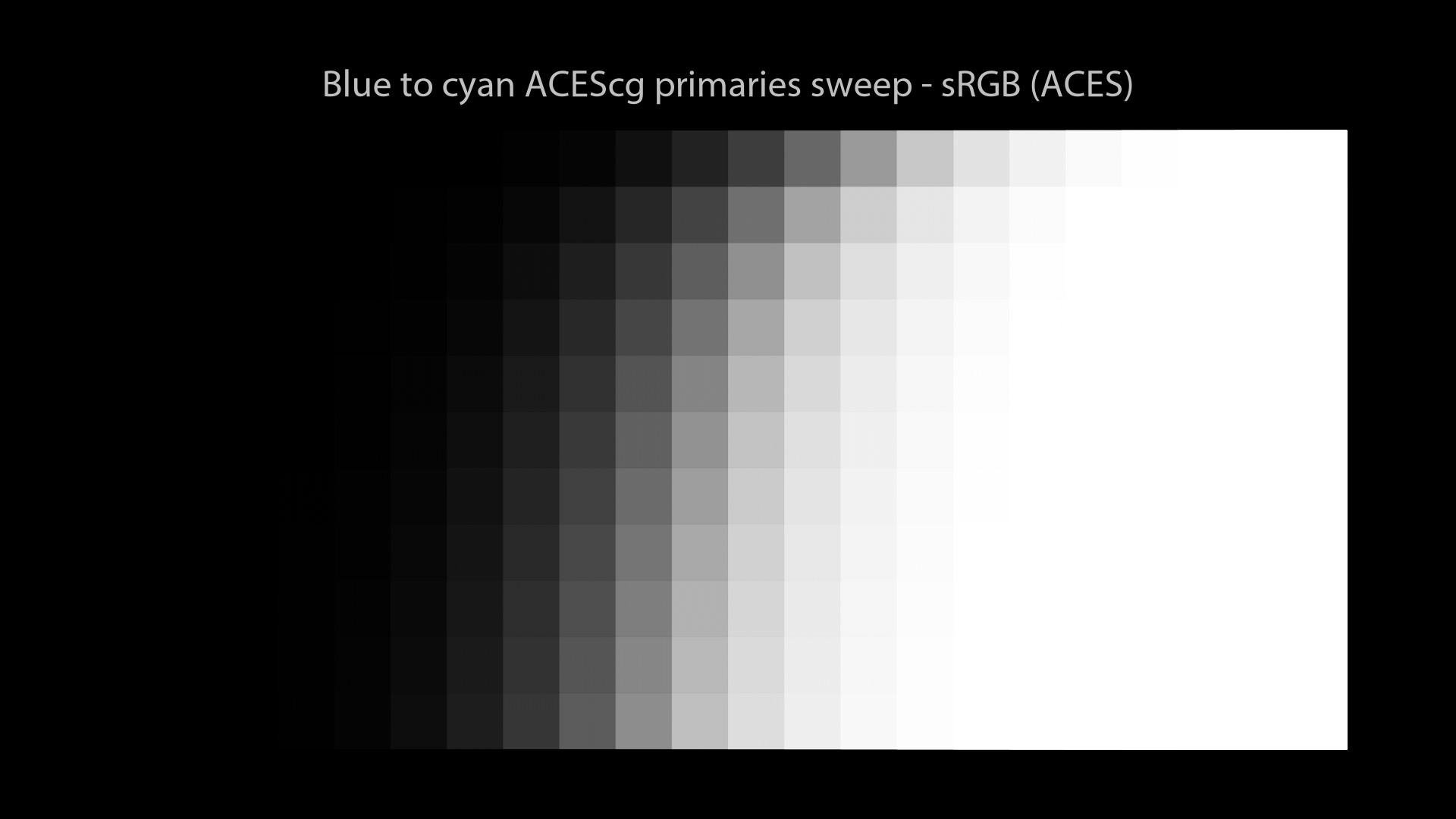
And yes, for completeness I have done these sweeps. I’m not sure if they tell us anything relevant, especially in a Full CG context. But here they are:
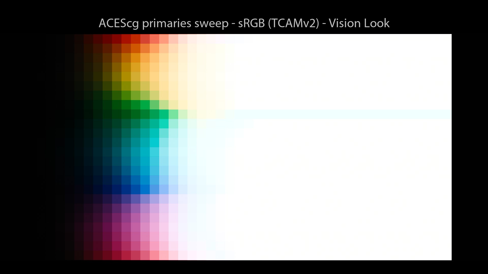
And finally here are our ACEScg images viewed with TCAMv2:
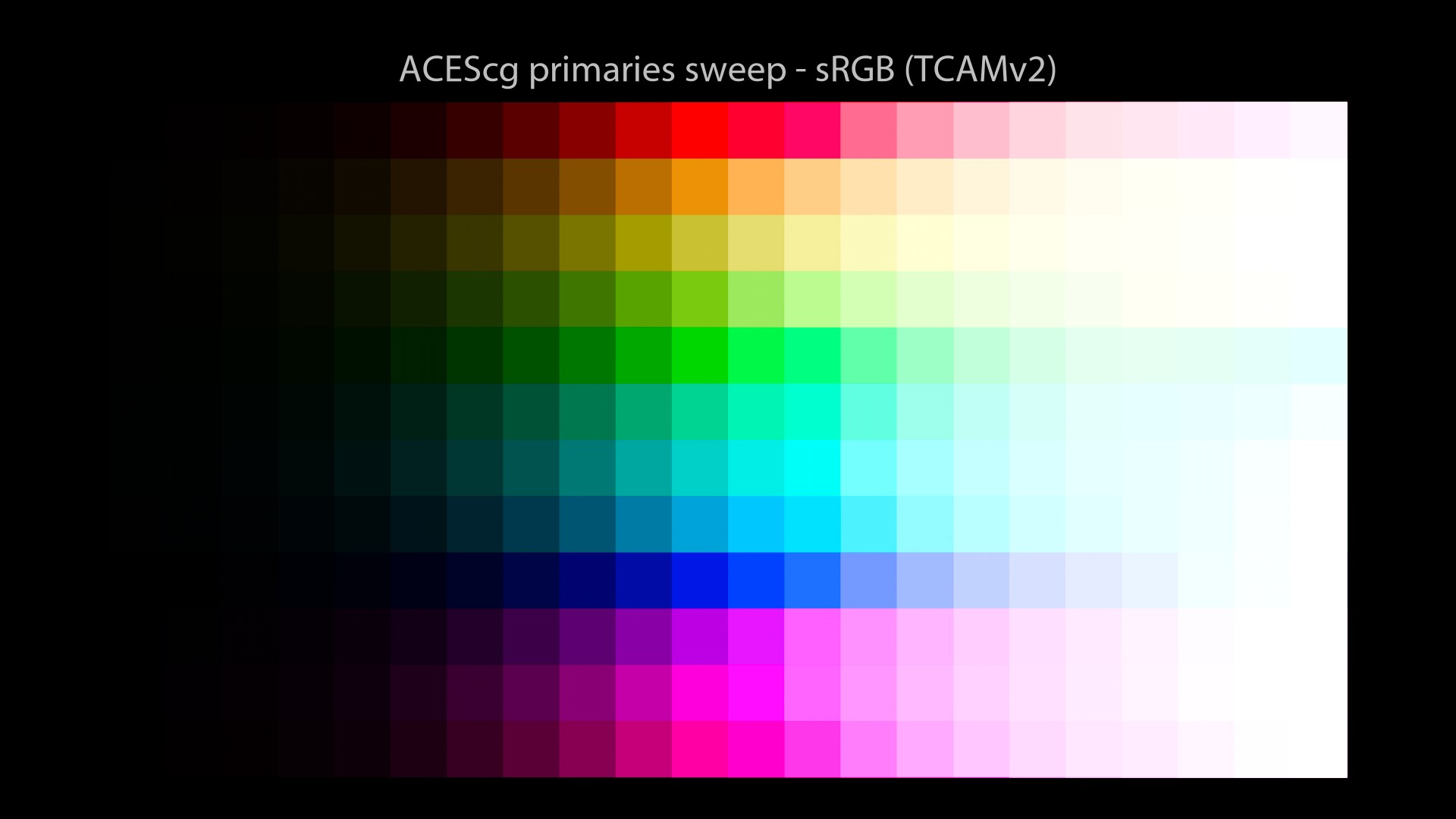
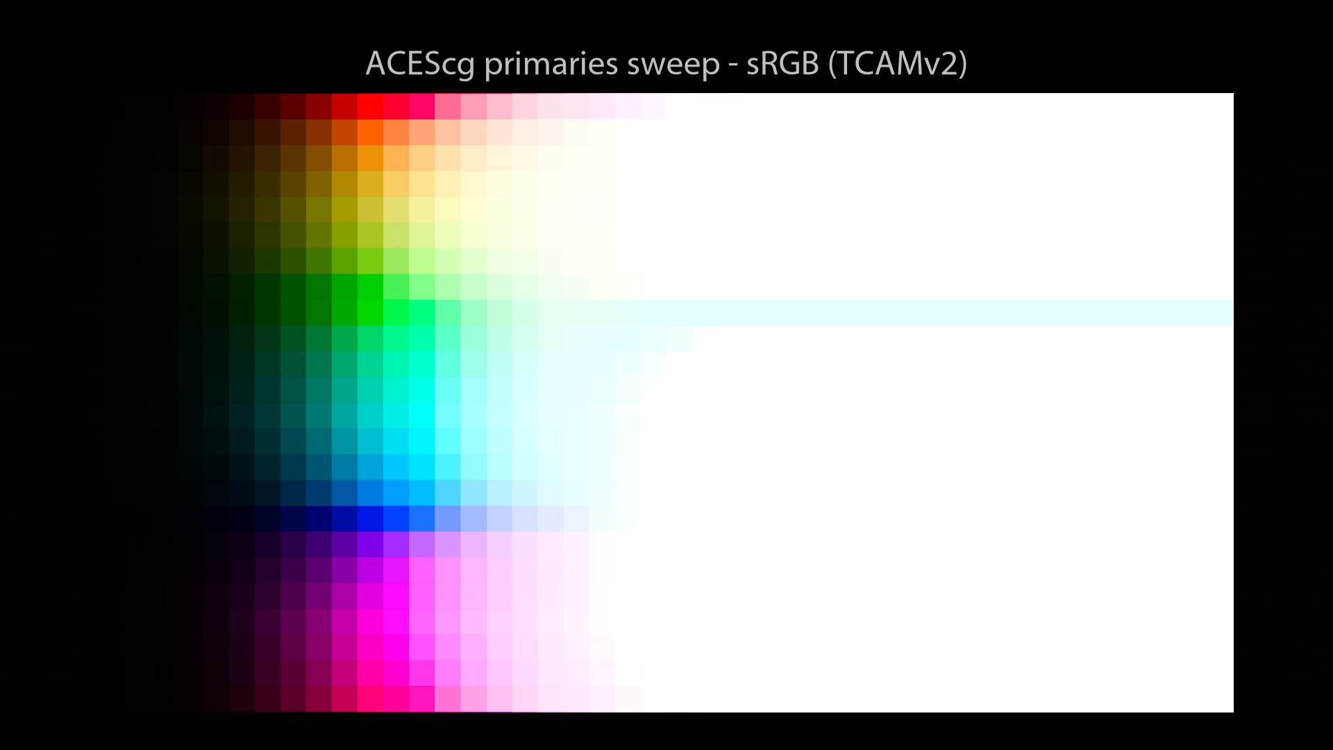
One main observation:
- We do see some Gamut Clipping and Hue Skews by using ACEScg primaries. This is far from ideal.
Why is this happening? Well, there is actually a reason for that. Let’s dive in!
TCAMv2 philosophy
Revelation#22: just like the Filmic Blender, the Display Rendering Transforms from TCAMv2 should not be used without a “Look“. Ideally, you should not use one without the other. As Daniele explains:
Daniele Siragusano.
So a choice has been made for TCAMv2 to have a “loose” Display Transform, that does the strict minimum to give colourists as much freedom as they need. Otherwise, if the Display Transform is too “restrictive”, it can become a pain to achieve a certain “Look“. There is this great video that explains it properly:
We are going to describe now a very important component of the TCAMv2 success: “Looks“. For clarity, I would like to state that TCAMv2 Looks are proprietary of FilmLight and should not be used without buying a license.
TCAMv2 looks
What are “Looks” exactly? What do we do with them? They’re just a creative grade baked into a LUT, right? How hard can it be to generate them? That’s what I have thought for a very long time until Daniele said during one of the VWG meetings:
Hum… I have probably misunderstood something then… This comment got me thinking really really hard! Because a “Look” (or “LMT”) is generally a color correction baked into a LUT and that’s pretty much it. So I asked and I got this amazing answer:
Nick Shaw to the rescue.
Okay, I did not expect that. Fascinating, really! Revelation#23: a look can contain much more than a grading node baked in. You can put way more complex and engineered stuff in a 3d LUT than a “simple” grading node.
Looks and Studios
I completely acknowledge here that my understanding of “Looks” is pretty limited. I’d say that “Looks” are not very common in most animation studios I have worked at. I’ll quote Kevin Campbell here:
Thanks Kevin for the precision. There are indeed differences between VFX and Animation workflows.
So let’s study one “Look” from TCAMv2 called “C-105 Vision”! I have especially chosen this look on purpose because it is one of the most impressive from TCAMv2 and has a making-of available online about its genesis.
C-105 Vision Look
Here is its description:
There is a making-of about this look (at 00:26:25) where Daniele explains his method to spectrally simulate a film-negative. Yep, that’s crazy impressive! This is probably one of the best Color Rendering solution out there. Do not hesitate to watch:
So, let’s have a look at our images with the C-105 Vision Look:
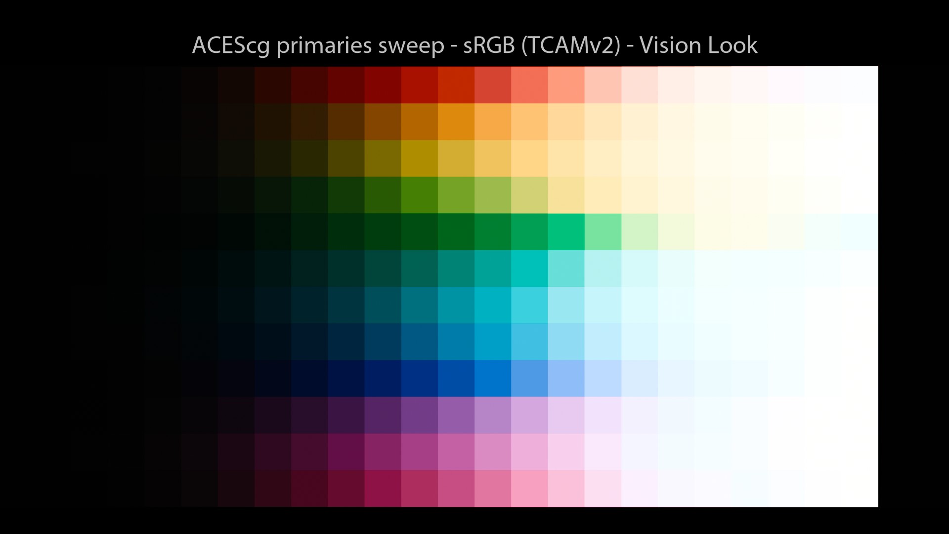

You have every right to like or dislike these images: the look is a creative and subjective choice. But here is the key: you have a choice! So you could imagine for each feature film, to sit with the Director and the Art Director looking at sweeps, images, references and to choose your “Preferred Color Reproduction“.
This “Look” could be based on the story, the characters or the emotion you want to convey. It could be set at a movie, sequence or even shot level. Really the possiblities are endless since you’re starting with a neutral Display Transform. Power to the image makers.
Revelation #24: in a full CG feature film, chosing an OCIO Config (and even the rendering primaries) is as important as chosing the camera, lenses and film stock for a live-action Director of Photography!
True; ARRI, RED and Sony also provide some looks for their Color Management Workflows.
Thanks Scott for the links!
Quality and Idendity
As a studio or freelance artist, you may be looking for two things:
- Quality.
- Visual Identity.
And if all studios and 3D shools end up using the same per-channel solution, we may never have both. So here is a little experiment I did to show you better the differences, especially the reange of values between different Display Transforms. Most of it was already described here on ACESCentral.
This test has been inspired by this thread on AC. I had been looking for a while to render something “iconic” for the Virtual Working Group (VWG). And by reading the notes on Gamut Compression, I thought: what is more iconic than a can of Coke?
So I did a bit of research to get the coca-cola red values, convert them to “linear-sRGB” and ended up with an exr texture of (0.9047, 0, 0). I then lit with an HDRI (the “treasure island” one) and a distant light. Here are the results:
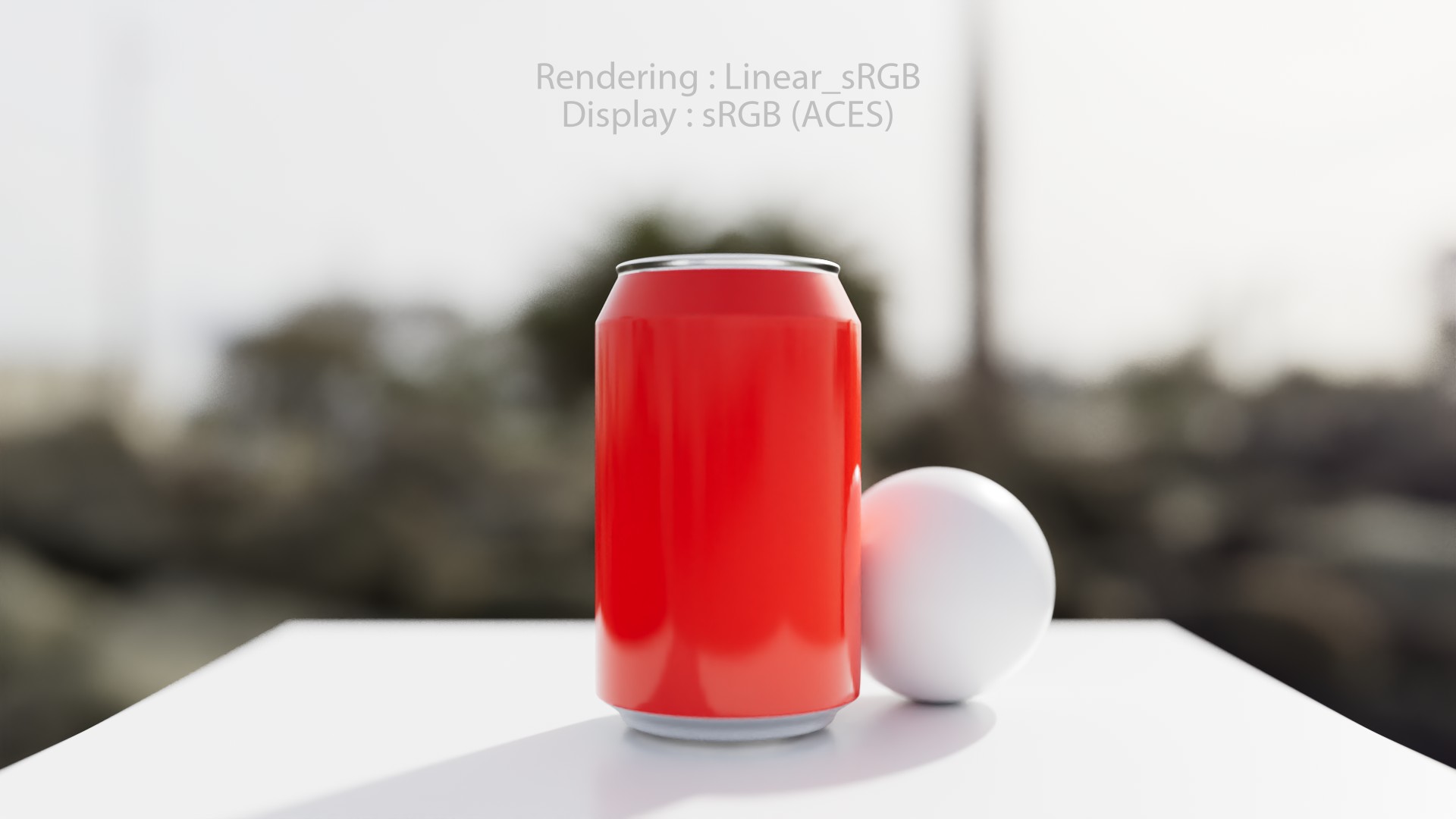
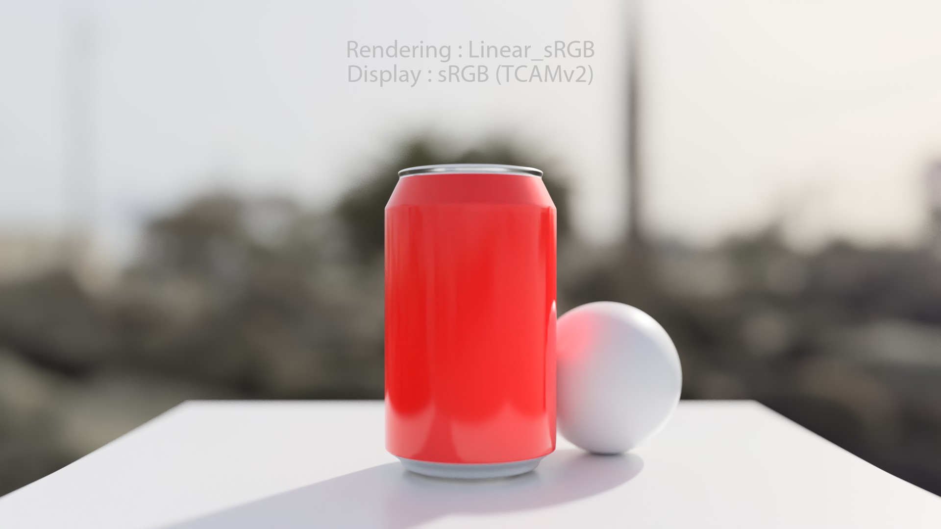
To avoid any confusion, here are the exact steps of this test:
- A single render in the BT.709 footprint.
- Which was then taken to the wider gamut working space of ACEScg (in Nuke).
- Each was rendered from ACEScg through their respective transforms.
Conclusion
Over the past years, colour has become a real obsession for me. I’m pretty sure I have lost some Brain cells trying to understand this stuff. But hopefully, it was worth it! Per-channel has given us for “free” a behaviour that seemed “filmic” (reduced saturation in highlights for instance)… But hopefully we know now the limits of this approach.
There is a desperate need for an open-source Color Management Workflow and ACES has filled this spot. Especially for the CG community. But we must not forget that ACES is just one solution among many. And hopefully, in the near future, more solutions will emerge because the research is still going on.
Revelation #25: Digital Colour Rendering is not achieved. It is a work-in-progress and there are still many things to understand.
This is my original sin and I have learned from it the hard way: there is no perfect Color Management Workflow. Hopefully, by sharing with you these new informations, I have made up for my past errors. Because when someone’s wrong, you can either hide your head in the sand or learn from your mistakes and fix them.
The journey
On a personal level, I have learned so many things about myself and how truly studying things. Almost like a philosophical journey. Here are a few of the lessons learned:
- We need brains, not role models.
- Use your eyes, trust your guts.
- No appeal to authority, test for yourself!
- The goal of this post is to think. Please examine what is said!
As the “most dangerous man in America” once said:
Think for yourself. Question authority.
Obviously, I would like to thank Jed Smith for providing all these wonderful Nuke scripts and his support during the writing of this post. I would not have been able to generate any of the plots without him! And I would like to finish with my favorite quote about Display Transforms, ever:
Daniele Siragusano.
Finally, once you have seen images through a neutral display transform, there is no going back. It is like seeing new and true colors for the first time. It is a leap of faith. Are you willing to take it?
Unfortunately no one can be told what a neutral Display Transform is. You have to see it for yourself
Summary
Through a series of 25 revelations, hopefully we have understood some stuff about Display Transforms:
- In the “nuke-default” OCIO config, the Rec.709 Transfer Function is a camera encoding OETF!
- With the “nuke-default” OCIO config, you will ALWAYS end up on the “Notorious 6“.
- An s-curve has nothing to do with the “Filmic” behaviour.
- OCIO is NOT implemented the exact same way in all softwares.
- It is rather recommended to edit the standard OCIO configs.
- Displays and Views have been swapped in the ACES OCIOv1 configs.
- The ACES Output Transforms do not solve anything. They’re essentially a Matrix 3×3 and a tonescale.
- Having a path-to-white does not mean that the Display Transform is “correct” nor “neutral”.
- A 1D s-curve LUT is applied on logarithmic (or semi-log) values.
- Any curve that converges at 1 will end up on the “Notorious 6“.
- All the scenes I have lit, rendered and displayed for the past 15 years have the “Notorious 6” look.
- A “beauty” exr file is NOT an image, it is a file containing light data.
- There are two rendering operations in CG: one from scene to data and one from data to image.
- Applying an s-curve on different primaries will yield a different result.
- There is no “compensation” possible with the ACES Output Transforms.
- RGB rendering is kind of broken from first principles (compared to real/spectral light transport).
- I have never used a proper tone-mapping solution. Does it exist?
- The s-curve is only one module out of several for a “modern” Display Transform.
- In digital RGB land, the path-to-white should be engineered.
- Even if a “chromaticity linear” approach is desirable, it does not necessarily create pleasing images.
- The colorimetry of the displayed image must always be altered from that of the scene.
- The Display Rendering Transforms from TCAMv2 should not be used without a “Look“.
- A look can contain much more than a grading node baked in.
- Chosing an OCIO Config is as important as chosing the camera, lenses and film stock!
- Digital Colour Rendering has NOT been achieved yet.
Sources
A series of threads on ACESCentral discussing the ACES 2.0 Output Transforms:
- Output Transform VWG Dropbox
- About issues and terminology
- Choose-your-own approach
- ACES background document
- Gamut Mapping Part 2: Getting to the Display
- Output Transform Tone Scale
- Human perception VS Filmic reproduction
- Open Display Transform by Jed Smith.
Some links to OCIO archeology:
- tonemap and s-curve (about spi-anim OCIO config)
- spi workflow (google site, looks a pre-relase of the official OCIO docs)
- Tonemap from Timothy Lottes
- Integrating CG Renders into Color Graded Film Footage
- Purple fringing with ACES in Spiderman
- ALEXA Log C Curve – Usage in VFX
- Colour artefacts or breakup using ACES
- Colour inaccuracies and config files
- ACES OpenColorIO-Configs (and other stories)
- The Future of OpenColorIO-Configs
- PR: ACES 1.1 and ACES 1.2 Support
- Studying Gamut Clipping
- Meeting#20 (2021/06/09) of the ACES Output Transforms was also very interesting about sigmoids and gaussian distribution.